Bringing the world's fastest Target Run to life.
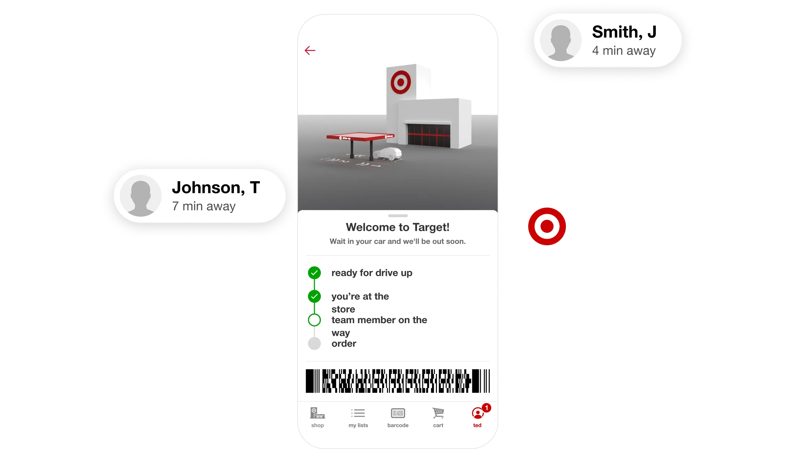

Target chose Livefront to bring Drive Up, the world's fastest Target run, to life.
Every day, millions of shoppers choose Target for its great prices, convenience, and design sense. The high expectations that accompany that kind of scale are why Target chose Livefront to help them reinvent the Target run. We collaborated with some of Target's best and brightest to define, design, and build Drive Up's guest-facing mobile experience, as well as the internal tools and systems that power it, on an aggressive timeline of less than 6 months from kickoff to launch.
Filling a hole in the market.
Consumers choose where to shop based on three criteria: price, convenience and immediacy.
Target stores offer great prices and instant gratification, but going into the store isn't always convenient. Amazon's Prime and Prime Now services offer incredible convenience, but come at the cost of a multi-day wait or an added delivery fee on orders below a minimum size.
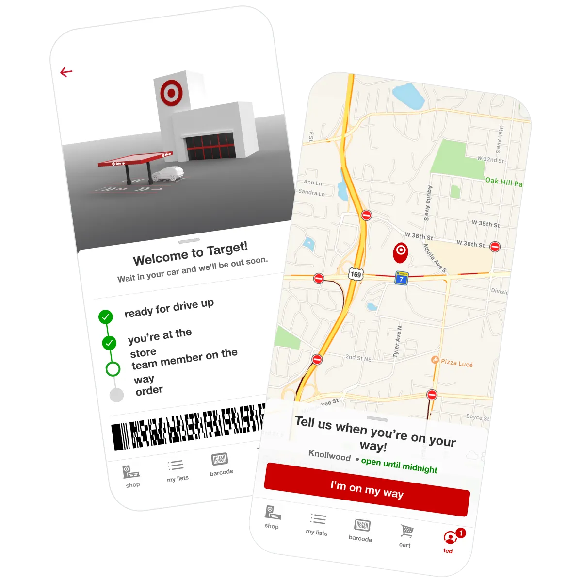
Drive Up, a free service for orders of any size, lives at the nexus of all three criteria and leverage's the retail chain's extensive physical footprint for a guest experience that's both state-of-the-art and uniquely Target.
Thoughtfully designed from end to end.
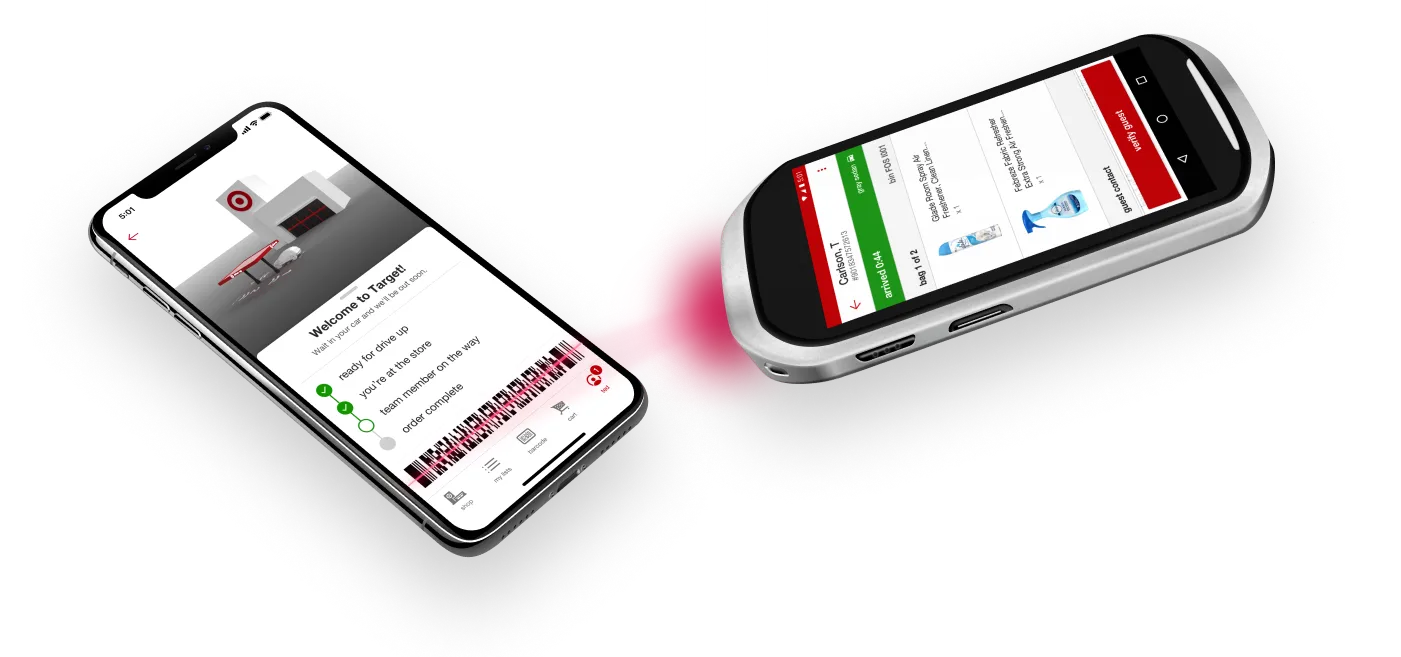
Getting the guest experience right meant getting the team member experience right as well. In addition to the guest-facing features and interfaces, we helped create all the internal tools and systems that power the service behind the scenes.
The right place at the right time.
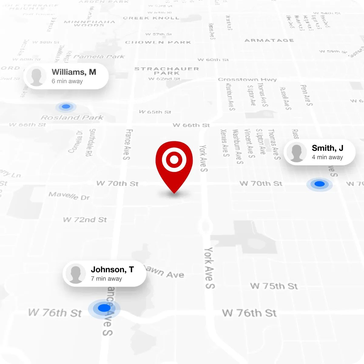
For Drive Up, timing is everything. If a guest arrives before a Target team member is ready to run their order out, they end up waiting. If the team member is ready and waiting too early, resource efficiency takes a hit. Success means getting both parties to the handoff point at the same time.
We helped solve this dilemma by marrying thoughtful service design with clever engineering. We looked at store floorplans and neighborhood maps to calibrate guest ETAs and learn how notifications should be timed. We simulated the experience for real Target guests to understand their driving habits and speed of service expectations. We painstakingly tuned geofences to detect guest arrivals as quickly and accurately as possible.
At launch, independent reviews showed that guests were finished and on their way an average of 1:18 after arriving at the store, a 35% improvement over the service's two minute goal.
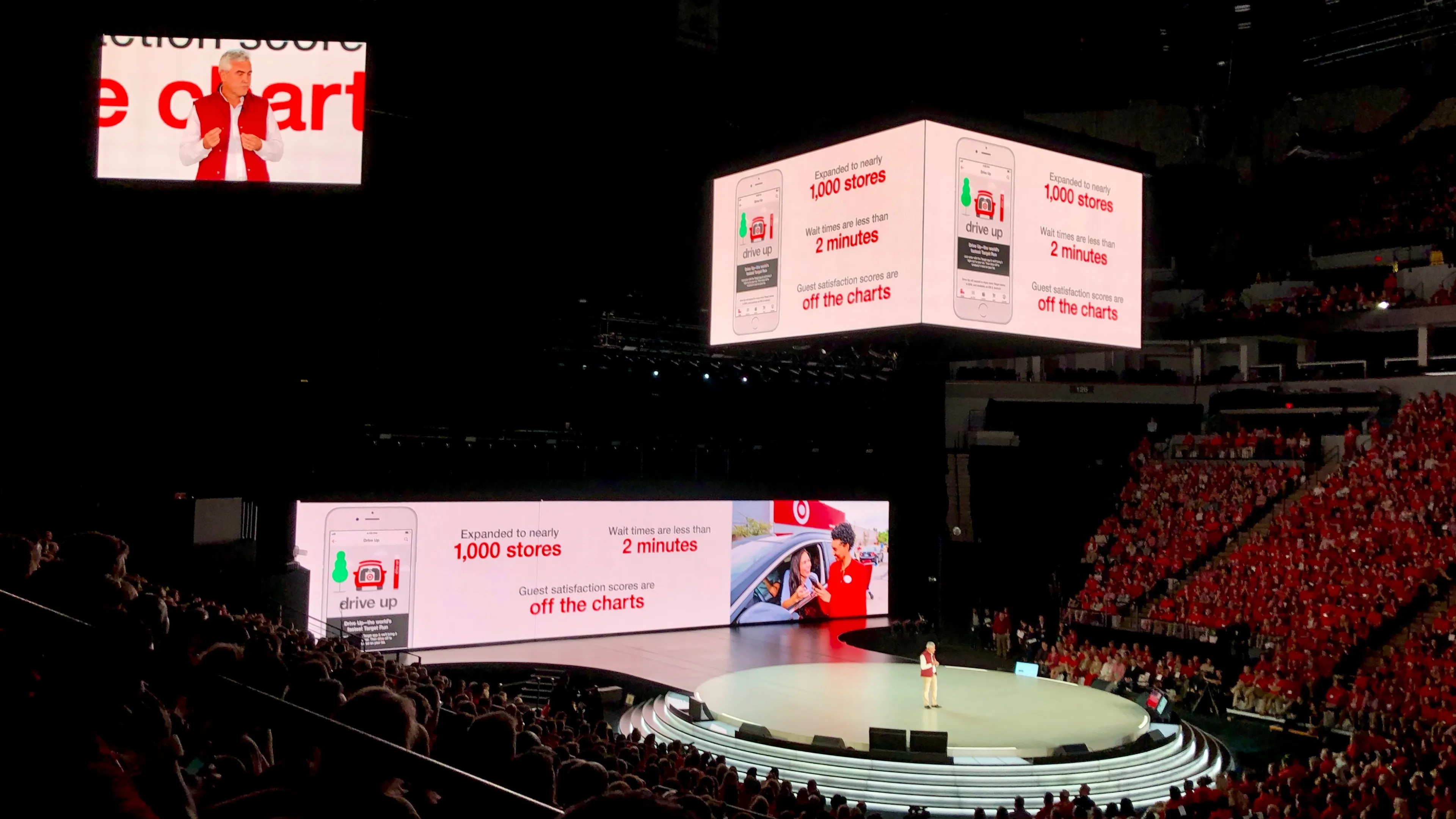
Drive Up was highlighted on Target's 2018 national meeting keynote, and has been a key talking point on earnings calls since its launch.
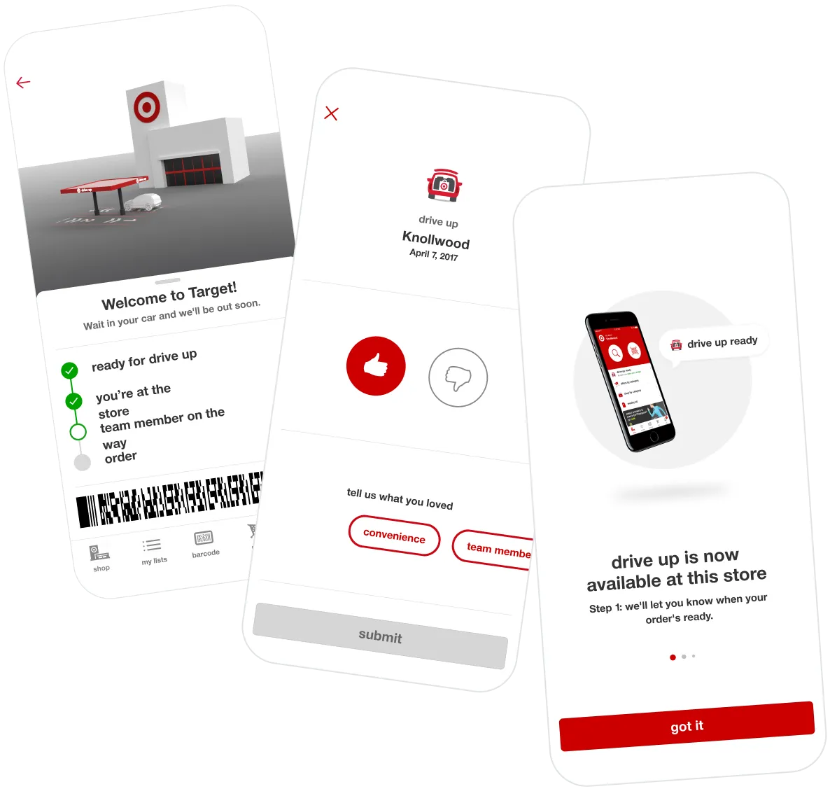
It's poetry in motion.
We brought the experience to life by infusing key moments in the guest journey with satisfying animations and microinteractions.
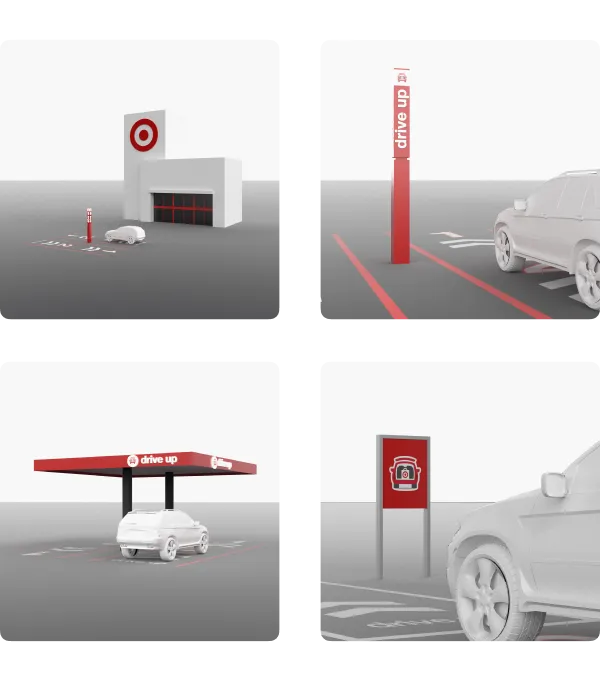
Telling the story in three dimensions.
One of our biggest challenges was getting guests — most of whom are using Drive Up behind the wheel — to intuitively understand what to look for and expect when they arrive. We found that showing was more effective than telling, so we created playful, representational 3D illustrations to help get the point across visually.
Our contributions.
Product Management
- Project Management
Strategy & Research
- Product Strategy & Vision
- User Research
- Concepting & Prototyping
Product Design
- Service Design
- Native Mobile Design
- Motion & Animation Design
- 3D Design
Development
- iOS Development
- Android Development
- React Native Development
- Quality Assurance Testing