Putting a mobile spin on provider searches.
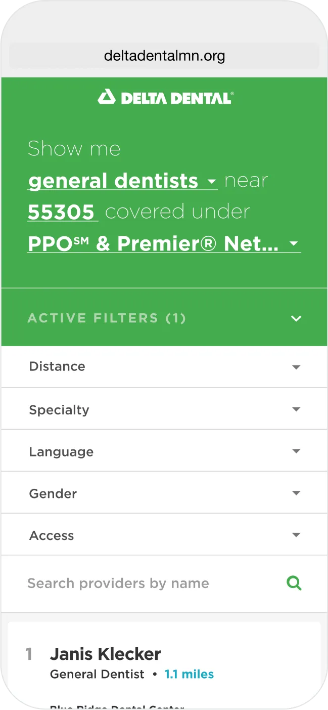

Delta Dental trusted us to put a mobile-first spin on the provider search experience.
As increased consumer choice continues to transform the healthcare industry, it's never been more important that healthcare services be marketed and delivered in a way that delights digital-native buyers. Dental care is no different, and dental plans are increasingly being bought and sold on the basis of the subscriber experience they offer in addition to traditional considerations like premiums and network. Delta Dental is the largest dental insurance association in America, with 37 member companies operating in all 50 states. We worked with its Minnesota arm to overhaul the Find a Dentist app used by current and prospective subscribers, as well as sales and support staff, to find and compare in-network dental practices across the country, elevating the digital experience for subscribers in the process.
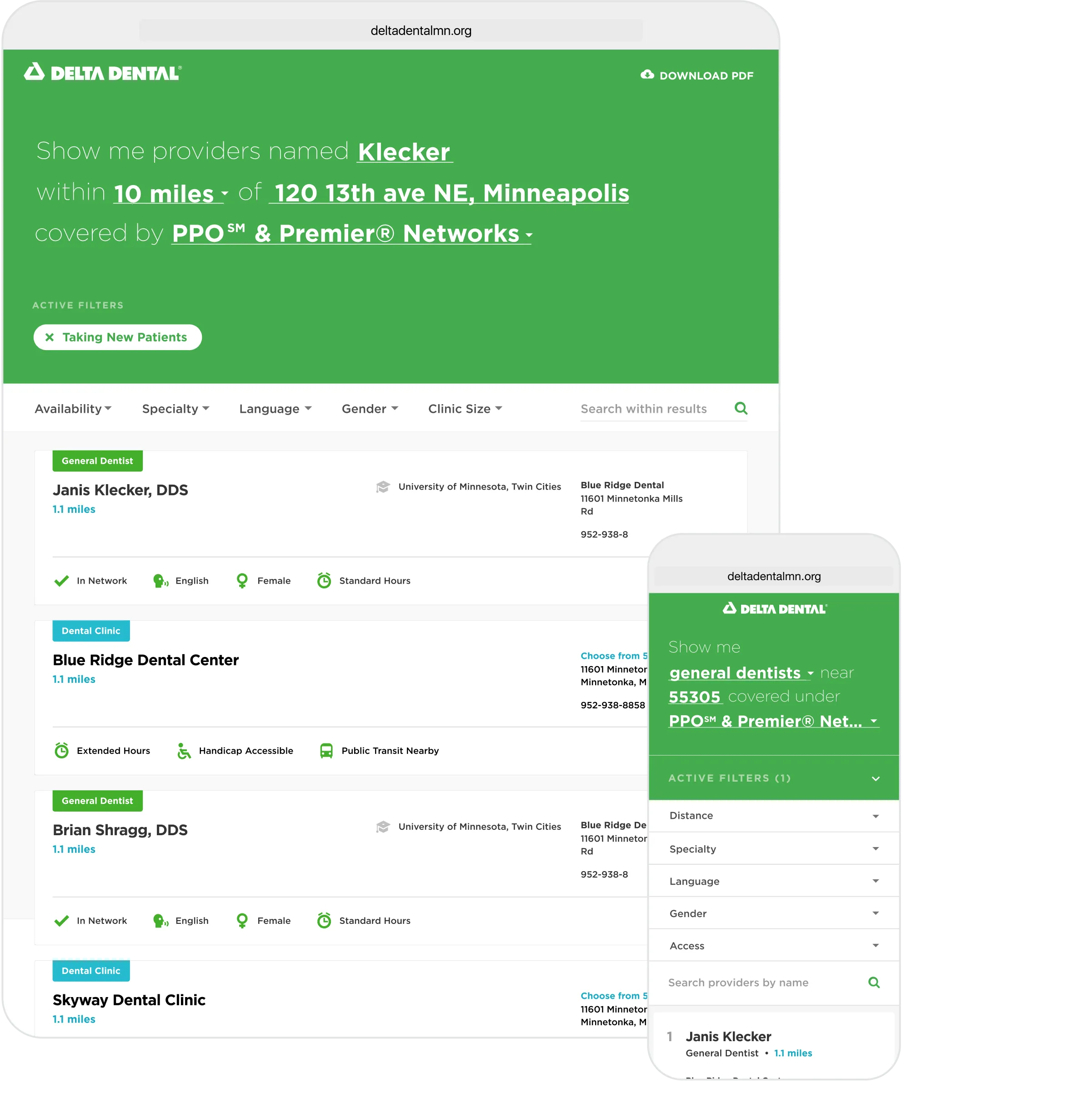
A way to find the perfect fit.
Finding a new care provider can be a big decision. There's so much to consider: location, hours, services provided, personal fit, and the list goes on. For some, it can be even more nuanced. Is the clinic multilingual? Is it located near public transportation? Every patient's needs and preferences are different, and the tools for finding a new provider need to reflect that. Find a Dentist lets Delta Dental members find the provider that's right for them based on a broad set of criteria ranging from location to practice size to clinic accessibility.
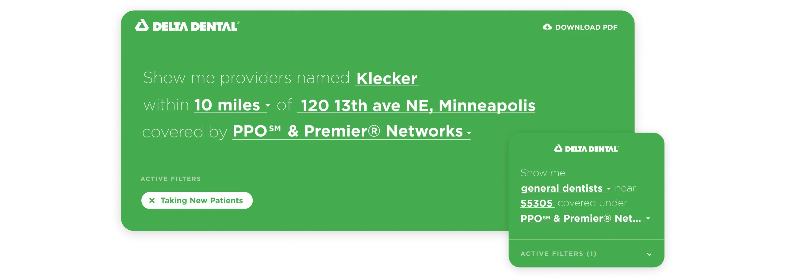
A little more conversation.
We humans don't think in search keywords, we think in complete phrases and sentences. We chose a natural, conversational intake interface to make getting highly relevant results dead simple and crystal clear.
Doing the most with data.
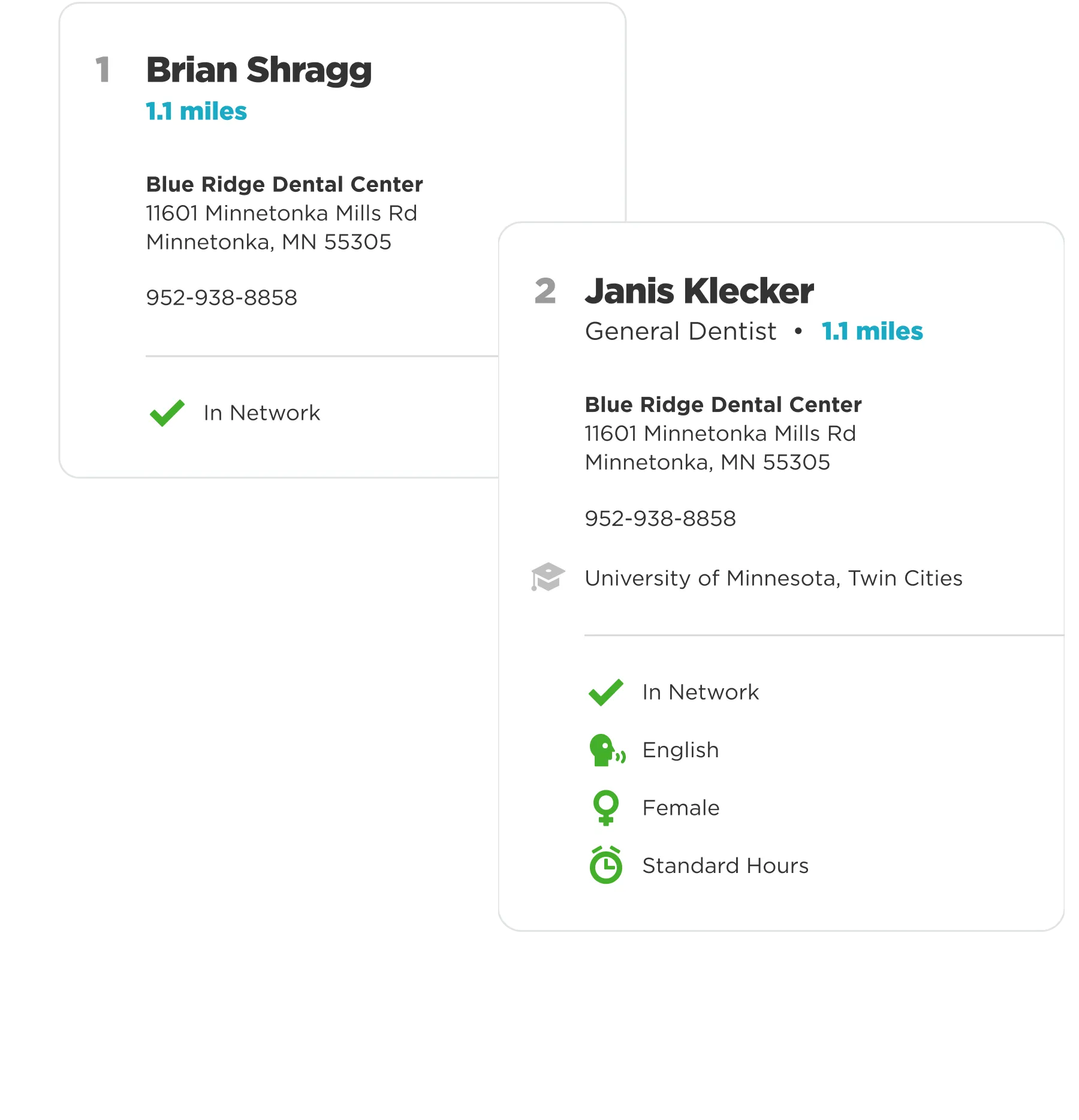
As part of the association, Delta Dental member companies are still relatively autonomous and don't always coordinate their operations. That's especially true in the information technology practice, where the structure and detail of equivalent data sets can vary wildly from state to state.
We had to work within the constraints of this disparity in building the search tool since not all of the data sets indexed had all of the attributes we might want to filter on or highlight in a results list. So instead of reducing functionality to the lowest common denominator, we built an application that degrades gracefully according to data availability and gives every user the best experience possible for their geography.
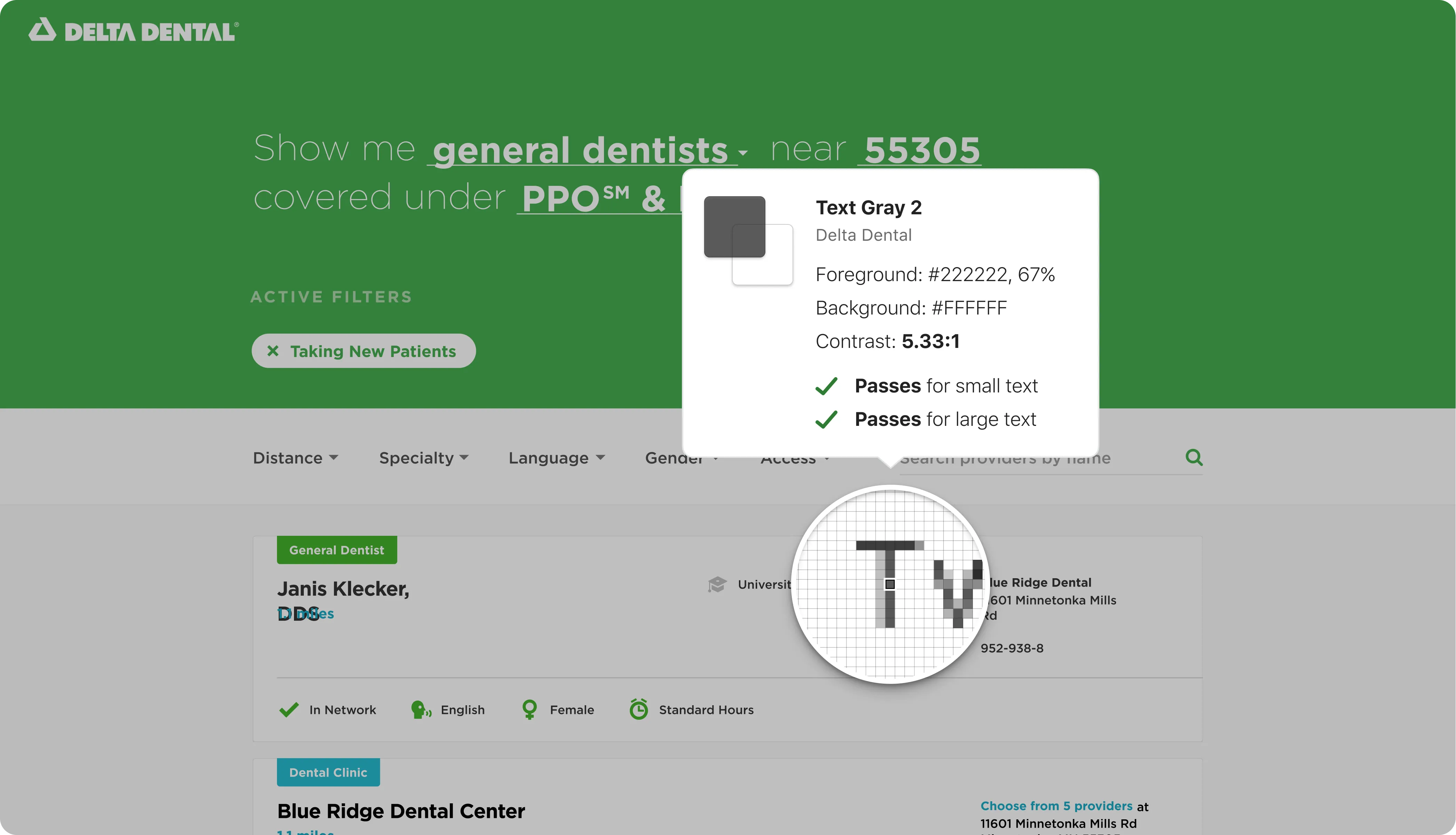
Accessibility as a first-class citizen.
Every individual deserves the best experience possible regardless of age or ability. And now with ACA-related accessibility regulations in effect at the federal level, there's even more incentive for healthcare companies to go the extra mile on inclusivity. Our holistic view of accessibility is reflected in both the design and frontend engineering of the Find A Dentist app, which fully adheres to the latest WCAG standards.
Our contributions.
Product Management
- Product Ownership
- Product Roadmapping
- Project Management
Strategy & Research
- Product Strategy & Vision
- User Research
- Concepting & Prototyping
Product Design
- Web Design
- Motion & Animation Design
Development
- Front End Development