

Layers of support for
every learner.
We helped GED drive increased conversion to the final test by creating a mobile app that supports all learners.
GED, a division of Pearson, is the most well-known brand for high school equivalency testing in the United States. GED administers exams and offers study plans and advocacy resources that support learners preparing for the test. Learners who can access these support resources have a much better chance of making it to test day and passing the GED than learners left to go it alone, and for years, this gap in support has presented GED with a conversion problem. In 2021, over 400,000 learners (82% of GED's total users) created a GED account but never took a test. To close this gap, GED partnered with Livefront to get much-needed support in the hands of all learners.
Putting on our thinking caps.
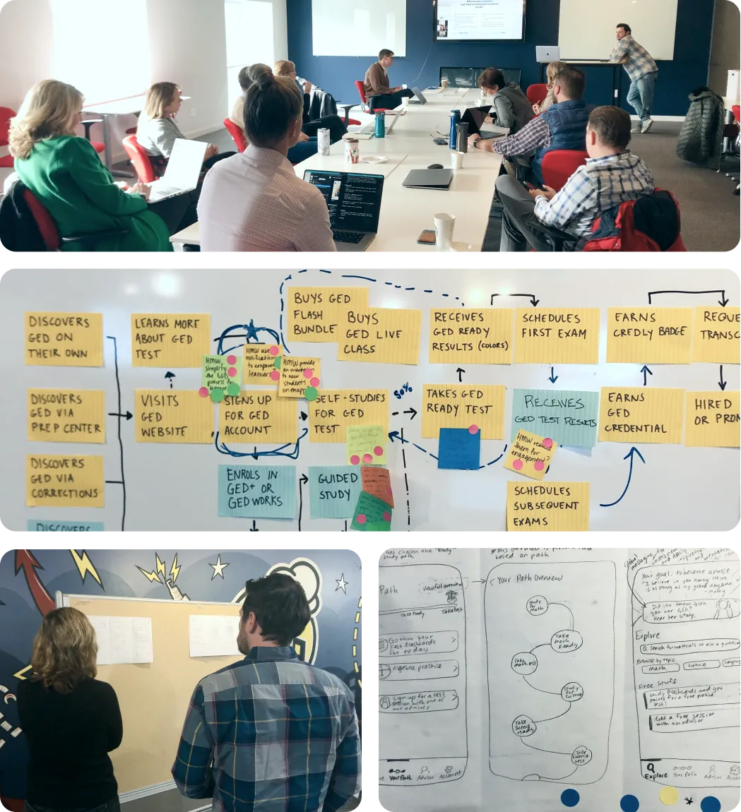
To kick off our discovery phase, we brought the core team members from Livefront and GED to the table for an in-person workshop. Through a strategic process of grounding, exploration, and ideation, the Livefront team helped GED identify an ambitious, powerful concept at the intersection of the market opportunity, the business goals, and learner needs. In the following weeks, the Livefront team refined, iterated, and expanded upon this concept in a series of six rapid design and testing sprints.
I want to thank you for all your hard work. It shows that you are very diligent, very detailed.
Real reactions for rapid improvements.
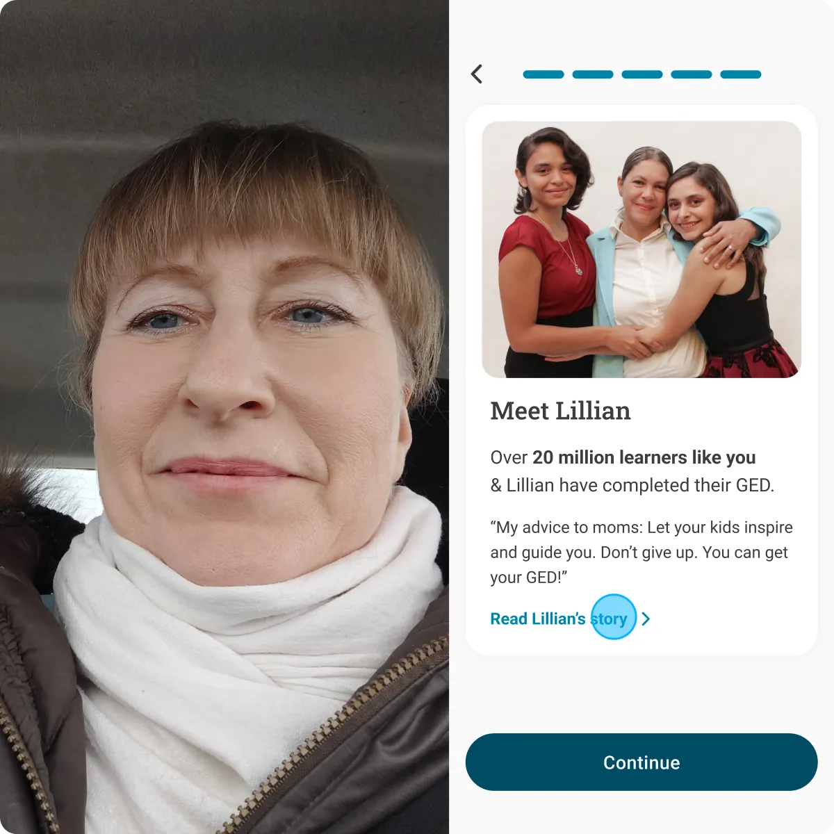
In each design sprint, Livefront conducted user interviews with current and potential GED learners to measure their reactions to a prototyped experience. In our remote testing sessions, participants were on their way to work, caring for children, and navigating accessibility challenges in real time. Meeting learners in their own environment, the team uncovered meaningful insights into the unique challenges the typical GED learner faces every day. The insights from each round led straight into the rapid refinement of the MLP feature set and design.
A tailored solution to a one-size-fits-all system.
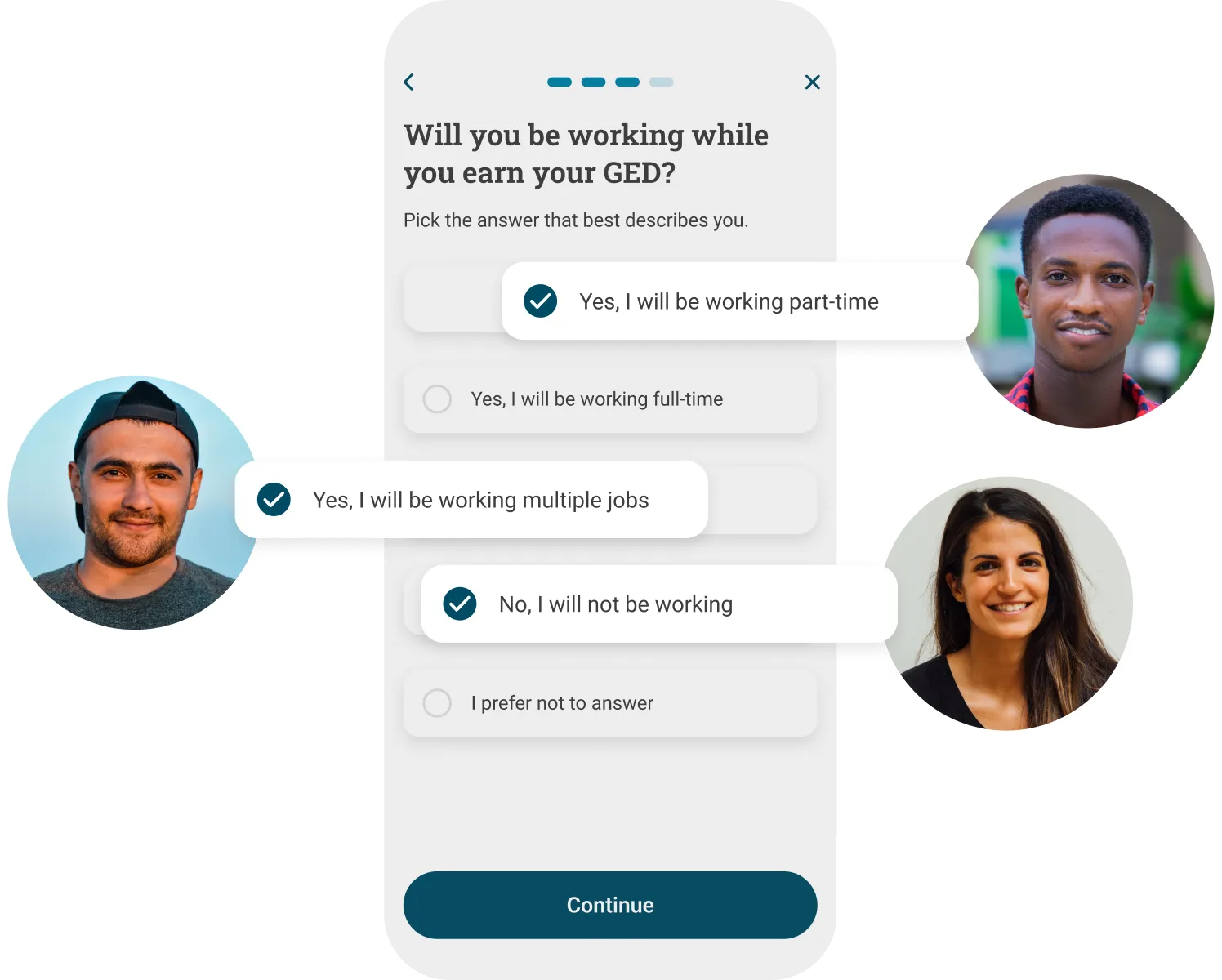
Many GED learners leave the traditional education system feeling let down by its one-size-fits-all approach; thus, the GED is as much an emotional journey as it is an academic one. To regain confidence, learners want a tool that understands their unique needs and tailors their experience accordingly. By laying the foundational elements of personalization, like surveys, goal setting, and targeted content, we created a simple base to deliver tangible value in the short term as the team develops more complex models for the future.
Meet Syd, your GED advisor.
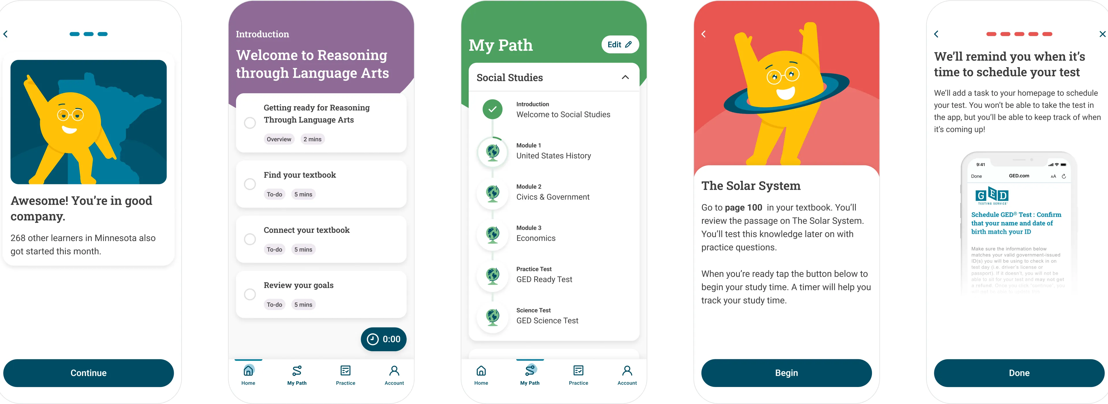
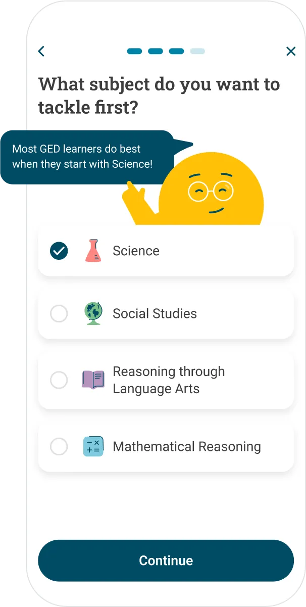
To add a unique personality and a layer of personal support to the app, we created a custom-illustrated character named Syd. Syd serves as an advisor, motivator, and study buddy—offering advice and encouragement at key decision points and moments of success. In testing, the character's lighthearted presence differentiated the app from the dry and intimidating education tools our testers were used to. To ensure the character can grow with the app long-term, we designed an organized, yet flexible system of movement and expression that is optimized for future animation.
Clear directions without having to ask.
The market is saturated with third-party GED study tools, but offers little guidance on what to study, and when. Resources like classes, textbooks, YouTube videos, and online materials are usually either prohibitively expensive or of dubious quality. Our task was to help solo learners navigate this overwhelming landscape without fundamentally changing the GED business model. To do so, we designed the app as a trusted study guide. First, we guide the learner through a goal-setting exercise and ask them to choose a study tool from a list of recommendations. Then, based on their choices, we create a personalized study path that breaks the material down into manageable sections that the learner can complete at their own pace.
Going it alone together.
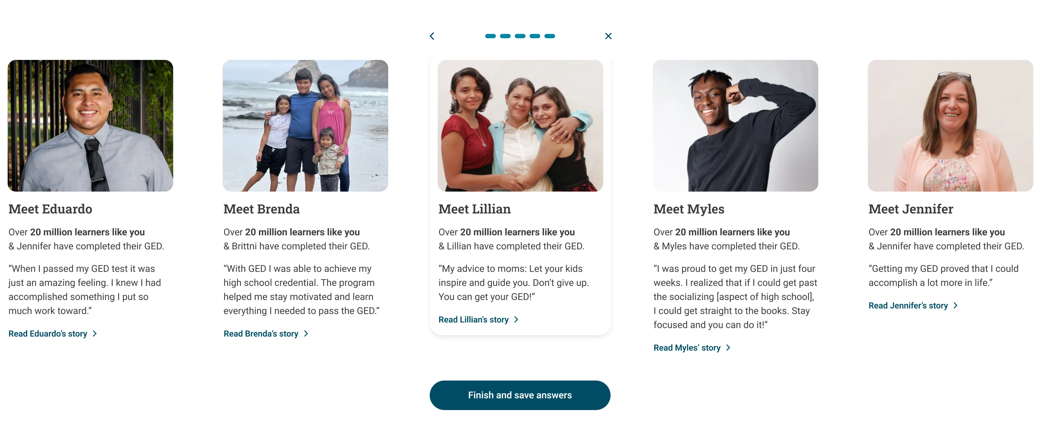
Unlike supported learners—who tend to have community connection points that can help overcome the obstacles that many experience after leaving traditional education—solo learners are often left feeling isolated. Personalized social-proof messaging woven throughout the app shows learners their place within the supportive GED community without the need to implement complex social features. For example, learners can see how many others in their state got started this month and read the story of a successful GED learner with similar traits, experiences, or background to themselves.
Keeping up the good work.
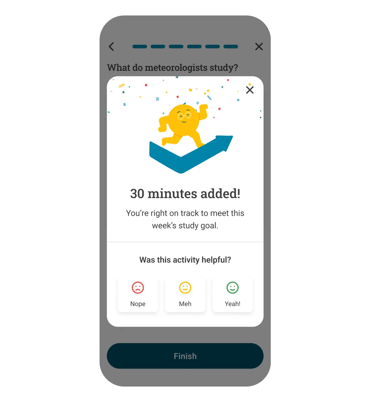
The four subject-specific tests of the GED are meant to be taken one at a time, and the duration of the GED journey depends on multiple factors. For solo learners, who often lack outside support and accountability, the study process can take more time. To help learners stay engaged all the way to test day, we included habit-forming cues, actions, and rewards at each step of the experience. As they move through their study path, the home screen continually adjusts to provide a clear cue to their next task. With each completed task, learners receive an encouraging message and are given visual feedback on their progress—replicating the support GED advisors are providing guided students today.
Practice makes perfect.
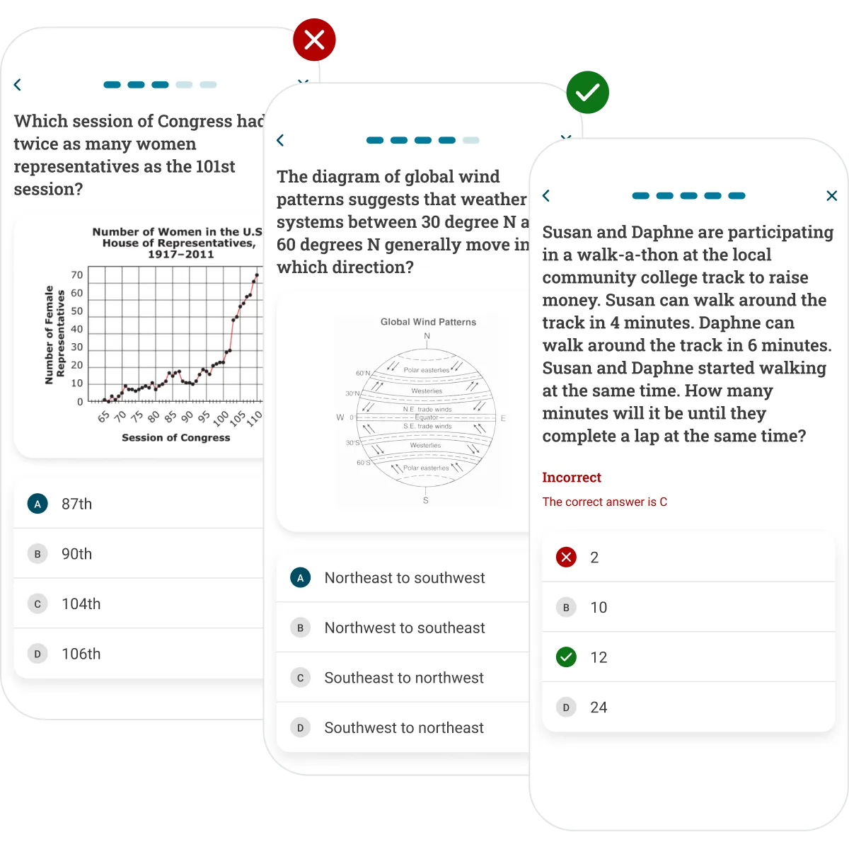
GED learners told us that they expect to be able to study in the app, and many preferred the real-world value of interactive practice to static reading. In combination with recommended outside study tools, we leveraged GED's vast library of practice test questions to provide learners with the in-app study experience they need. When broken down into modules, learners read about a topic outside the app, then come back to the app to test their knowledge. This focus on practice—and the ability to leverage existing GED content—sets the stage for future subscription models.
Charting the course to a bright future.
The MLP app is the foundation that GED will continue to learn from and develop over time. To guide this development, we created a strategic product roadmap and a set of core product and design principles rooted in our user research insights. Keeping these principles top of mind will ensure the app stays on track as product decisions are made. A comprehensive style guide and component library with accessibility considerations and clear documentation were created to ensure the product maintains visual consistency as it scales. In combination, these elements set GED up to succeed moving forward.

That even though this is it, you're wrapping it up you still care a great deal. Everything you wrapped up for us was done with care. It's very obvious. So thank you!
Making the grade.
Our contributions.
Product Management
- Project Management
- Product & Delivery Coaching
Strategy & Research
- Product Strategy & Vision
- Design Sprints
- User Research
- Concepting & Prototyping
Product Design
- Native Mobile Design
- Illustration Design
- Motion & Animation Design
- Design Systems
