Memberships fit
for customers.
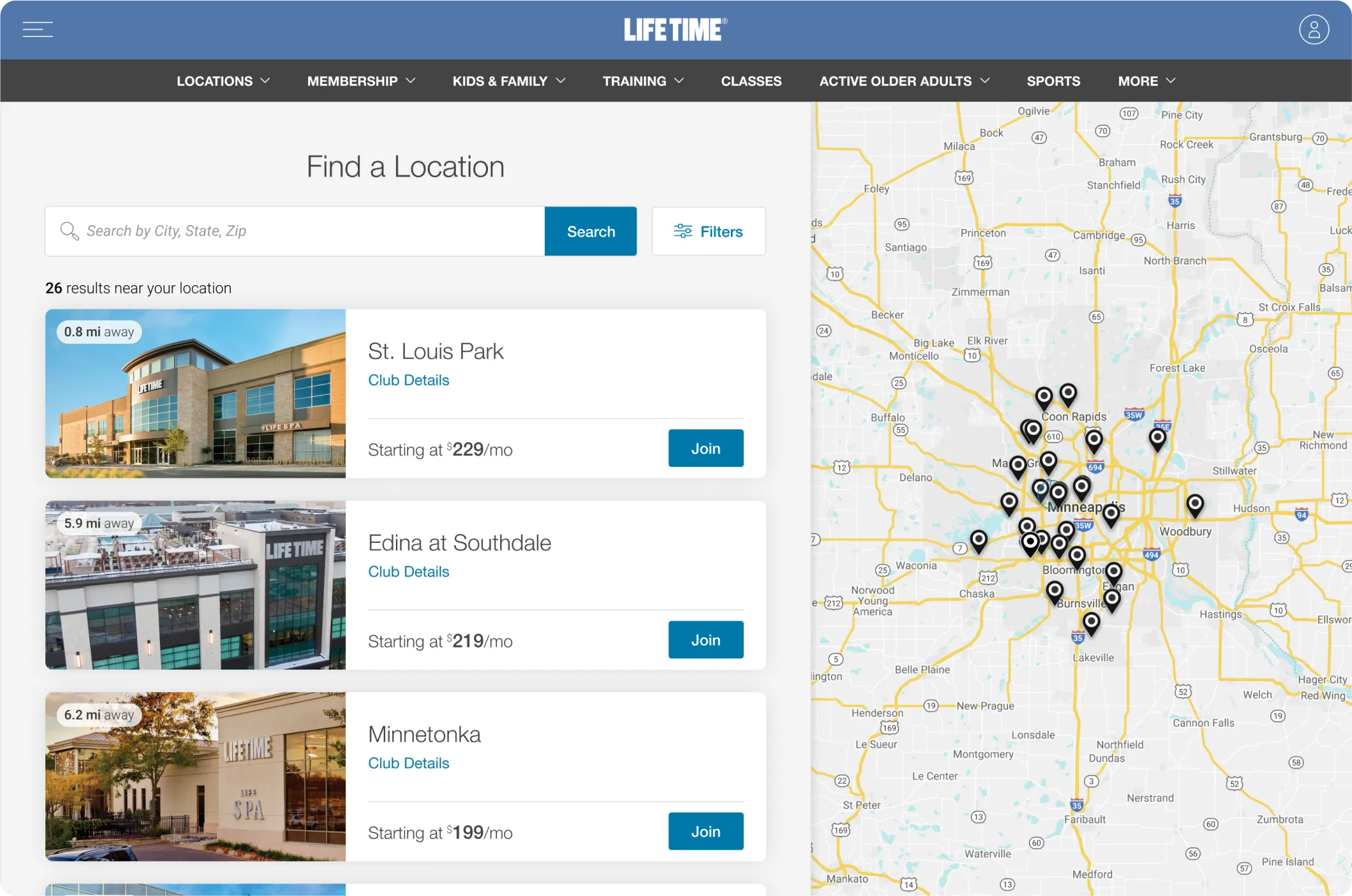

We helped Life Time win new members by bringing its distinctive club experience to the e-commerce channel.
Life Time has always won on experience within its national chain of health and fitness clubs. With the imperative to evolve and grow its online presence, Life Time was faced with the challenge of replicating the high-touch sales process in which club employees help prospective members build the perfect membership to fit their needs. Life Time turned to Livefront to help drive membership sales by creating a digital version of the concierge-like sales experience it has long been known for.
A heavy lift.
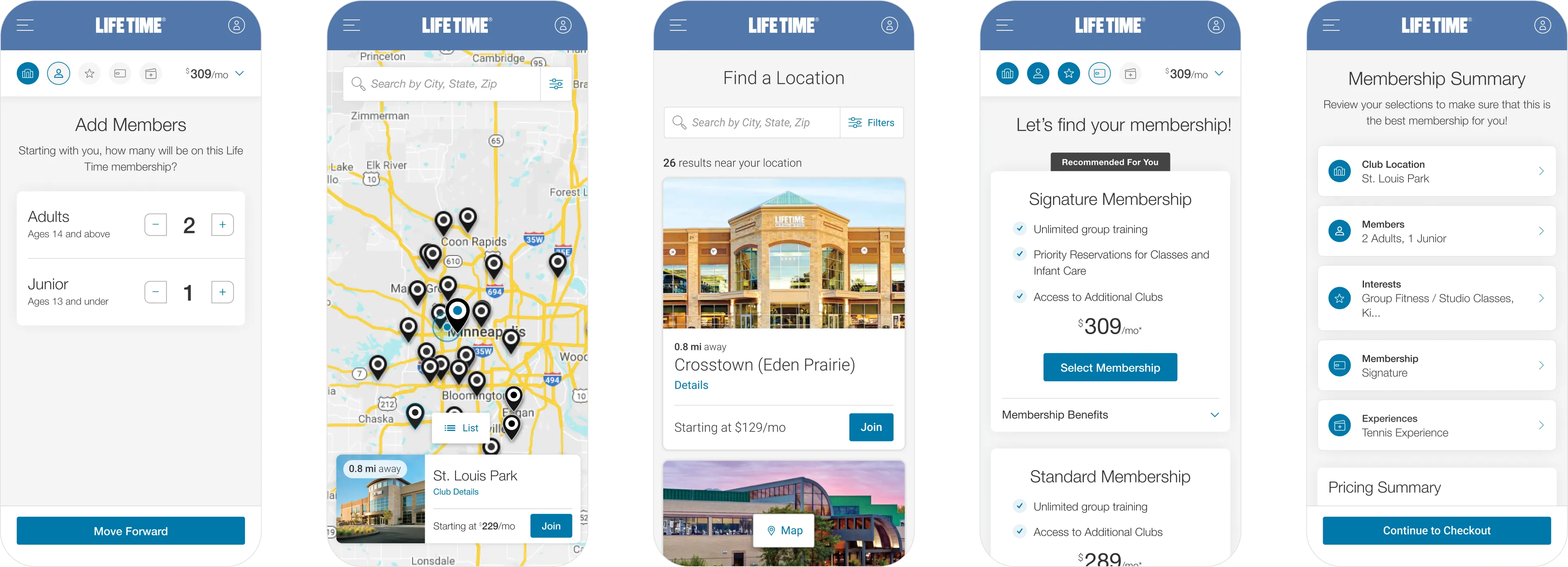
Creating a fitness membership plan to aid personal lifestyle goals can be a daunting task. Between choosing the right community and the right membership options, customers can get easily overwhelmed and abandon their purchase.
It was our job to ease those overwhelming feelings by creating a simple and elegant purchase path that guides prospective members through the first step in their fitness journey.
Real streamlining.
The legacy online membership journey packed multiple steps into a few screens to create the appearance of a more streamlined approach. Because of the heavy information density and cognitive load, Life Time observed a high bounce rate prior to purchase, and lost revenue as a result.
Getting our steps in.
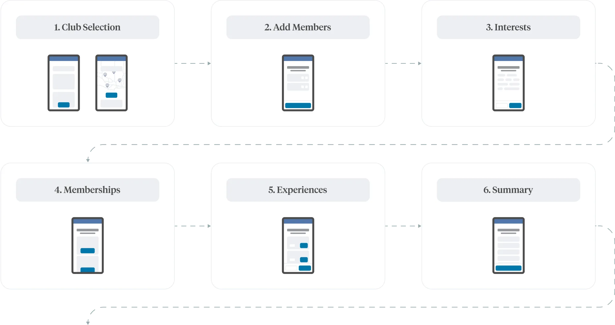
In diagnosing the problem, we first took a critical look at the analytics behind the existing process. The data suggested the density of the information presented with each registration step was causing users to abandon the flow.
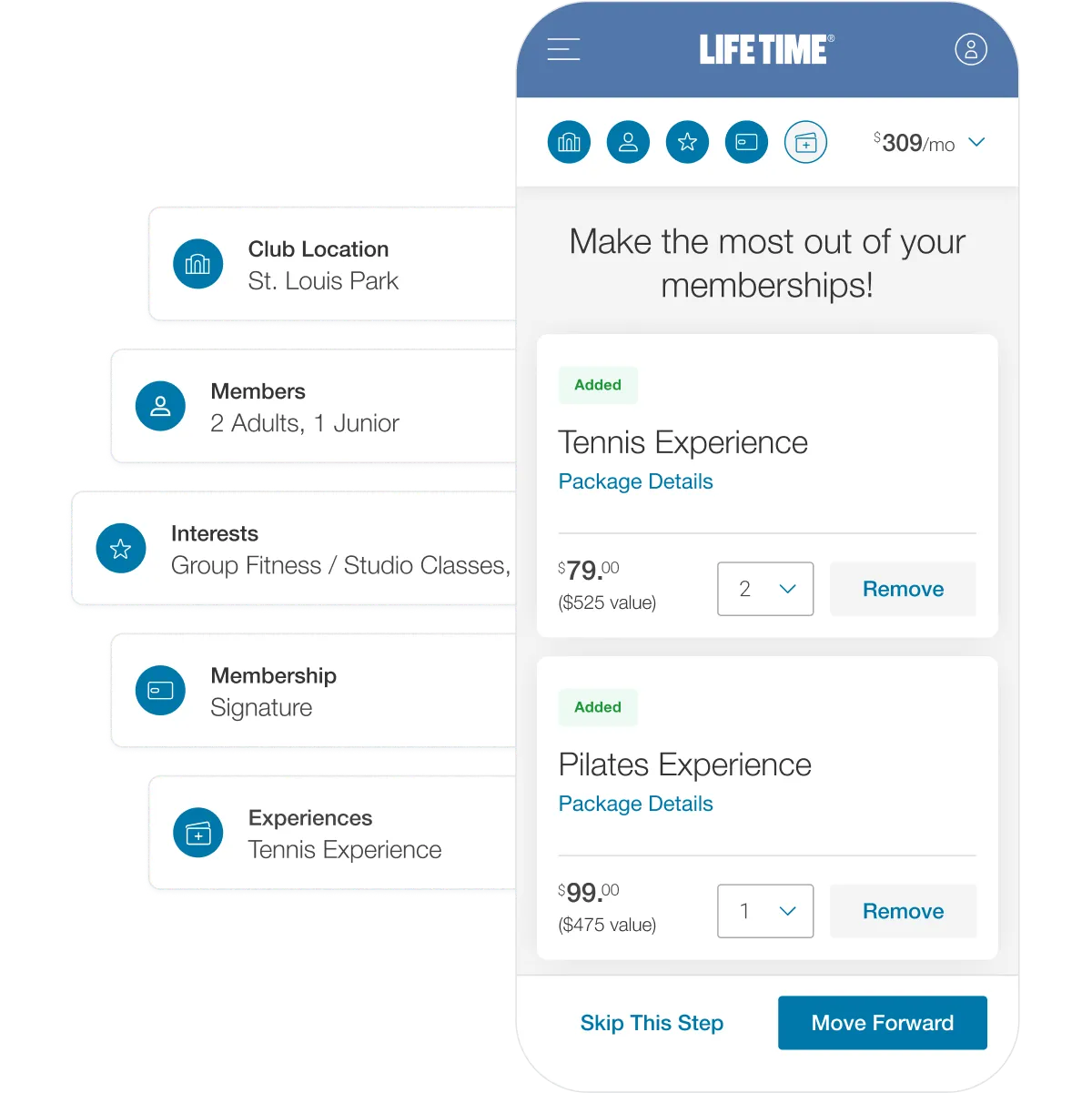
Ultimately this theory was proven correct. By separating each registration task into its own step, the process became more manageable, reduced user fatigue, and increased conversion by 43% nearly overnight. Even though this change made the process seem longer on the surface, it allowed users to focus on a singular task as opposed to being overwhelmed with information density.
Transparency from start to finish.
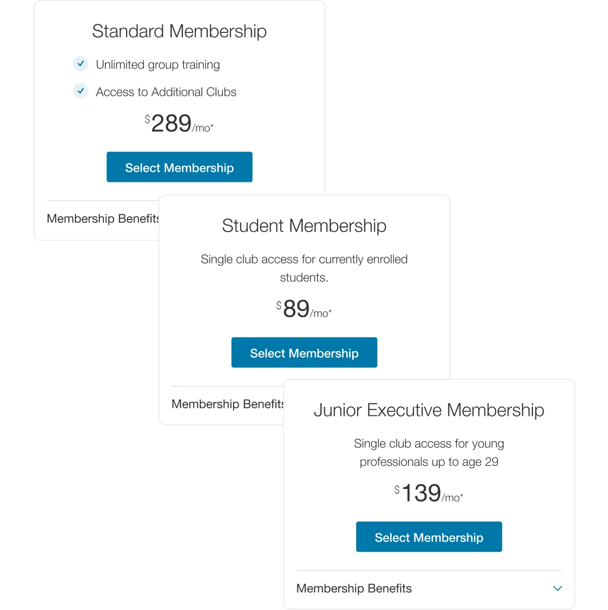
Even though Life Time offers flexible membership package options to fit different prospective member needs, membership purchase rates were down overall around the time the project started. To get to the bottom of this, we dug into insights from user interviews and analytics data to reveal that the true culprit was not around a lack of options, but rather the ambiguity of final pricing.
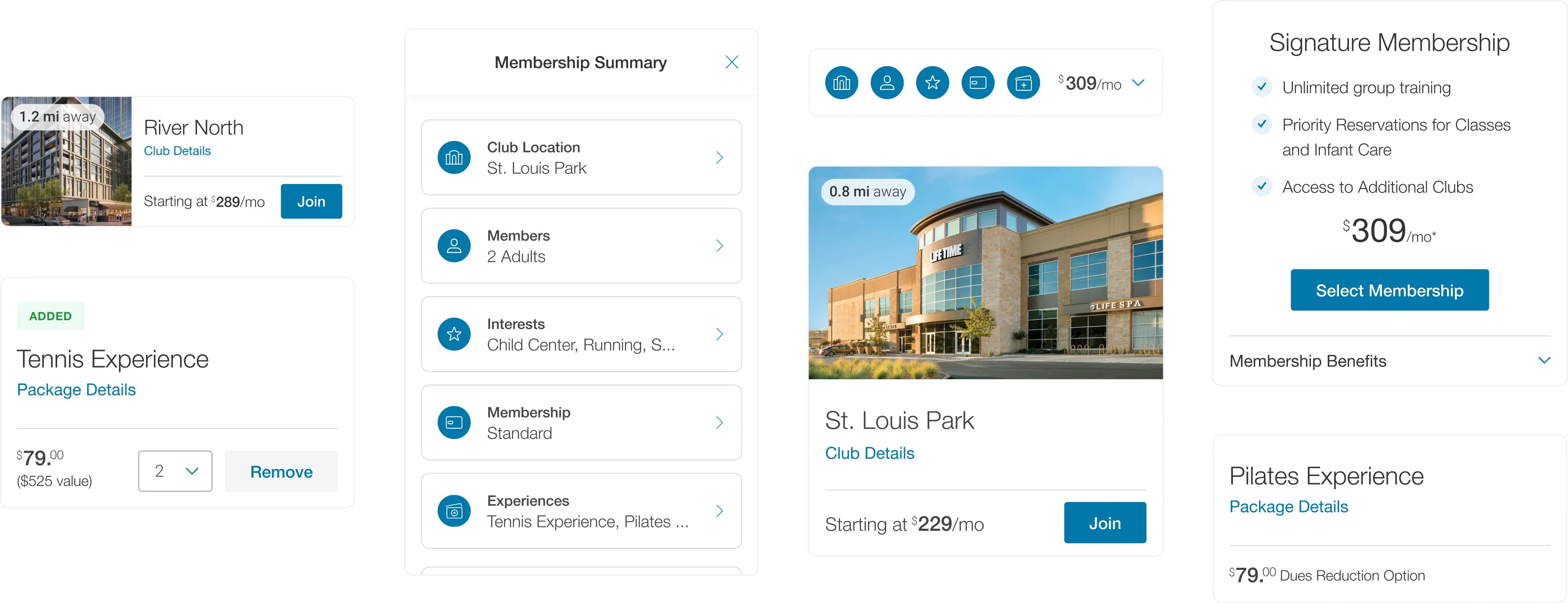
Rather than changing the Life Time pricing model, we focused on transparency and accessibility to alleviate final pricing sticker shock by elevating pricing at every step throughout the journey.
Personal, with or without the trainer.
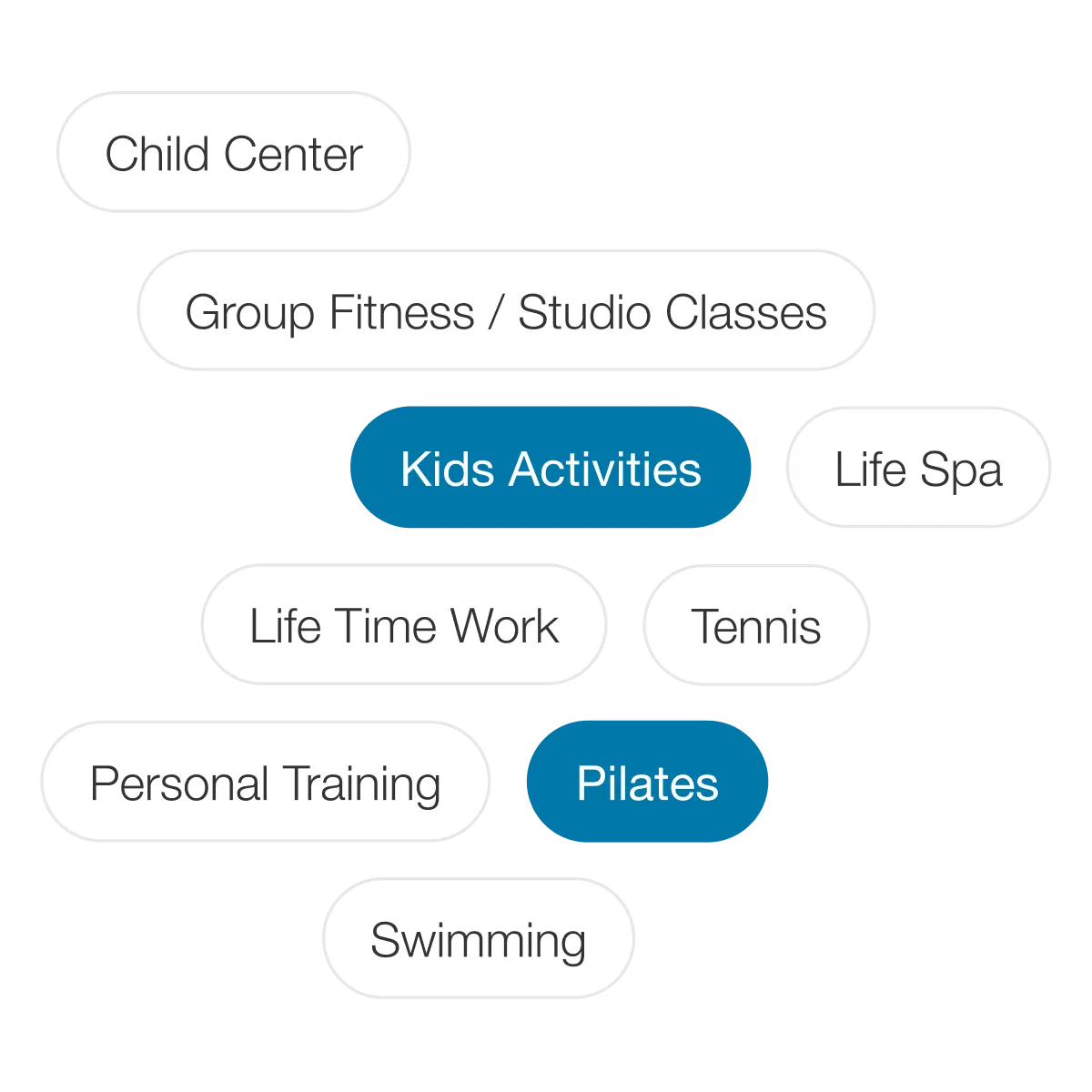
For consumers, memberships can often feel impersonal—serving the interests of the membership organization rather than the individual member. After reviewing in-depth interviews with prospective members, we learned how they often struggled to see how Life Time's offerings would benefit them personally on their journey towards a healthier lifestyle.
Following familiar design patterns, we emphasized gathering user needs and interests early in the sales process to inform personalized product recommendations, ultimately creating a more meaningful experience specially tailored for each individual member. By putting the member at the center of this experience, their previous hesitations about the value of a membership melted away.
A personal best.
Our contributions.
Strategy & Research
- Product Strategy & Vision
- User Research
- Concepting & Prototyping
Product Design
- Web Design
- Design Systems