Bringing mobile-first thinking
to medical sales.
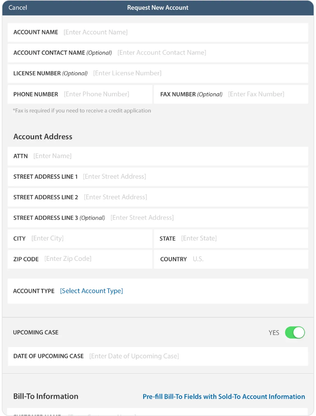

The Medtronic iPad App
Medtronic is a global healthcare solutions company committed to improving lives through innovative medical devices, technologies, services. For more than 60 years, its mission has remained the same: to alleviate pain, restore health, and extend life for people around the world. Livefront was engaged by the firm's Spine division, part of its Restorative Therapies Group, and tasked with creating an intuitive iPad app to enable sales and inventory management in a complex, clinical setting and empower traveling sales associates to access complex workflow and real-time inventory & pricing information. Over the course of nearly 2 years, we collaborated extensively with business, technology, and design stakeholders to transform legacy sales and business processes and reimagine them through a human-centered, consumer-informed lens.
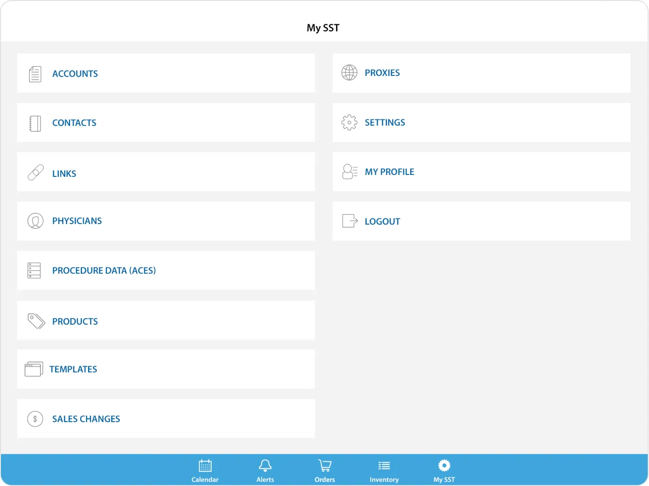
Business process gets with the times.
Paper forms. Fax machines. Inventory calls. Before Livefront came along, Medtronic Spinal's order and inventory management processes were like something straight out of a 90's workplace comedy. These days, particularly in the fast-paced and ultra competitive world of medical device sales, that kind of cumbersome inefficiency is literally a dealbreaker. Our mission was to tame the complexities of these legacy sales and business processes and streamline the experience for traveling field sales agents and their hospital customers, both of which increasingly bring expectations of mobile technology formed by interacting with best-of-breed consumer products, to drive outcomes including faster fulfillment, lower cost of doing business, and less time spent by salespeople processing orders… meaning more time selling.
Enormous complexity, seamlessly streamlined.
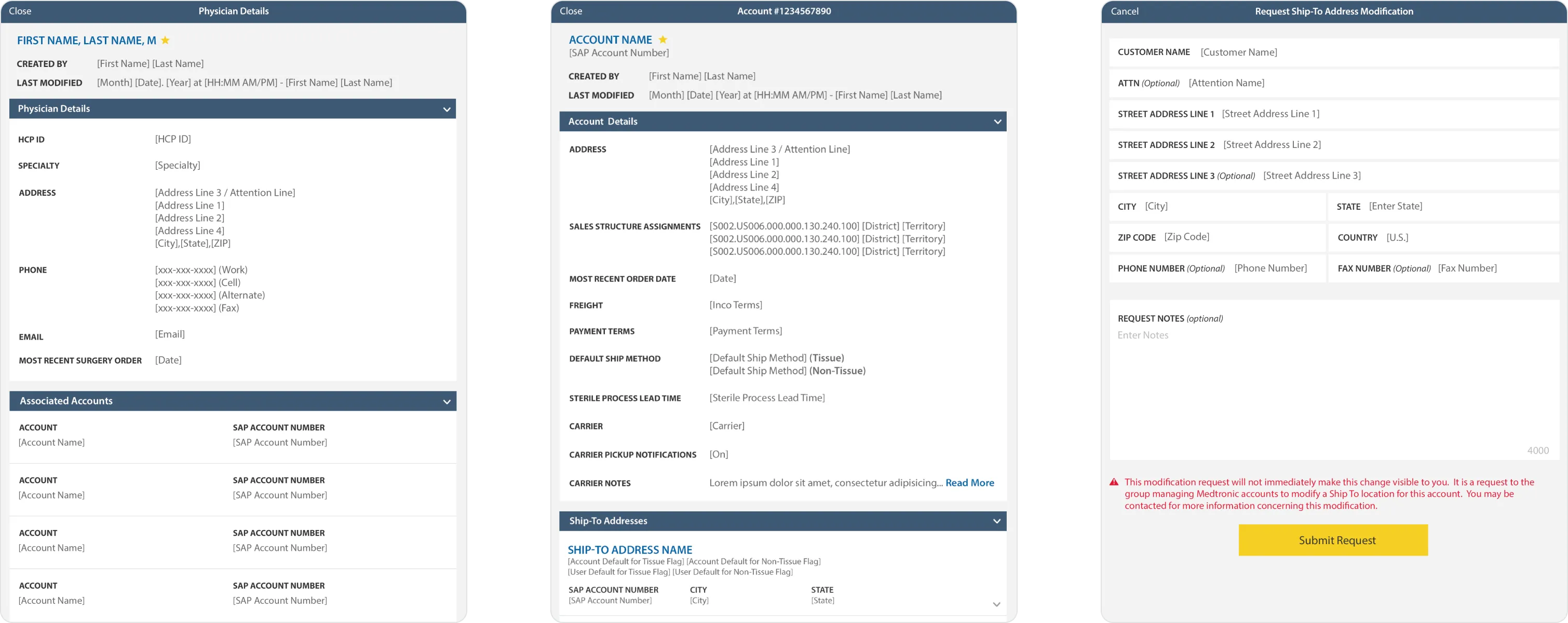
The medical device sales channel is a complicated beast with immense complexity and variability in almost every aspect, from the the depth and breadth of the product catalog itself, to the quirks of billing and accounting, to order tracking and record keeping, to who has access to what information throughout, and beyond. From beginning to end, we designed and built the app to gracefully handle this endless fractal of edge cases and tested it extensively at every stage of the process to ensure that no set of conditions was left unaccommodated.
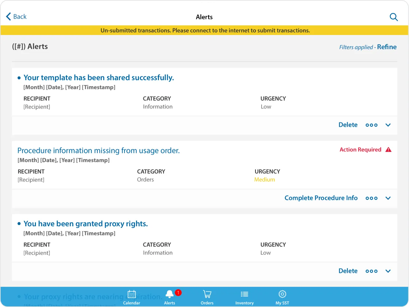
Let's take this offline.
Hospitals and clinics are radio-sensitive environments with notoriously onerous wireless policies and often spotty connectivity. We designed the app to seamlessly support fully featured offline use while also ensuring adherence to industry and government regulations.
Designed for scalability.
Because of the extreme variability and reuse inherent in the nature of the project, we were intentional from the outset about design with scalability and abstraction in mind. In addition to the app itself, we produced extensive style and pattern documentation to support the addition of new catalog content, features, and capabilities over time.

Our contributions.
Strategy & Research
- Product Strategy & Vision
Product Design
- Native Tablet Design
- Design Systems
Development
- iOS Development
- Android Development
- Quality Assurance Testing