Creating a flexible mobile design framework.
We created a flexible mobile design framework for one of America's leading healthcare brands.
Optum, a division of UnitedHealthcare, serves millions of patients and their families in areas including preventive care, pharmacy benefits, and medical finance. The Fortune 10 firm's wide scope of services spans numerous mobile apps, many of which are dynamically cobranded or white labelled by its partners and customers, resulting in enormous complexity and redundancy throughout the company's product ecosystem. Optum engaged Livefront to help bring some much-needed cohesion to the chaos by means of a multi-brand, cross-platform, enterprise-wide design system to be shared by all mobile product teams under the UHC umbrella.
Therapy for a fractured ecosystem.
Optum is a large organization made up of many independent businesses offering a diverse array of services. While these services are often bundled, the business units that deliver them are highly autonomous and often deeply siloed. Because each business line has its own design and development resources—some in-house, some external—quality and approach varies greatly from app to app, resulting in a fragmented ecosystem rife with one-off solutions. For a brand that positions itself as a leader in integrated digital healthcare, that's unacceptable.
Our mission in creating the Optum App Design Pattern Library, or App DPL for short, was threefold: bring improved consistency and aesthetics to Optum's mobile product portfolio, empower the designers working on those products to iterate and validate more rapidly, and streamline the implementation workflow for their developer counterparts. And because technology and the market move at light speed, our solution had to be resilient to change and flexible enough to adapt and evolve over time.
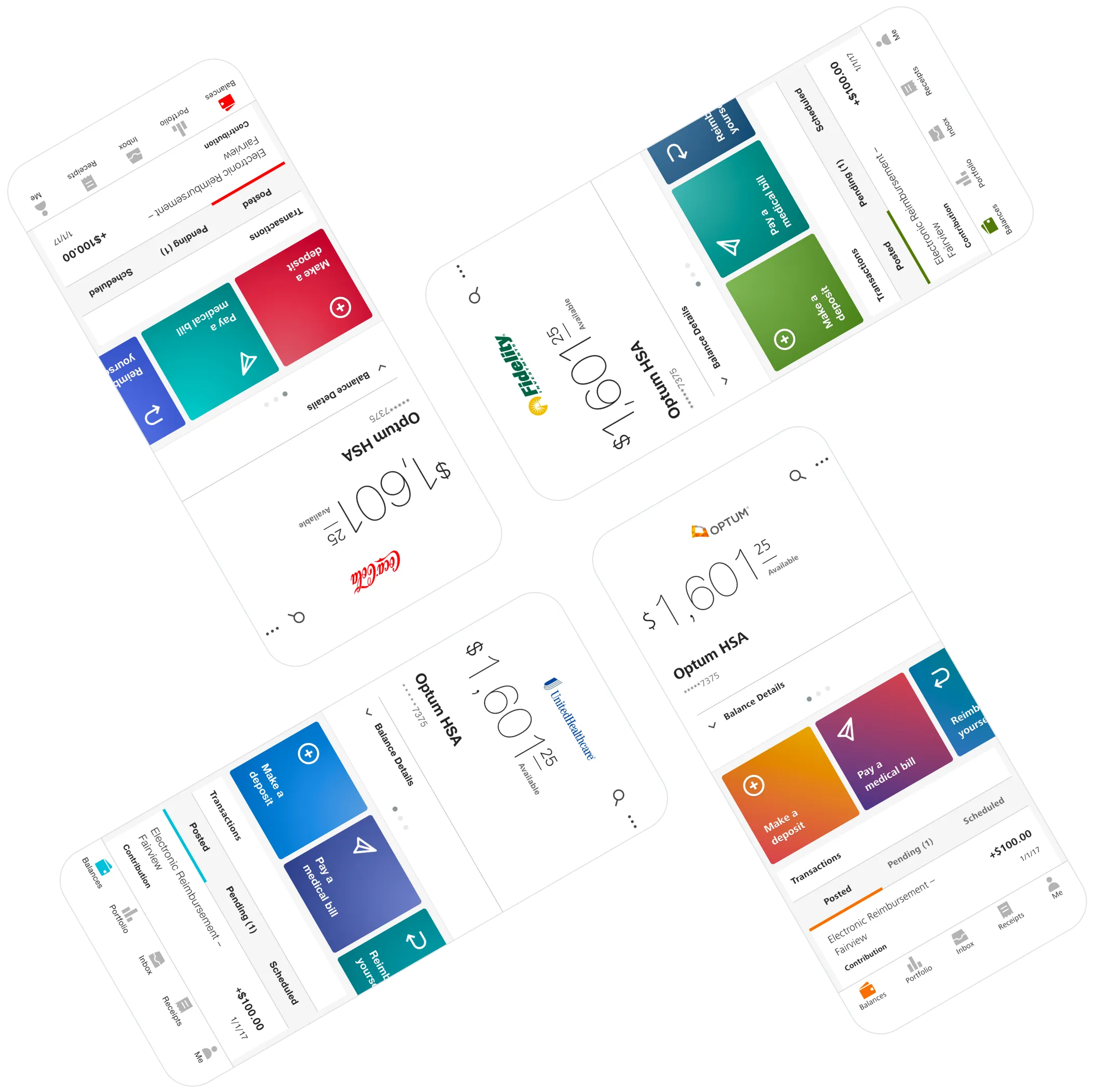
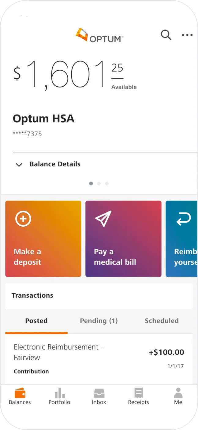
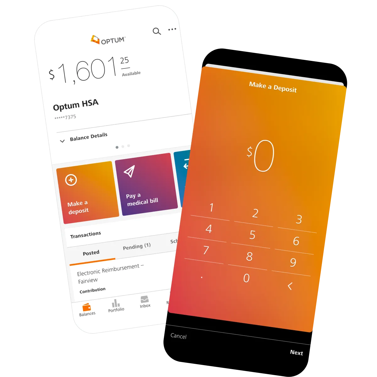
One product, many brands.
Especially for native design.
While Atomic Design is an increasingly popular design system methodology and certainly influenced our approach, we believe its deep conceptual roots in web design make it somewhat less than perfectly suited to native mobile design. Moreover, the diversity of applications and use cases inherent in Optum's organizational model rendered higher-level concepts like organisms and templates mostly impractical for our purposes.
Instead, the App DPL employs a three-tiered structure: base elements like color and type are combined to create UI components like buttons and bars, which coalesce into spatial and sequential patterns of interaction. Additional guidance on motion and usability ties the system together, establishing a firm foundation for native-first product design.
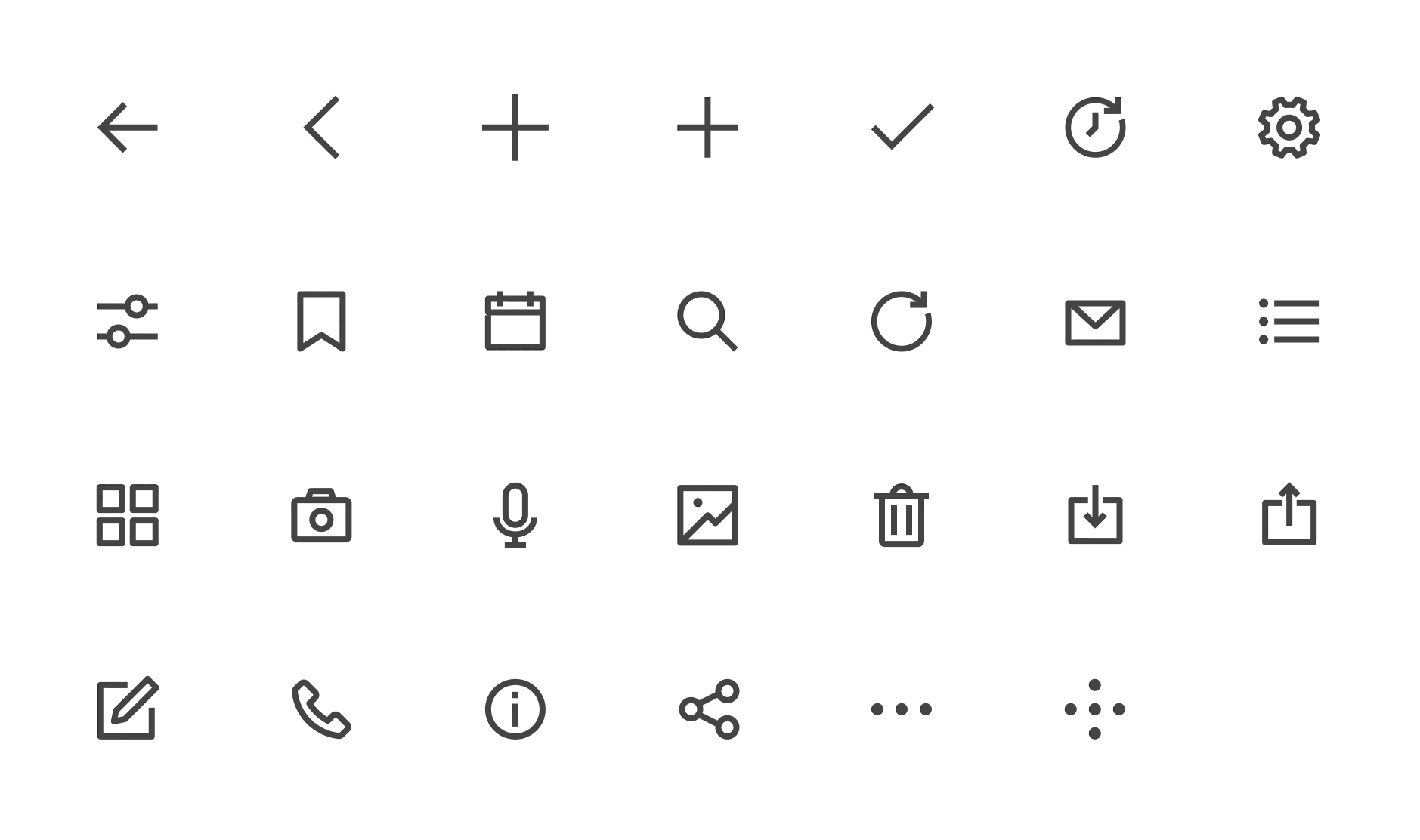
Custom icons for every occasion.
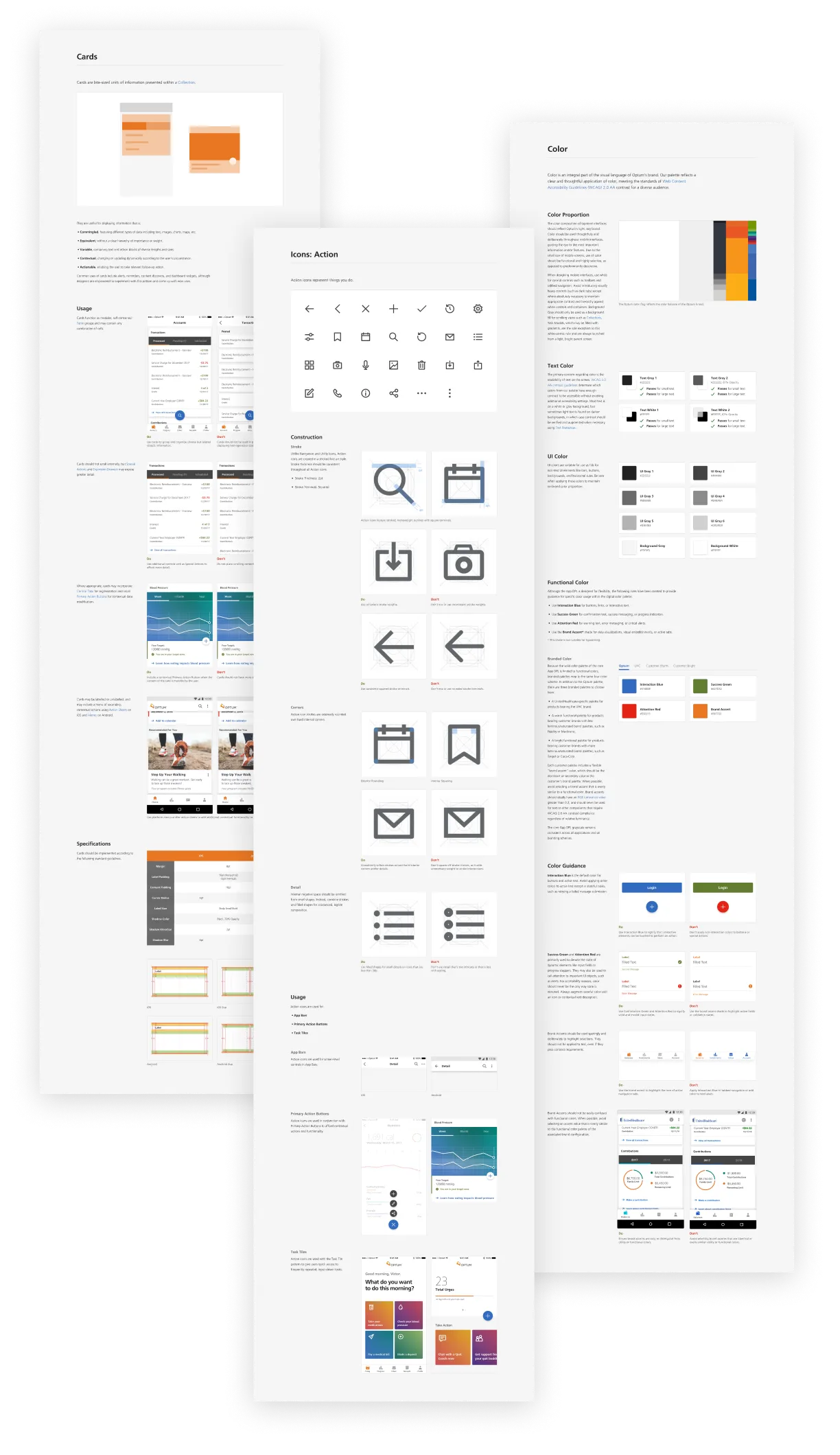
We created separate, distinct icon sets for navigation, global user actions, and contextual utilities and indicators. Each case had subtly different constraints and requirements which are reflected in the weight and detail of each set. Every icon is intentionally crafted for the scale and pixel density of mobile displays, and is sculpted to pair well with the four typefaces included in the system. The system also includes grids and guidance to support the expansion of each set over time.
The App DPL is so well thought out, thorough, and at a level of quality I know I couldn't get elsewhere... I couldn't be more pleased.
Staying in sync with a living library.
While good documentation is essential, it's hardly enough. The less designers are forced to rely exclusively on specs, the smaller the margin of error and the greater the freedom they enjoy to express their creativity. Every reproduced component or stylistic discrepancy represents an opportunity to improve, automate, and empower.
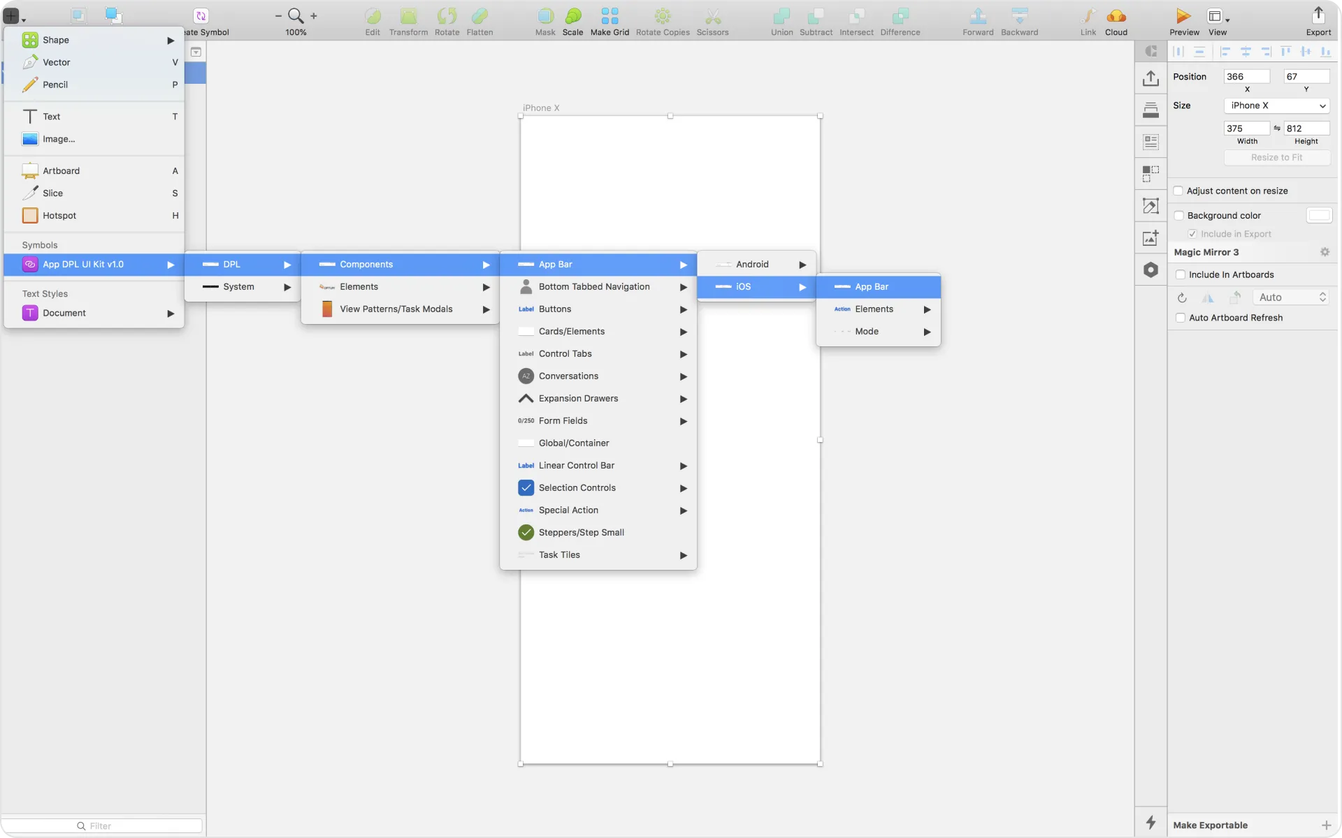
For those reasons, the entire App DPL also exists as a Sketch symbol library, maintained in parallel with the documentation and branding SDKs. This drastically accelerates designers' workflows and automates conflict resolution when patterns change and new components are added. And because every symbol is intricately nested, entire interfaces can be rebranded from top to bottom with just a few simple dropdown selections.
More than just a style guide.
The success of any design system hinges entirely on adoption within the organization. We wanted to make that process as easy as possible for Optum's employees and design partners, which is why we created over 50 pages of searchable guidance, specs, and examples to accompany the initial release.
Our contributions.
Product Management
- Project Management
Strategy & Research
- Product Strategy & Vision
Product Design
- Native Mobile Design
- Motion & Animation Design
- Design Systems
Development
- iOS Development
- Android Development
- Front End Development
- SDK Development
- Quality Assurance Testing