Putting prescriptions back within reach.
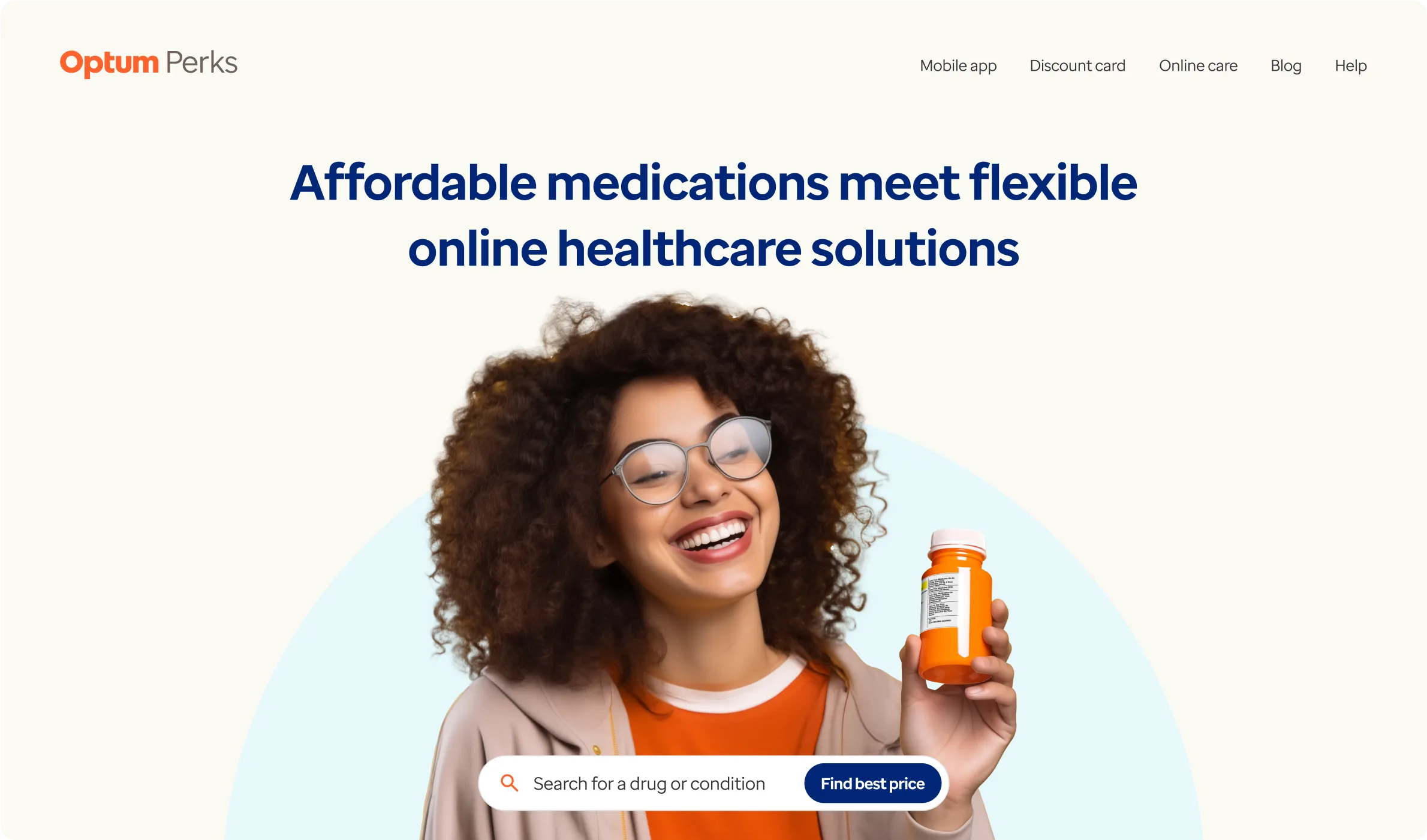

We helped Optum improve access to life-changing prescription medications for budget-conscious healthcare consumers.
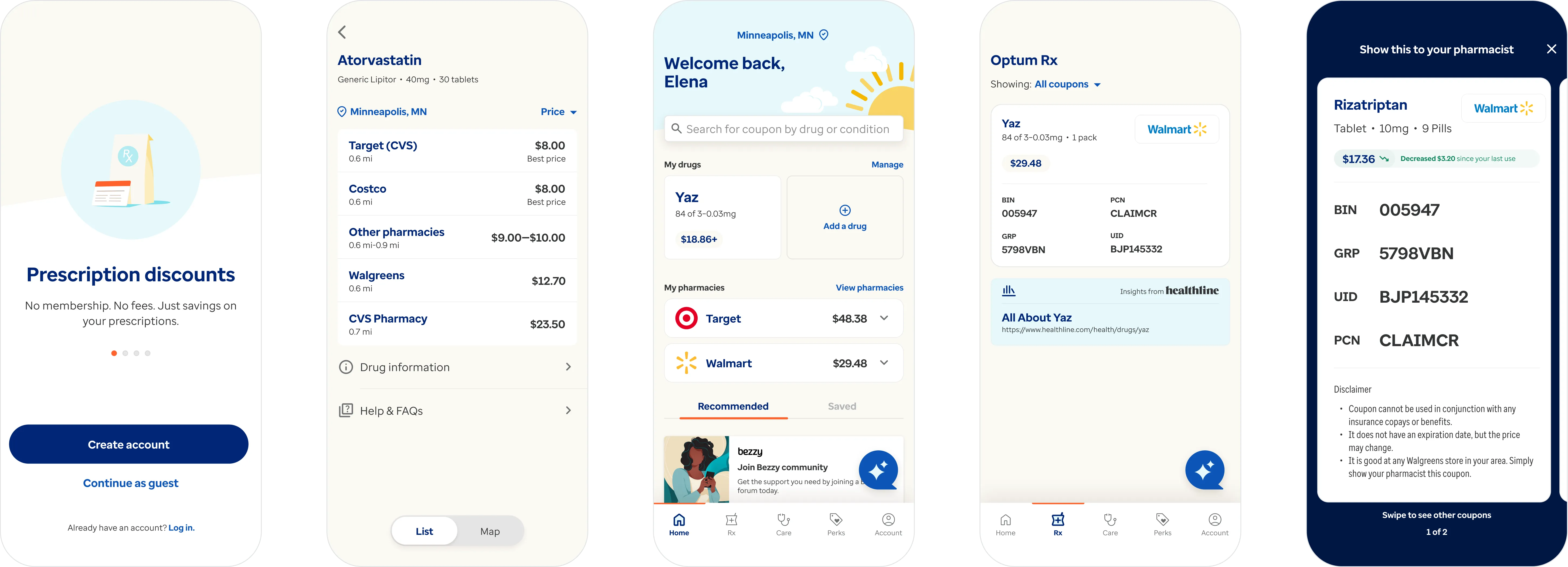
Optum, a division of UnitedHealthcare, is one of the largest pharmacy benefit managers in the healthcare industry, and its subsidiary OptumRx is one of the US' leading mail order and specialty pharmacies. As a part of its 2017 acquisition of ScriptRelief, an online prescription discounter, Optum inherited SearchRx, a mobile-first competitor to other popular discount programs like GoodRx and Blink Health. Spotting the enormous opportunity in this growing segment, and the potential threat to its own core businesses, Optum decided to double down on SearchRx and relaunch it as Optum Perks, its first direct-to-consumer digital brand. Beginning in 2019 and continuing through its successful 2020 relaunch, Livefront led the effort to completely rethink the mobile and web experiences, rearchitect its backend web services, and guide forward-looking product strategy in close collaboration with senior Optum stakeholders.
Access to prescriptions drugs for those who need it most.
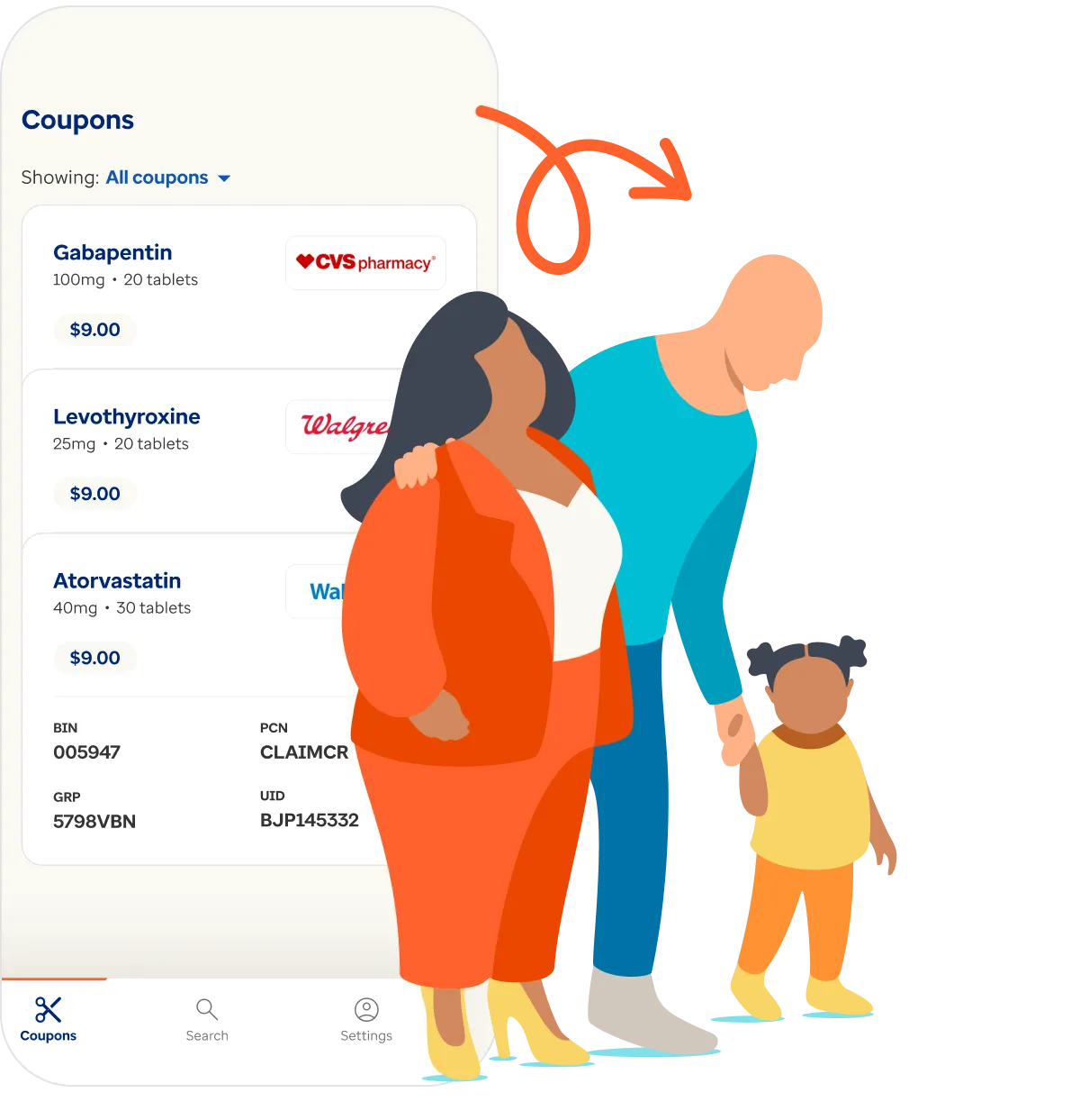
Most consumers with health insurance assume that their plan benefits guarantee them the best price and access to prescription pharmaceuticals available to them. In reality, that's far from the case. Medical reimbursement is an extremely complex, opaque patchwork of human systems and information systems laden with counterintuitive incentives. In many cases, even consumers with excellent health benefits can save money by opting not to use their prescription drug benefit and instead buying drugs through a free, off-benefit discount program.
Consumers are waking up to this fact. Particularly with the explosion in popularity of high-deductible HSA plans over the last decade, the off-benefit prescription market has grown dramatically and shows no sign of slowing down. Discount aggregators like GoodRx and Blink Health have made a big splash in the retail pharmacy space, and direct-to-consumer prescribers like Ro and Hims are shaking up general care. As this trend continues, incumbents are scrambling to adapt.
Starting off on the right foot.
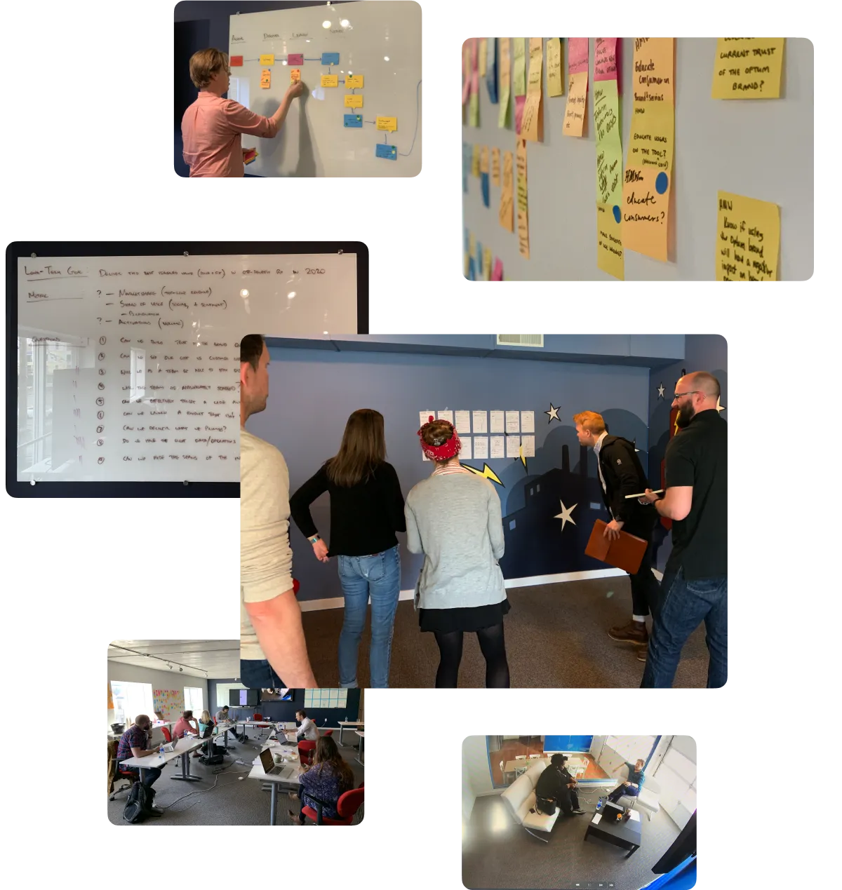
While we were working with a pre-existing product, we weren't interested in surface-level enhancements. We approached the opportunity as a nearly blank slate and kicked off the engagement with a week-long design sprint, together with the core Optum working group, to immerse ourselves in the problem space and build rapport with our client partners. By the end of week one, we had a tested prototype, a clear sense of direction, and far more intuitive insight than any research report could give us. And even better: while we began the week as partners we ended it as one team, and that sense of personal familiarity and a shared mission set the tone for the rest of our work together.
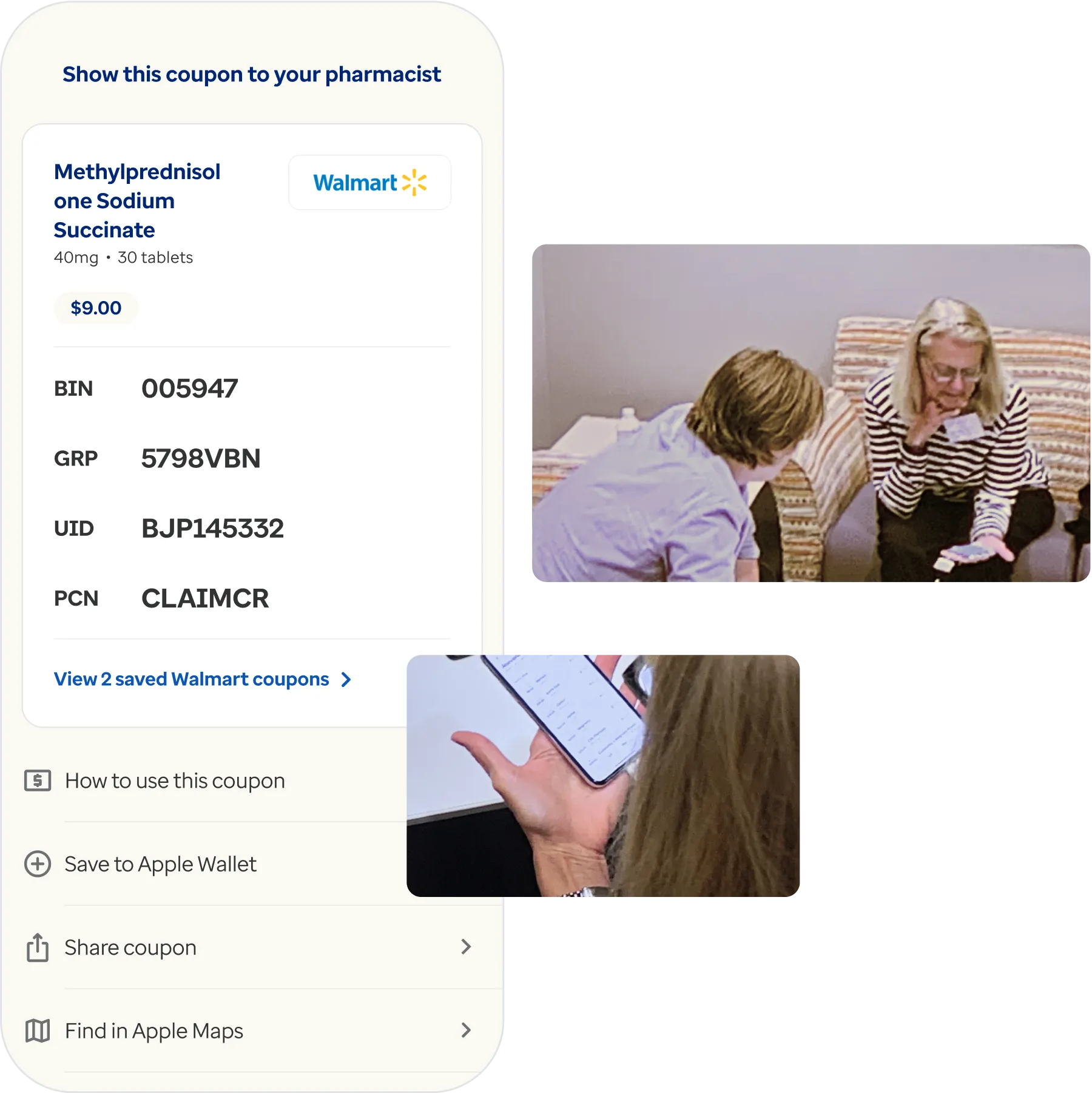
Just what the patient ordered.
Throughout the months-long design process, we conducted usability testing and user interviews with carefully vetted research participants on a regular, biweekly cadence. This steady stream of feedback revealed flaws in our thinking and assumptions early—helping us stay nimble and giving us ample room to course-correct with minimal rework—and also uncovered high-value opportunities to leverage Optum's unique strengths to clearly differentiate Optum Perks from other, competitive products.
An integrated, omnichannel experience
Optum Perks is an omnichannel brand, with consumer touch points spanning web, mobile, social, email, in-store marketing, and more. Making sure the mobile and web experiences complemented each other seamlessly and took full advantage of the unique strengths of each platform was of the utmost importance. Our design team owned the soup-to-nuts user experience across web, iOS, and Android—including the website's informational, content-oriented surfaces in addition to its core product search interface—which enabled us to deliver a cohesive, end-to-end experience across channels.
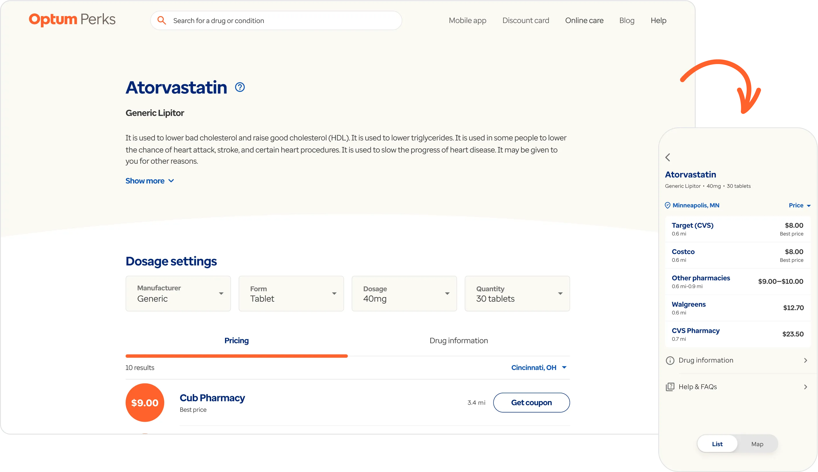

Always at your service.
Digital products can only ever be as good as the web services behind them. If services are slow, brittle, or poorly abstracted, that results in performance and availability problems that break the experience for end users. To make sure we were realizing the full potential of the experience we were designing from the user's perspective, we worked closely with our technical counterparts at Optum to collaboratively structure and specify a REST API design that would ensure smooth, seamless content delivery across platforms in an elegant, scalable, and maintainable way.

Saving the waiting for the waiting room.
Every millisecond counts on the web. That's why we took full advantage of bleeding-edge technologies and architecture patterns to minimize our reliance on database performance at runtime and instead batch compile static content at build time. The result: a blazing fast web search experience that's always up to date and never skips a beat.
Our contributions.
Product Management
- Product Ownership
- Product Roadmapping
- Project Management
Strategy & Research
- Brand Strategy
- Product Strategy & Vision
- User Research
- Concepting & Prototyping
Product Design
- Native Mobile Design
- Web Design
- Illustration Design
- Motion & Animation Design
- Design Systems
Development
- Web Services Development
- iOS Development
- Android Development
- Front End Development
- Quality Assurance Testing