Redesigning a first-class mobile shopping experience.
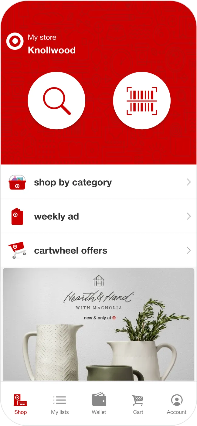

Since its earliest days in the App Store, we've helped drive Target's mobile strategy.
One of the most beloved brands in retail, Target has long distinguished itself from its competition through a commitment to great, accessible design. The Target app is another expression of that promise, offering a first-class mobile shopping experience with stores at the center. We helped get it off the ground, and have walked right alongside Target as the apps team has grown from a handful of key players to a mature, thriving digital product organization. Millions of downloads and a few major updates later, we're still there and more valuable than ever.


Mobile commerce, entirely from scratch.
When we started working with Target, we were building something new from the ground up. Now the things we make touch millions of users every day, generating massive revenues and saving consumers even more of their hard-earned money. We've been a key partner for Target throughout, helping to define product direction, anchor the core design and engineering functions with senior talent, implement key operational practices, and mentor new team members.
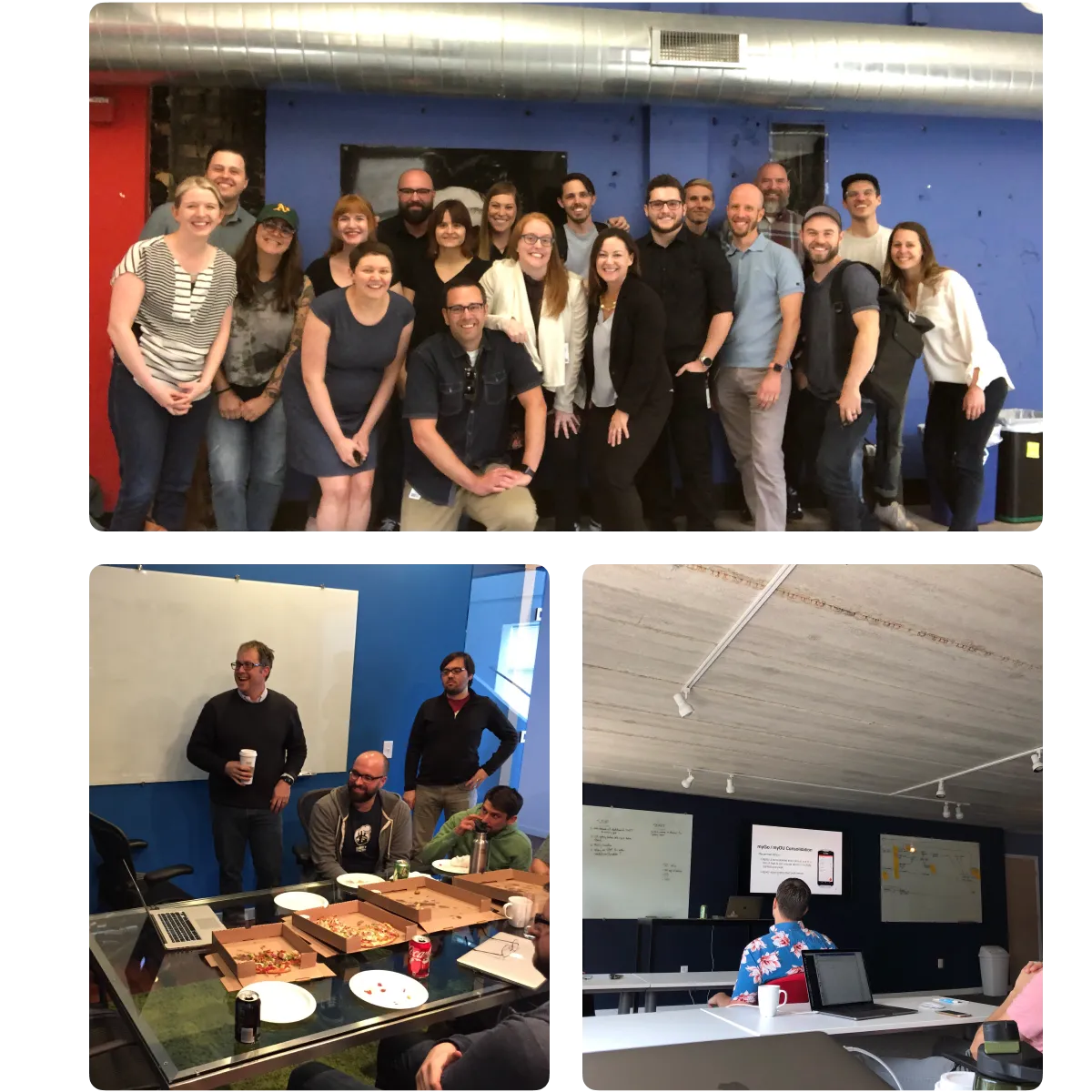
Building a team of A-players.
Talented people like to work with other talented people. It's that simple. That, however, can pose a recruiting challenge for incumbent players, who may struggle to attract and retain the top design, engineering, and product talent that might otherwise find abundant opportunity at fast-growing tech companies and startups. A big part of our job has been to be the team other A-players want to be a part of and to set and maintain a level of excellence that enables everyone to do their best work. We like to think of the fact that Target has kept us around for so many years as evidence that we've lived up to our end of that bargain quite well.
In it for the long haul.
A danger of consultancies is that they often lack long-term accountability due to the finite nature of each engagement. This absence of "skin in the game" can show up as shoddy work, poorly thought-out decisions, or a cavalier strategic approach. While we treat every client engagement as if it were an indefinite arrangement and stand by the durability of our thinking as a rule, the length of our tenure with Target has led to an unusually deep mutual trust and admiration. From app architecture to design patterns, our ownership of each piece of the puzzle is backed up by a track record of thoughtful, effective, sustainable decision-making.


The blue dot marks the spot.
Stores are at the heart of the Target app. Microlocation-based features like Deals Nearby and interactive store maps help you get the most out of your Target run by making it easier to find your way around the store and spot great deals and discounts. We helped create the proprietary mapping system and location smoothing technology under the hood, laying groundwork for additional location-enabled features in the future.
An in-house insight engine.
As technology-first e-tailers continue to command more and more market share through sophisticated personalization and targeting, data has never been more important in retail. For the last few years, we've worked closely with the team building Target's in-house data aggregation and analytics platform, Firefly, to create the iOS and Android SDKs that enable the product organization to observe user behavior across all Target mobile apps and marry that information with data collected in stores for industry-leading cross-channel insights.
A match made in massive scale heaven.
In 2017, Target decided to merge the flagship mobile app with its wildly popular Cartwheel app, a digital coupon book which guests have used to save over $1B. We played a key role in managing the integration, owning much of the platform-level architecture and infrastructure upon which the newly merged app was built.


Moving the numbers up and to the right.
Our stewardship of conversion-critical features like product details, cart, and checkout regularly resulted in multi-million dollar quarterly revenue increases. That's great, but how we did it is even better: by eschewing dirty tricks and vanity metrics in favor of a user-centered approach that regarded improved performance as a natural outcome of a faster, friendlier, and generally more compelling guest experience.
A product that can speak for itself.
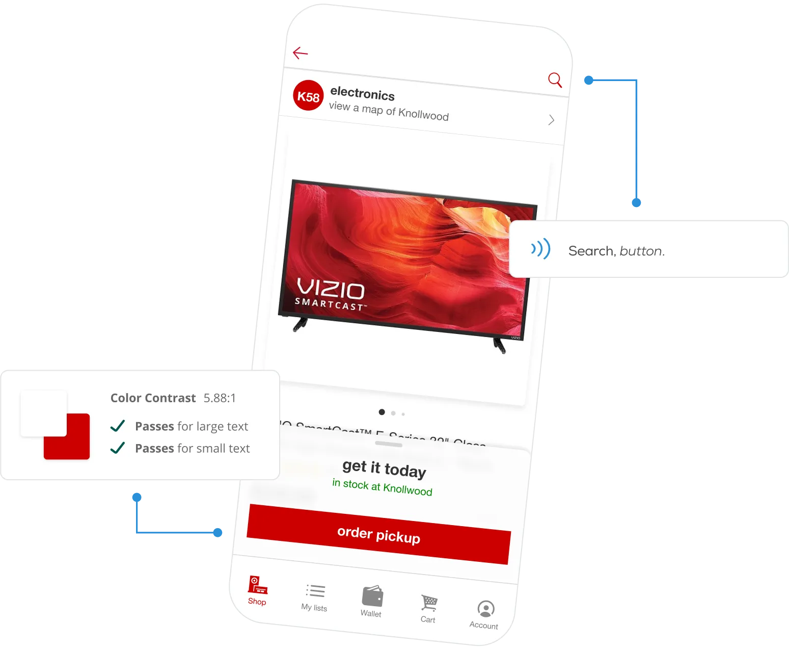
Target has always been committed to delivering the best possible experience to all guests regardless of age, identity, or ability… and so have we. In a digital context, that means making accessibility a top priority and approaching both design and technical implementation with a holistic, inclusive mindset. We drove the effort inside of Target to formalize and socialize its mobile accessibility practices and take maximum advantage of platform features like VoiceOver, Dynamic Type, and system-level contrast and motion enhancements. The result? A mobile shopping experience that's equally welcoming to everyone, no matter who they are.
Proof is in the aisles.
Our contributions.
Product Management
- Product Ownership
- Product Roadmapping
- Project Management
Strategy & Research
- Product Strategy & Vision
- User Research
- Concepting & Prototyping
Product Design
- Native Mobile Design
- Motion & Animation Design
- Design Systems
Development
- iOS Development
- Android Development
- SDK Development