Article
Accessibility Do’s and Don’ts for Interactive Cards
February 25, 2025

Expand the reach of card UIs with sturdy, conventional markup
Card UIs are everywhere
UI designers love cards for good reason: they group related information in a visually engaging, interactive way. But making them accessible for keyboard and screen reader users is trickier than it seems.
Note: working code examples are available here .
Simple and Complex Cards
There are primarily two kinds of interactive cards:
Simple: The entire card is clickable and that’s the only available interaction.

Complex: The overall card is clickable, but there’s also one or more interactions available within the card.

Links vs. buttons
When there’s an action the user can perform we should use an interactive element type (when possible — we’ll talk about an exception later). Generally, this should be an <a> or <button> element.
- Use an
<a>when the action navigates the user to a new place. (In a single page app, if the URL changes, that's a new place! URLs are the web's waypoints!) - Use a
<button>for actions where the URL does not change - opening a pop-up, adding an item to a cart, expanding or collapsing part of the UI, etc. Buttons come with tons of accessibility functionality out of the box, and are criminally underappreciated .
HTML’s role attribute can also be used to allow other tags to present themselves as buttons or links to assistive technology, which can be useful for more complicated scenarios.
In this article we mainly use
<button>, but the same patterns apply to<a>.
Simple cards

✅ Do use a <button>.
<button class="card" onclick="showPopup()">
    <span class="card-title">Card Title</span>
    <span class="card-description">Description</span>
</button>
Buttons have built-in accessibility features for keyboard users and screen readers. All you need to supply is a click handler, and the browser takes care of the rest. Lean on that off-the-shelf power, and keep your implementations simple!
❌ Don’t use a <div> with (just) a click handler.
<div class="card" onclick="showPopup()">
    <span class="card-title">Card Title</span>
    <span class="card-description">Description</span>
</div>
Keyboard users and screen readers will have no idea this element has an action associated with it.
🟡 If you must use a <div>, add custom behavior to mimic <button>.
<div class="card"
    onclick="showPopup()"
    role="button"
    tabindex="0"
    onkeypress="showPopupIfEnterOrSpaceBarPressed(keycode)"
>
    <span class="card-title">Card Title</span>
    <span class="card-description">Description</span>
</div>
If you can’t use a <button> for some reason, you can trick any element into behaving like a button, but you need to do some manual work.
role="button"tells accessibility tools to use this as a buttontabindex="0"makes the element navigable by keyboardonkeypress="showPopupIfEnterOrSpaceBarPressed(keycode)"needs logic to mimic standardenter/spacebarkeyboard behavior
You also need to add a way to “disable” the not-really-a-button and styling for the :focus-visible state. This extra complexity is error-prone — just use a button when possible.
❌ Don’t put block element inside buttons (and links).
<button class="card" onclick="showPopup()">
    <h3 class="card-title">Card Title</h3>
    <p class="card-description">Description</p>
</button>
Technically, block elements like <h3> and <p> are not allowed within <button> (and links). Browsers will happily render those inner elements, but assistive tech can get confused, and will probably remove the semantic meanings and treat the contents as "presentational" anyways.
Complex cards
Some card designs have a smaller “inner” action in addition to the card-wide action.
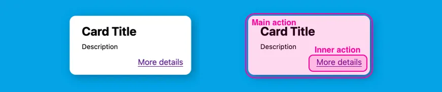
❌ Don’t nest interactive elements.
<button class="card" onclick="showPopup()">
    <span class="card-title">Card Title</span>
    <span class="card-description">Description</span>
    <a href="#" class="card-link">More Info</a>
</button>
Browsers will render this, but it violates accessibility standards. Screen readers may ignore the inner link, and keyboard navigation can become confusing since tabbing follows a linear path, not a hierarchy.
✅ Do make the interactive elements siblings.
<div class="card">
    <button class="card-main-action">
        <span class="card-title">Card Title</span>
        <span class="card-description">Description</span>
    </button>
    <a href="#" class="card-link">More Info</a>
</div>
Even if the interactive elements are visually nested, they don’t need to be nested in the HTML. CSS is powerful enough to allow two sibling elements to appear like one is inside the other. See the working example for one way to handle the styling.
Digression: Are complex cards a good design for the web?
Actions within actions are not a great fit for the web. Going back to the venerable tabindex property, established decades ago in browsers no one even uses anymore, the idea has been that you can traverse from interactive element to interactive element in a linear (if jumpy) pattern. There are no affordances to “drill in” to find buttons within buttons.
One of the tenants of web accessibility is that the accessible experience should align with the visual experience as much as possible. For instance, when a modal window opens, we “trap focus” so that the boundaries of the keyboard and screen reader experience match the new visual boundaries.
Even if we make complex cards accessible, there’s still a mismatch: visually, actions look nested, but assistive tech presents them as side-by-side. In my humble opinion, designers should avoid this nested action scenario on the web.
Cards, plural
It’s tempting to use divs, but lists sound better for screen readers.
🟡 Avoid <div>s if you can.
<div class="card-list">
    <div class="card-item">
        <button class="card"></button>
    </div>
    <div class="card-item">
        <button class="card"></button>
    </div>
    <div class="card-item">
        <button class="card"></button>
    </div>
</div>
Divs add no extra meaning — screen readers just see a stack of buttons. It works, but there’s a better way.
✅ Do use list markup.
<ul>
    <li>
        <button class="card"></button>
    </li>
    <li>
        <button class="card"></button>
    </li>
    <li>
        <button class="card"></button>
    </li>
</ul>
List markup gives the screen readers additional context to work with. Screen readers can announce the total number of items and the user’s current position in the list. It’s a modest upgrade from the div example, but often trivial to implement over divs.
Play your best card
Browsers may tolerate imperfect markup, but assistive technologies — and real users — won’t always play along. By dealing solid, semantic HTML, you can stack the deck, making your card interfaces accessible without overcomplicating your code.
Pete Jones advocates for accessibility using gambling analogies at Livefront .

