Article
Animating font size in UILabels
August 21, 2017
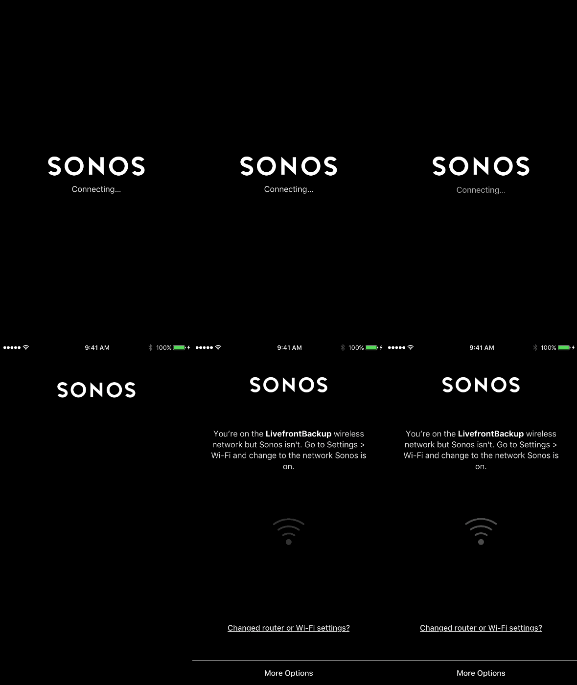
I’ve noticed a loading screen design pattern where a placeholder gets swept up to the title position.

Let’s say you want to do that with a UILabel. We access a label’s font size through its font, but Apple hasn’t made the label.font implicitly animatable so we can’t simply go like this:
// This does nothing
UIView.animate(withDuration: 1.0) {
    let smallerFont = label.font.withSize(10)
    label.font = smallerFont
}
However, we can enlarge it by hitting the transform:
UIView.animate(withDuration: 1.0) {
    label.transform = CGAffineTransform(scaleX: 2.0, y: 2.0)
}
Yikes. That looks pixellated when blown up because the small font rendering doesn’t contain enough detailed information to look good at a higher resolution.
A better strategy:
- Create the larger sized label first.
- Scale it down to mimic the smaller label.
- Animate it back to its normal scale.
var bounds = label.bounds
label.font = label.font.withSize(100)
bounds.size = label.intrinsicContentSize
label.bounds = boundslet scaleX = label.frame.size.width / bounds.size.width
let scaleY = label.frame.size.height / bounds.size.height
label.transform = CGAffineTransform(scaleX: scaleX, y: scaleY)UIView.animate(withDuration: 1.0) {
    self.label.transform = .identity
}

This way we get the benefit of a more detailed render.
We’ll use a different strategy to shrink it:
- Scale down the transform of the larger label.
- Swap in the smaller font at the end.
let labelCopy = label.copyLabel()
labelCopy.font = label.font.withSize(20)var bounds = labelCopy.bounds
bounds.size = labelCopy.intrinsicContentSizelet scaleX = bounds.size.width / label.frame.size.width
let scaleY = bounds.size.height / label.frame.size.heightUIView.animate(withDuration: 1.0, animations: {
    self.label.transform = CGAffineTransform(scaleX: scaleX, y: scaleY)
}, completion: { done in
    self.label.font = labelCopy.font
    self.label.transform = .identity
    self.label.bounds = bounds
})

Not bad… but see the slight jitter at the end?
That happens because a scaled down label at the larger size doesn’t look exactly the same as the smaller label. Pretty close, but not pixel perfect.
Some fonts change all sorts of properties at different sizes to make them more readable. The character spacing might be different. The way the glyphs are drawn might be different. The font creator will do whatever it takes to help their readers.
Now, this isn’t that big of a deal. You could use the above animation and call it a day.
If you want extra credit though, throw in a cross-fade between the two labels. To see the code for this check out my GitHub project: https://github.com/regularberry/AnimatedFontSize

-
Sean Berry
Software Engineer

