Article
Good Product Design Comes From Iteration, Not Perfection
November 9, 2026
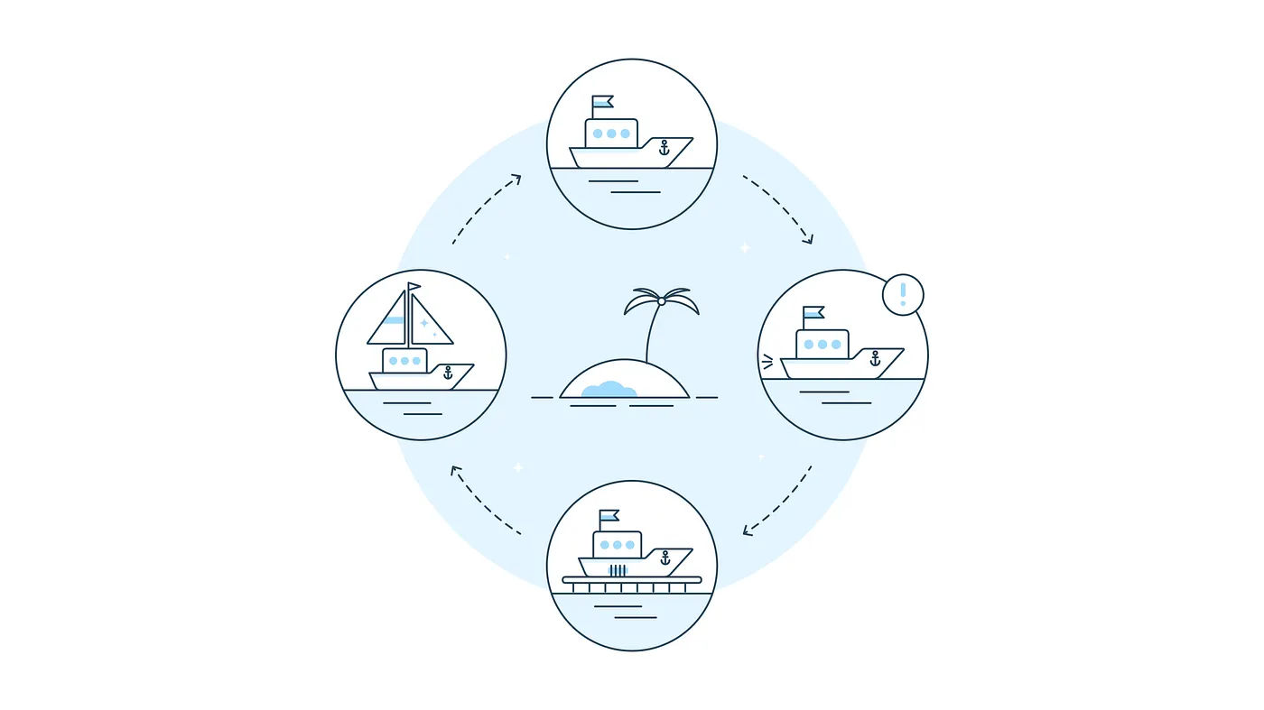
The cleaning spray Formula 409 is said to have gotten its name from the 409th batch its inventors tested. James Dyson built 5,127 prototypes over five years before he had a bagless vacuum that actually worked. Thomas Edison is often credited with saying he never failed, he just found ten thousand ways that wouldn’t work.
The usual lesson here is that progress rarely arrives fully formed, and that’s true. But there’s a better one underneath it: none of these stories actually ended. Formula 409 didn’t stop at batch 409, and Dyson didn’t stop at 5,127. The light bulb kept changing long after Edison stopped counting, from filament to fluorescent to LED, until the thing on your ceiling has almost nothing in common with the thing he patented.
Product design works the same way. Iteration isn’t the step that happens after the design work. In a lot of ways, iteration is the design work, and in our field it’s the expectation. Our work is never really done. Not after you ship the product, not after it’s out in front of real users, and not even after it earns rave reviews in the App Store. Shipping is a milestone, not a finish line.
The only constant is change
Digital products live in a world that refuses to hold still. Technologies shift, expectations rise, and tastes turn over. Competitors show up with better ideas, and behaviors that felt novel last year become the ones users assume by default. Products that don’t evolve get left behind by the ones that do. Consider the Netflix iPhone app when it launched in 2010.
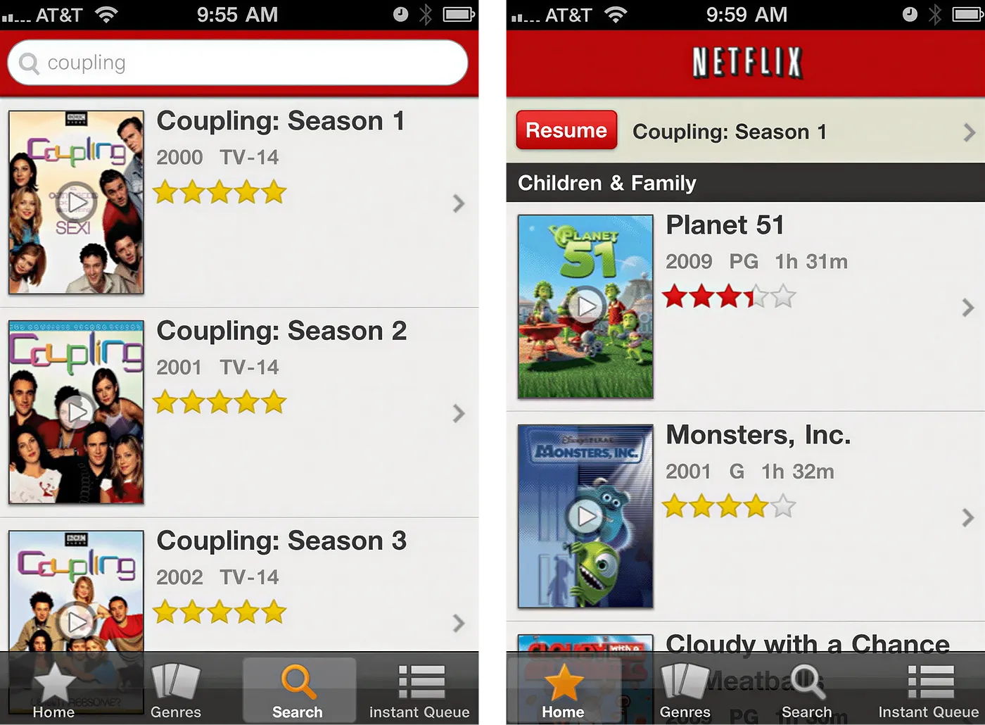
A talented team got paid a lot of money to build that, and at the time, they earned it. This wasn’t a careless first pass. It went through its own rounds of design, iteration, testing, and approval. More importantly, people were thrilled with it. TechCrunch opened its launch coverage with “Oh, man. It’s here.” Subscribers could suddenly stream movies and shows on a phone over Wi-Fi or 3G, and in 2010 that felt like magic.
That reaction is what sticks with me. We look at that interface now and clock its limitations instantly, but people in 2010 looked at the same screen and saw the future. It was a good app then, and it would be an unusable one today, even though the design itself never changed. The world around it did.
Netflix’s mobile experience wouldn’t have stayed competitive if the team had celebrated the launch, declared the app finished, and walked away. It had to keep pace with its users, its catalog, its competition, and the devices it ran on. Here’s how the app looks today.
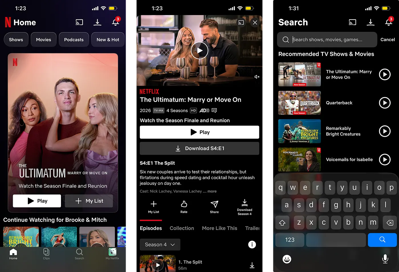
At the time of writing, the Netflix iOS app holds a 4.7-star rating from more than seven million users and ranks twelfth in the App Store’s entertainment category. A very solid app, one might say. But there’s still no such thing as perfect. Even at five stars, even with all seven million reviewers somehow universally satisfied, there would be room to make it better. A perfect rating only describes one group of users at one moment, and the moment passes. Expectations move, and the product has to move with them.
I’d bet the Netflix app changes as much over the next sixteen years as it did between 2010 and 2026. Technology will change, sure, but so will our tastes. New apps will show up, new ideas will land, and new behaviors will become second nature. What feels modern today will eventually feel dated, and that’s just the life cycle of a product.
Failure is baked into the work
Product designers have to get comfortable with that, because failure is built into the job, and that’s not a bad thing. It’s part of the process. No design you make will stand unchanged, and even getting to version one takes an enormous amount of failure, or more accurately, an enormous amount of exploration that never reaches a user. Open one of your Figma files and count the screens you made before you landed on the one that shipped. If you really want to drive yourself crazy, use a plugin to count every layer in the file, then compare that number to the layers in the screens that actually went out. Don’t be surprised when the percentage is tiny.
Those unused screens and discarded layers aren’t waste. They’re the record of every decision that produced the finished thing, and each one taught you something about what worked, what didn’t, and what the product could become.
And even the screens labeled “final” are only final for now. A requirement changes, a user surfaces a problem you didn’t know you had, a competitor introduces a better pattern, or a new technology makes yesterday’s constraint irrelevant. The design that felt complete this morning may need to change by next quarter, and if the product is going to keep up, it will.
Iteration is not change for change’s sake
All of that said, there’s one thing worth holding onto: iteration and change are not the same thing. Don’t redesign a product because the current version has been around a while, or because a new visual trend is making the rounds. Constant motion isn’t the same as progress, and sometimes the right design decision is to leave something alone.
Snapchat’s 2018 redesign is the example everyone reaches for, and it earned the reputation. A Change.org petition calling on the company to reverse it drew more than 1.2 million signatures. After first-quarter results showed sharply slowing user growth and revenue pressure that Snap partly attributed to the redesign, its stock fell as much as 22 percent to its lowest level since the IPO, wiping roughly $4 billion from the company’s market value. The following quarter brought Snapchat’s first reported decline in daily users, which Snap also blamed largely on the redesign. The company eventually reversed parts of it.
What makes it instructive, though, is that the redesign wasn’t aimless. Snap had reasons: separate friends from publishers, make the app easier for a mainstream audience to understand, and give advertisers a better home. Those are real goals, but they weren’t user problems. The team could answer what would be better for the business without being able to answer what would be better for the person holding the phone. And that’s the whole point. You need a purpose for iteration, so ask:
- What problem are we solving for our user?
- What evidence do we have that it’s a real problem?
- What would actually be better for them?
Then test, because that feedback loop is the crucial part. Build something, put it in front of people, watch what happens, and let what you learn shape the next version. User testing is largely the experience of watching your own failures surface in real time, and that’s a good thing.
Signal comes from a lot of places: usability sessions, analytics, App Store reviews, support tickets, accessibility audits, and conversations with the people who use the product every day. But not every signal calls for a redesign, because smoke isn’t always fire. Users will ask for contradictory things, data will tell you what’s happening without telling you why, and a newer pattern can look exciting and still make the experience worse, depending on who you’re building for. A product may never be finished, but every change still has to earn its place.
Made to persist
“We are made to persist. That’s how we find out who we are.” I’ve always liked that line from Tobias Wolff. My wife and I keep a little block with about a hundred interchangeable quotations on it, and this one has been up for a while now. One day it’ll change too.
I’ve been thinking about it a lot lately. Persistence is how we find out who we are, but it’s also how we find out what the things we build can become. That feels worth remembering right now, when the industry, the tools, and the job itself seem to change every week. We persist by continuing to learn, question, test, and adapt, and the products we make have to do the same.
No product is ever complete, and no product is ever perfect. Good design comes from iteration. So go build something. Test it. Break it. Build it better.