Article
How to customize the style of your Dokka documentation
Update the look and feel of your API docs with some simple CSS
August 22, 2024

At Livefront we use Dokka when we need to generate API documentation for our Android projects. It’s simple to setup, works great right out-of-the-box with minimal configuration, and supports a wide variety of output formats . One of the few issues is that the style of the standard HTML output, while drastically better than the JavaDoc styles of yesteryear, can feel a bit cookie-cutterish.
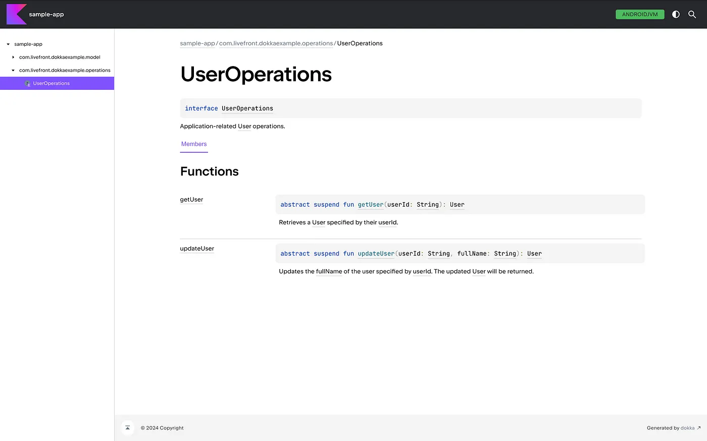
Fortunately Dokka allows us to easily customize the look and feel of the generated content. Let’s see what it takes to convert the standard output into something that would look at home in one of our Livefront projects.
Setup
Aside from the standard configuration when adding Dokka to your project, we will need to add the following to our library or application module’s build.gradle.kts file:
buildscript {
    dependencies {
        classpath("org.jetbrains.dokka:dokka-base:1.9.20")
    }
}

...

tasks.dokkaHtml.configure {
    pluginConfiguration<DokkaBase, DokkaBaseConfiguration> {
        // Configuration options will go here
    }
}
As we’ll see later, we will need to specify additional options in the pluginConfiguration block.
The Footer
One quick change we can do is to update the footer text to something relevant to our organization. The standard Dokka footer displays a generic “© 2024 Copyright” message. Updating that to say “© 2024 Livefront” is very straight-forward:
tasks.dokkaHtml.configure {
pluginConfiguration<DokkaBase, DokkaBaseConfiguration> {
footerMessage = "© 2024 Livefront"
}
}

The Logo
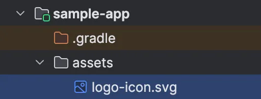
By default, each Dokka generated page displays the Kotlin logo in the upper-left corner. While not as simple as updating the footer text, replacing the logo with Livefront’s isn’t too difficult. First, we save the logo to the assets folder within the application or library module and name it logo-icon.svg (or whatever extension is necessary):
Then we’ll reference that new file within the Dokka configuration block:
pluginConfiguration<DokkaBase, DokkaBaseConfiguration> {
    customAssets = listOf(file("assets/logo-icon.svg"))
    ...
}
While that works as-is, the logo is confined to a size of 50x50px and looks a little cramped:

To allow the page to display the full-size logo, we will need to add custom CSS to override the existing styles. Fortunately Dokka has included some pre-defined variables that we can adjust so that in most cases we don’t need to specify full CSS rules. A few of the key root styles it defines:
/* --- root styles --- */
:root {
    --default-gray: #f4f4f4;
    --default-font-color: black;
    --header-font-color: var(—default-font-color);

    --breadcrumb-font-color: #637282;
    --breadcrumb-margin: 24px;
    --hover-link-color: #5B5DEF;

    --footer-height: 64px;
    --footer-padding-top: 48px;
    --footer-background: var(--default-gray);
    --footer-font-color: var(--average-color);
    --footer-go-to-top-color: white;

    --dokka-logo-image-url: url('../images/logo-icon.svg');
    --dokka-logo-height: 50px;
    --dokka-logo-width: 50px;
}
So by adjusting --dokka-logo-height and --dokka-logo-width we should be able to expand the logo to its full dimensions. To do so, we first need to create our own CSS file in the assets directory alongside our custom logo. For this example I’ve called it my-styles.css, but it can be named anything we want. It then needs to also be referenced in the Dokka configuration block:
pluginConfiguration<DokkaBase, DokkaBaseConfiguration> {
    ...
    customStyleSheets = listOf(file("assets/my-styles.css"))
    ...
}
my-styles.css is very simple, only overriding the logo width and height with the correct dimensions:
:root {
    --dokka-logo-height: 32px;
    --dokka-logo-width: 152px;
}
This unfortunately produces documentation with an incorrectly sized logo on each page:
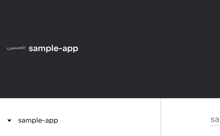
As of version 1.9.20 there is a bug within Dokka’s CSS rules that reverses the logo’s width and height. This isn’t noticeable when the logo is 50x50px, but the above logo has been forced into a 32x152px box. To work-around this issue we can either reverse our custom width and height, or we can override the underlying CSS rules defining the logo’s dimensions. If we do just reverse the width and height, we’re at risk of confusing our fellow developers and having it breaking again in the future if Dokka does fix the bug. The safer change is to redefine the entire rule in our custom CSS file, and hopefully remove it whenever a fix is made:
:root {
    --dokka-logo-height: 32px;
    --dokka-logo-width: 152px;
}

.library-name--link::before {
    background-size: var(--dokka-logo-width)
        var(--dokka-logo-height);
    width: var(--dokka-logo-width);
    height: var(--dokka-logo-height);
}
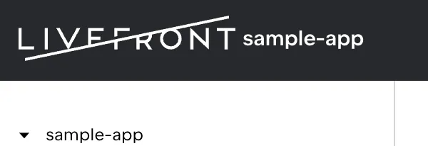
That produces a logo that actually matches the defined dimensions:
The last couple of changes are more subtle, but are intended to better match Livefront’s color palette.
The Header
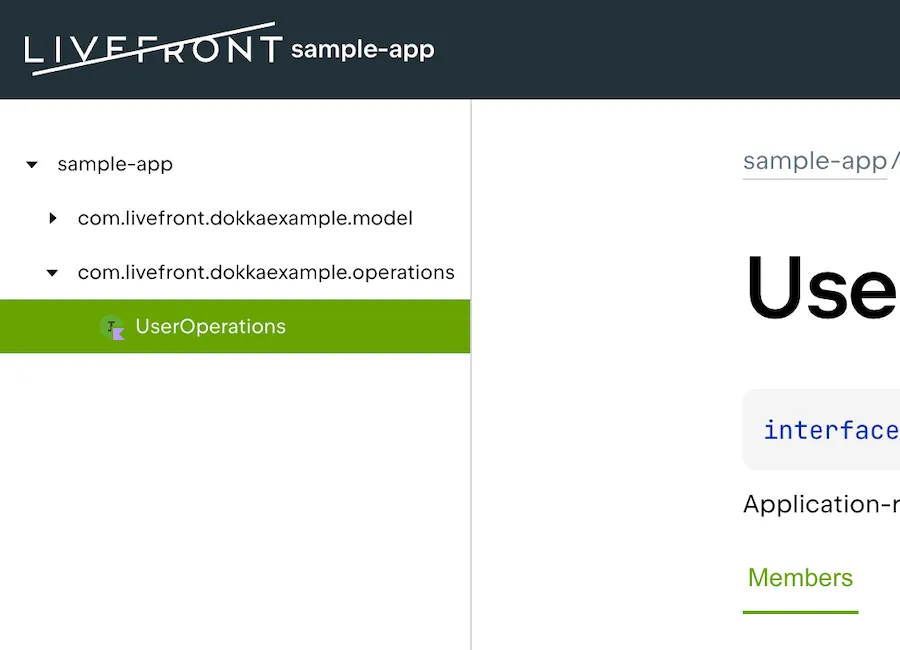
Returning to those pre-defined CSS properties that Dokka supplied, we see that the header uses the --color-dark property for its background, which has a value of #27282c. Livefront’s color palette includes a similar slate color with the value #223138 that we could use instead. It’s a subtle but important change to match our brand colors.
:root {
    ...
    --color-dark: #223138;
    ...
}

Links
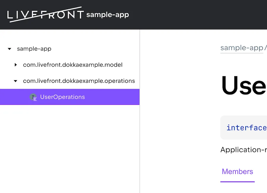
The final change involves the color of navigation tabs and links. By default, those items are displayed as purple, but we’d like to change that to another of Livefront’s colors. For this we’ll pick green, which has the value #67a300. This update involves three of the pre-defined rules we saw before:
:root {
    ...
    --active-section-color: #67a300;
    --active-tab-border-color: #67a300;
    --sidemenu-section-active-color: #67a300;
}
Once updated, we’ve eliminated the purple and switched over to our familiar shade of green:
The End Result
In the end, the overall code changes are quite small. We’ve updated the module’s build.gradle.kts:
buildscript {
dependencies {
classpath("org.jetbrains.dokka:dokka-base:1.9.20")
}
}
...
pluginConfiguration<DokkaBase, DokkaBaseConfiguration> {
customAssets = listOf(file("assets/logo-icon.svg"))
customStyleSheets = listOf(file("assets/my-styles.css"))
footerMessage = "© 2024 Livefront"
}And added a logo to the assets folder alongside our custom my-styles.css file:
:root {
    --dokka-logo-height: 32px;
    --dokka-logo-width: 152px;
    --color-dark: #223138;
    --active-section-color: #67a300;
    --active-tab-border-color: #67a300;
    --sidemenu-section-active-color: #67a300;
}

.library-name--link::before {
    background-size: var(--dokka-logo-width)
        var(--dokka-logo-height);
    width: var(--dokka-logo-width);
    height: var(--dokka-logo-height);
}
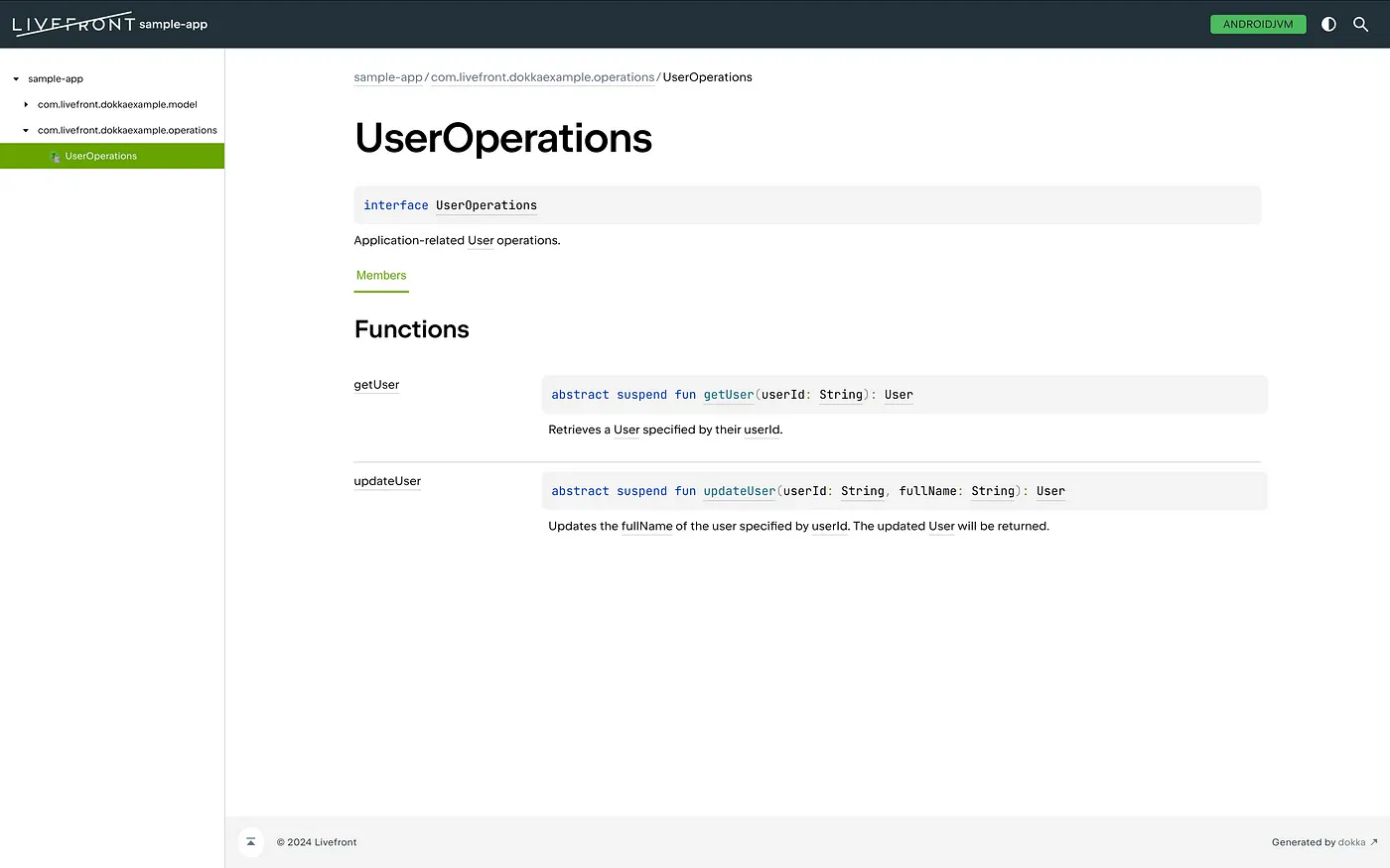
With these few modification, we’ve produced something that looks a little more like a Livefront product than when we started:
We could certainly go further if we wanted; Dokka gives us full control over all of the CSS. We could adjust sizes, include custom images, rearrange how elements flow, or completely eliminate certain items on the page. Dokka also allows developers to modify the templates used to generate the HTML, which would let us completely customize the structure of each page of documentation if we wished. For now, though, it’s good to know what’s possible with just a few lines of code.
Before switching to Android, Sean used to spend all of his time working with HTML and CSS at Livefront .

