Article
How to Design a Successful A/B Test
From designer to designer, there is a path of least resistance.
September 15, 2023
User testing is arguably the most important aspect of UX. Many may think product designers simply “make things look pretty” or are mere “mockup people”, but there is so much more that goes on behind the scenes to make a product not only pleasing to look at but functional too.
In this article, I talk about A/B testing from a designer’s point of view — what A/B testing is, why you should care about it, and how you might design a successful A/B test. Check it out!
What is A/B testing?
Simply put, A/B testing is a multi-variant test that allows multiple versions of a single feature or concept to be tested against one another in a public-facing environment.
A/B testing is one of the most direct methods known for proving causality between product features and user outcomes. When you launch two or more versions of a single variable — A, B, C, etc — on a website or native mobile, user data can be collected to better inform product decisions.
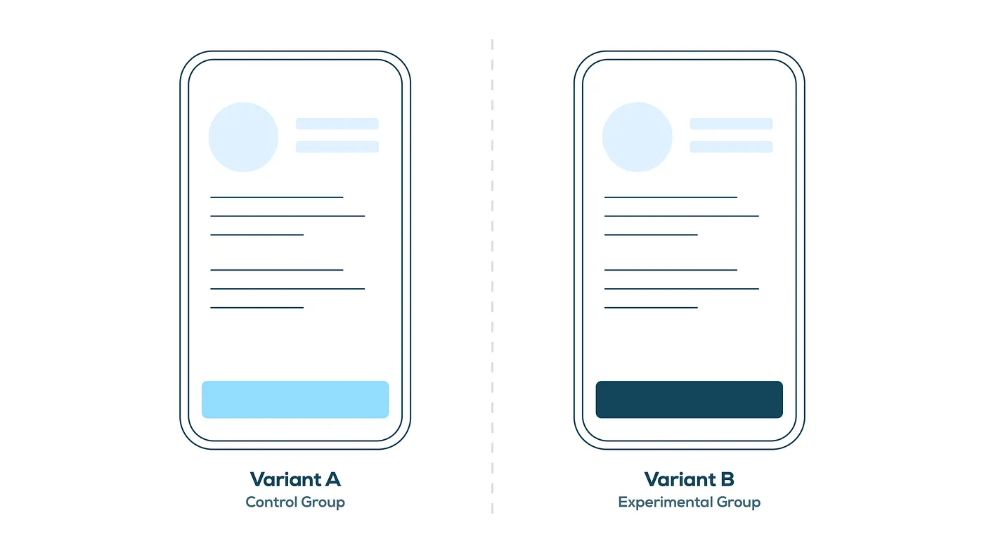
Take a look at the image above. Here we have two variations of the same feature — the only difference is the button color at the bottom. There’s a control group, noted as Variant A, and an experimental group, noted as Variant B. This is where the name “A/B testing” comes from.
A control group is typically the current experience on a website or app, while an experimental group is its testable counterpart. When these two groups are tested against each other, inferences can be made and used to determine which version outperforms the other based on a declared metric, ultimately revealing a winner.
Why should designers care about A/B testing?
A/B testing is one of the truest forms of testing. It allows designers to get as close to the real deal as possible. There are no simulated experiences or user set-up required like there is with prototype testing (i.e. “Imagine you are _____”, “Pretend you are ___”, etc).
Here are a few note-worthy benefits of A/B testing for designers:
1. Results are real
Unlike other testing methods, A/B testing allows you and your team to design, develop, and release features to real users. That means the data you collect is from actual users — there’s no better way to get results!
2. Cognitive dissonance is a thing of the past
Because A/B testing gets released onto a public platform, users get to experience features in the most natural way possible. As far as users are concerned, they are experiencing the same feature as everyone else and have no idea what they are seeing is one of many variations, putting biases at bay.
3. Outcomes can aid stakeholder buy-in
Stakeholder hesitation can be trying, but testing is a great way to combat it. And what do stakeholders love more than company profit? Data! Give stakeholders exactly what they want and let the results from your A/B test do the talking. If all else fails, remember that testable variants are retractable, meaning you can always revert to the original experience if need be (though, I hope that’s not the case).
How can you design a good A/B test?
A good A/B test comes in many shapes and sizes. You can test anywhere from one to many experimental groups. This is commonly referred to as A/B/n testing. However, tread lightly when utilizing this type of A/B testing — especially if you exceed five experimental groups (i.e. six total including the control group). I like to design no more than three for two main reasons:
1. It’s extremely expensive
The cost to implement an A/B test doesn’t come without the price tag. As noted earlier, every variant tested needs to be designed, developed, and released, which involves a lot of parties and their time. The overhaul itself can sometimes be hard to accept, but there are ways a designer can help lower the cost:
Design Tip #1: Leverage your already-established design system
You know all of those carefully crafted components you created? The ones that took much longer than you thought to create? Use them to your advantage. It will save a lot of time and money — for you and your developers — if you can repurpose as many components, assets, and styles as possible that already exist in your platform.
Design Tip #2: Utilize modality for quick & dirty A/B testing
Modality is all the rage right now in terms of aesthetics. When designing variants for an A/B test, use modalities such as cards or sheets. It gives you the power to plug and play easily and allows you to continuously test and iterate to figure out the perfect mix for users.
2. Results aren’t instant
The more variants you add to your test, the more watered down your results will be. If you’re set on running more than three variants, you’ll need to run your A/B test for a longer period of time in order to reach a clear winner. Keep this in mind as you design your A/B test:
Design Tip #3: Limit the number of variables within a variant to get the cleanest results
If you change too many aspects between your control and experimental groups (e.g. button color and headline copy and visual treatment and screen placement), you won’t be able to understand why your winning variant was more successful than the other(s). This is because there were too many variables at play. Make sure the variants you are creating only differ in one or two ways from one another (e.g. button color or headline copy or visual treatment or screen placement) — that way you know exactly what influenced the end user’s decision.
Design Tip #4: Make sure your variants are bold enough to create a clear separation
While you don’t want to change too many variables within your individual variants, you still want to make sure your variants are different enough from each other to illustrate clear separation. If not, you’ll end up in the exact same situation with watered-down results and no clear winner.
What if your team thinks A/B testing is more work than it’s worth?
If you ever have trouble convincing non-designers that A/B testing is worth the effort, my best advice is this: designers are the secret weapon.
When it comes to understanding users, product designers have the instinct and intuition to construct and define an A/B test without breaking the bank. They know what users are looking for and how to go about putting those thoughts into testable variants. Designers are continuously making conscious, thoughtful decisions to restrict overhead, while still testing plausible solutions. And if the designer is following the tips laid out above, you should have plenty of ammo in your pocket to conduct a successful A/B test.
Sample A/B Tests
To help illustrate A/B testing a little more, I’ll leave you with a few examples from a fictional mobile app called Rooted, a digital houseplant delivery company.
Example #1: A/B tests that are low effort, but have the potential for high impact
This is the type of situation that would either raise the ceiling of an already good experience or raise the floor of a pre-existing poor experience. In this example, a persistent “Add to Cart” button is added to improve discoverability with the hope of driving product sales.
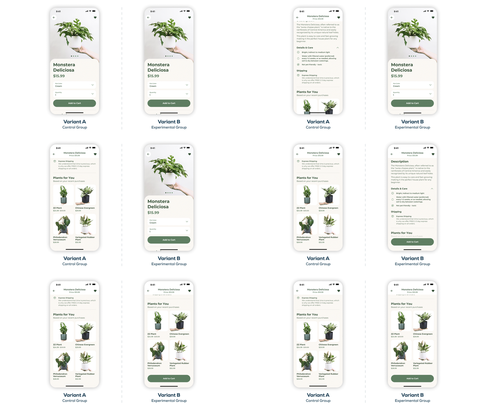
Variant A is the existing experience, also known as the control group. You’ll notice as a user scrolls down the screen, the “Add the Cart” button scrolls off and becomes inaccessible. That means when the user has consumed enough information to inform their purchase, they would be required to scroll all the way back up to the top of the screen in order to add to cart. You can see why this is problematic.
Variant B is the upgraded experience, also known as the experimental group. In this variant, an “Add to Cart” button becomes fixed to the bottom of the screen as the original button scrolls off. This allows the user to consume the necessary information without sacrificing the visibility of the “Add the Cart” button, and the user can add to cart at any point while scrolling.
Example #2: A/B tests that require scale in order to get meaningful results
If your team has ever debated whether or not something is worth pursuing, and the implementation is rather subtle with little lift, then an A/B test could be your deciding factor. In this example, a satisfaction guarantee statement is added to the product detail screen to improve buyer confidence with the hope of driving product sales.
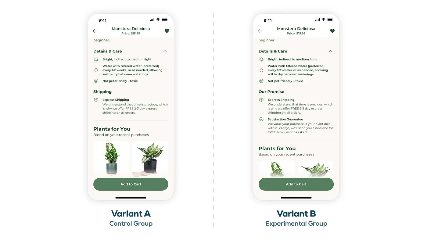
Variant A is the existing experience and control group. The piece to pay attention to here is the “Shipping” section about halfway down the screen that talks about free 2–3 day express shipping.
Variant B is the new experience. Here the “Shipping” section is converted to a promise statement, pulling in the brand’s commitment to customers. Not only is free 2–3 day shipping noted, but a “Satisfaction Guarantee” statement is added.
Note: The changes between variants A and B are subtle, which means the A/B test will need to run for a longer period of time in order to see clear results.Example #3: A/B tests that are high effort, but you’ve already committed to building
Another great scenario for A/B testing is when you already have stakeholder buy-in to pursue a major redesign or costly feature implementation to validate assumptions. In this example, a new payment method is added to increase ease of use with the hope of driving product sales (you’re probably catching onto Rooted’s North Star metric by now 😉).
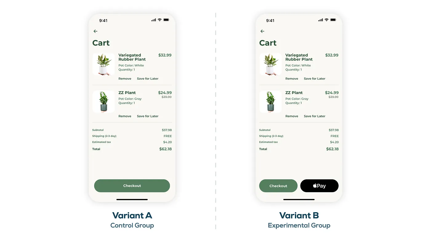
Variant A is the existing experience. Here you have a single “Checkout” button at the bottom of the Cart screen, and tapping on “Checkout” would send users down a typical checkout process where they would be asked to enter shipping and billing information.
Variant B is the new experience. You’ll notice there are two buttons at the bottom of the screen now: “Checkout” and “Pay”. Adding a quick action like Apple Pay right away on the Cart screen would streamline the checkout experience significantly, eliminating the need for multiple forms and screens to enter shipping and billing information. You can see why the team wanted to test such a feature!
What’s next?
Now that you have a better understanding of A/B testing, it’s time to get out there and try it yourself! If you’re not sure where to start, check out these prompts to get started:
- Do you already have a feature that is controlled by conditional logic? What would happen if you simply took it away? That’s a great A/B test.
- What about a feature that you’re not quite sure about? Does it provide user value? A/B test it to find out!
- Are you launching a new feature soon that is an upgrade from the existing experience? A/B test to validate your assumptions.
A/B testing is a great tool to have in your toolbox as a designer, and the opportunities are all around you—you just have to look for them.
Ali pushes pixels and shapes user experiences at Livefront.


