Article
It’s Alive!
Turning design mock-up into reality
March 20, 2017

Designers have all the fun.
They work with the ideal case, the platonic solid of all mock-ups. Then they click export as.... No edge cases to interfere with impeccable typesetting. No missing APIs to force compromises. No long tail of support to address oversights or upgrades. Just perfect UI harmony.

I’m being slightly facetious — at some point designers have to deal with a developer, and by extension a computer that tolerates no ambiguity. Depending on the scope, this can be a long collaborative process with complex choices. The ideal case may quickly recede from reach.
That’s not to say the fun is over. Bringing a beautiful design into reality is a process I adore, and for a developer like me there’s an additional dimension of beauty to build into the real digital artifact: a clean, tractable API. From the outside, the API should be a minimal expression of requirements and economy of moving parts. From the inside, a compartmentalization of tasks.
Building towards both a clean API and beautiful design involves the acknowledgment of real-world complexity.
It is that process I would like to catalog. In this article I will outline some high level steps to take when evaluating and implementing a design, and I will frame those steps with a UI mock-up that inspired me.
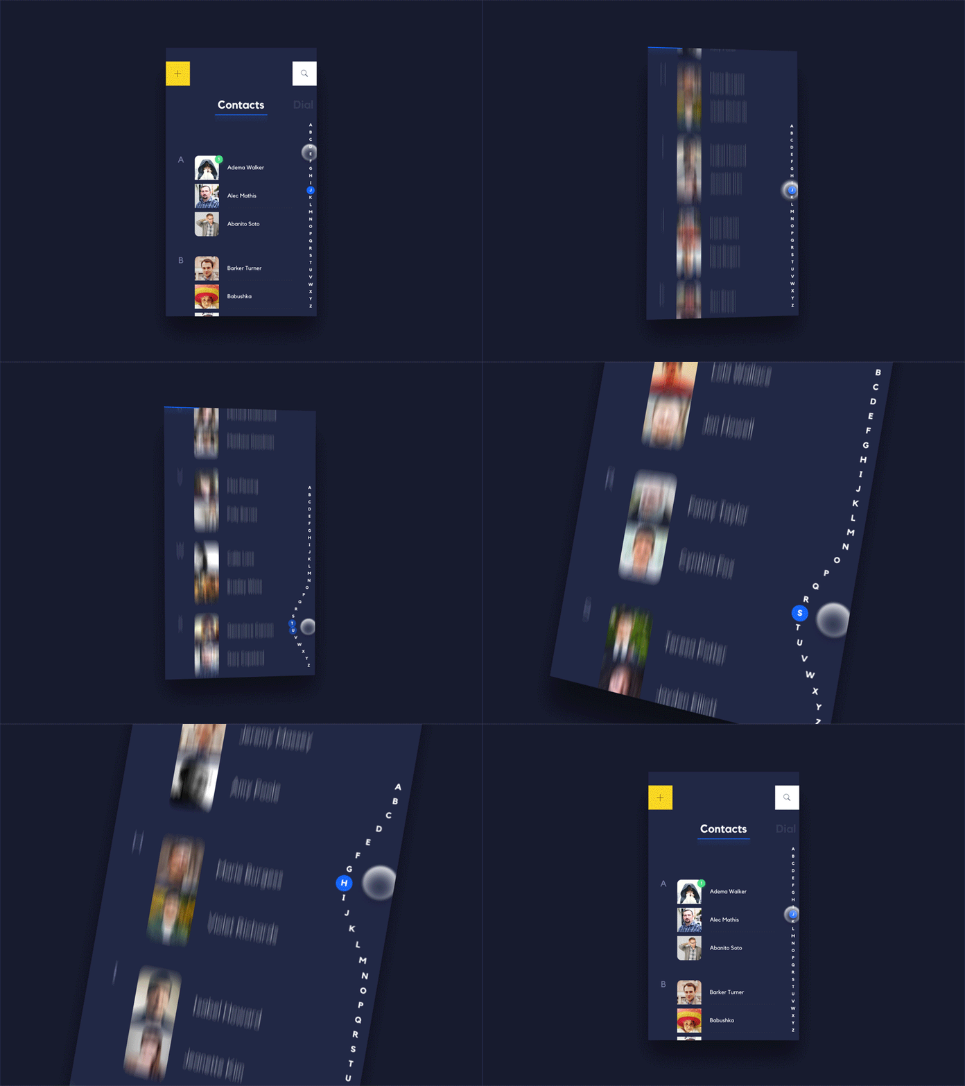
Nice!
In the sections below I will refer to my implementation and the path it took, but you can also see the end result on GitHub .
To be clear, the goal for this specific example is to create a custom component for the scroll bar on the right hand side. It should be attachable to any scrolling content. It might interact with a list of contacts, but should be prepared to support sectioned content as defined by the developer using it. That means it will not be hard-coded with A-Z, or attempt to sort the corresponding collection.
Where to start?

1. Observe.
Unless you are specifically concerned with removing ambiguity, it’s easy to miss a flurry of details in the typical design mock-up. A full-speed demo animation can cruise past critical information in a few frames. If the mock-up is not composed of standard transformations offered by the system UI Toolkit, note those facts early. You may need to approximate the design rather than match it frame for frame, and your designer may decide to revise their approach based on your findings.
Additionally, designs often come with implicit assumptions. Root them out.
- What information does the design assume is easily accessible? Is it presenting data you don’t have?
- Does the design rely on non-existent APIs or events?
- Can you derive missing information yourself, or will your API consumers be forced to inherit the extra complexity?
- Does the design assume pretty real-world data? What would the implementation look like if the data is ugly?
When answering these questions, keep in mind your ideal outward-facing API. Building backwards from there, you can discover what minimal extra complexity would allow your component to function.
Going back to the scroll bar example, my ideal external API would be a single method:
public void attach(Scrollable s);Where Scrollable is any scrolling container, such as RecyclerView or ScrollView.
Possible?
Note the following about the mock-up:

- The animation is straight forward
We have enough information in the Android touch event stream to animate these letters at a lateral offset. The final implementation will, at most, involve only two of the primitive animation types (translate, scale, rotate, and alpha). More on this below.
- The mock-up assumes perfect scroll percentage information.
Swiping up and down on the scroll bar results in a corresponding percentage change in the attached scrolling content. However, almost no RecyclerView implementations in the wild know their own content height in absolute terms. You may have noticed that the system scroll bars on RecyclerView will sometimes flail wildly while flinging down a list. In the typical use case, a RecyclerView can only offer a feeble estimate of its aggregate content size.
It is possible to approximate the scroll distance using smoothScrollTo, but that is based on item position rather than a fraction of height. A more granular scroll is certainly possible, but will push responsibility onto the consumer and increase the API complexity.
- The mock contacts data is too clean.
As noted above, the list smoothly scrolls to match the percentage on the custom scroll bar. Even if we’re given an absolute scroll percentage from the RecyclerView (again, that’s hard to do), it will not map 1:1 to evenly spaced letters on the scroll bar.

This further pushes our API towards item position based scrolling instead of granular percentages.
- The gentle slope of the letter offsets can be approximated, for now.
Speaking practically, the strategy for animating the letters will use a “bumper circle” to the right of the text’s vertical alignment.
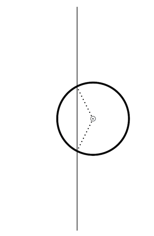
In the adjacent graphic, the vertical line represents the path of the text at rest, from top to bottom. The circle is a simple rounded protrusion that can be combined with the vertical line to give an approximate rounded edge on the scroll bar near the touch position.
The circle and line won’t be drawn, but will be used to calculate the momentary horizontal offset of each letter as the user swipes up and down the scroll bar. It’s also possible to use a ValueAnimator to change the circle’s center.x position over time, giving the letters a smooth transition between resting and protruding.
The design has a sloped curve instead of a semicircle. It is possible to reproduce the slope in code, but for now a circle is a nice approximation with simpler math.
I’ve drawn some debug lines on an empty canvas to demonstrate the effect:

Having calculated a vertical path and the protruding semicircle, it’s easy to draw some text directly onto the canvas with horizontal offsets corresponding to the path’s x position.
2. Work backwards from your ideal API
With some additions to the ideal API, the complexities noted above can be addressed without pushing too much responsibility onto the API consumer.
The scroll bar needs a few pieces of information to correctly space and correlate each section to a position in the adjacent scrolling content container.
- The number of sections.
- The title of each section (may be a letter of the alphabet, or not)
- The relative size of each section.
The public API might take the form of an adapter, implemented by the consuming developer:
If possible, piggyback on established patterns. In this case an Adapter style interface makes some sense, because the proximate UI elements such as ListView and RecyclerView come with their analogous Adapters.
3. Use it yourself, then write a great README
Be your own API consumer. Tighten the feedback loop by being the first to implement a feature using your component.

Ask yourself,
What am I expecting a developer to do when using this?
then write that down in clear steps, with examples.

Though it may come with affordances for messy real-world data, and for the judicious minimization of API complexity, the beauty of a design is preservable. As the developer, you are the first to feel it come to life.
Who’s having fun now?
Collin is a custom UI junkie at Livefront , and he thanks you for reading.
