Article
Padding vs Content Margins: A Discreet VoiceOver Nuance
January 9, 2025
In today’s digital age, accessibility isn’t just a nice-to-have — it’s a must-have. Let’s face it: if your app can’t be used by everyone, you’re leaving people out, and that’s just bad design (and karma). Luckily for iOS developers, Apple’s SwiftUI is here to save the day with some useful tools for building inclusive interfaces.
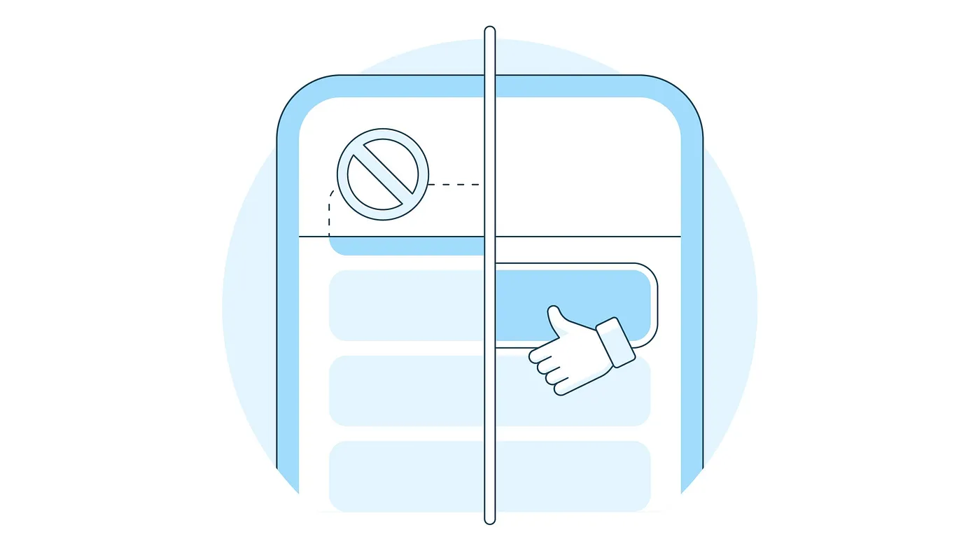
However, there are hidden nuances that can make or break accessibility, especially for users navigating with assistive technologies. One such nuance — surprisingly tricky and potentially frustrating — is the difference between padding and contentMargins when it comes to VoiceOver. Let’s take a closer look at why this matters and how it affects the user experience.
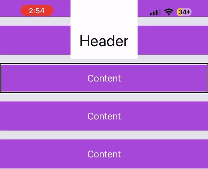
The following screen looks pretty simple. Outside of being beautifully polished and incredibly aesthetic, there’s nothing out of the ordinary… right? What if I told you there was a hidden VoiceOver bug waiting to bite?
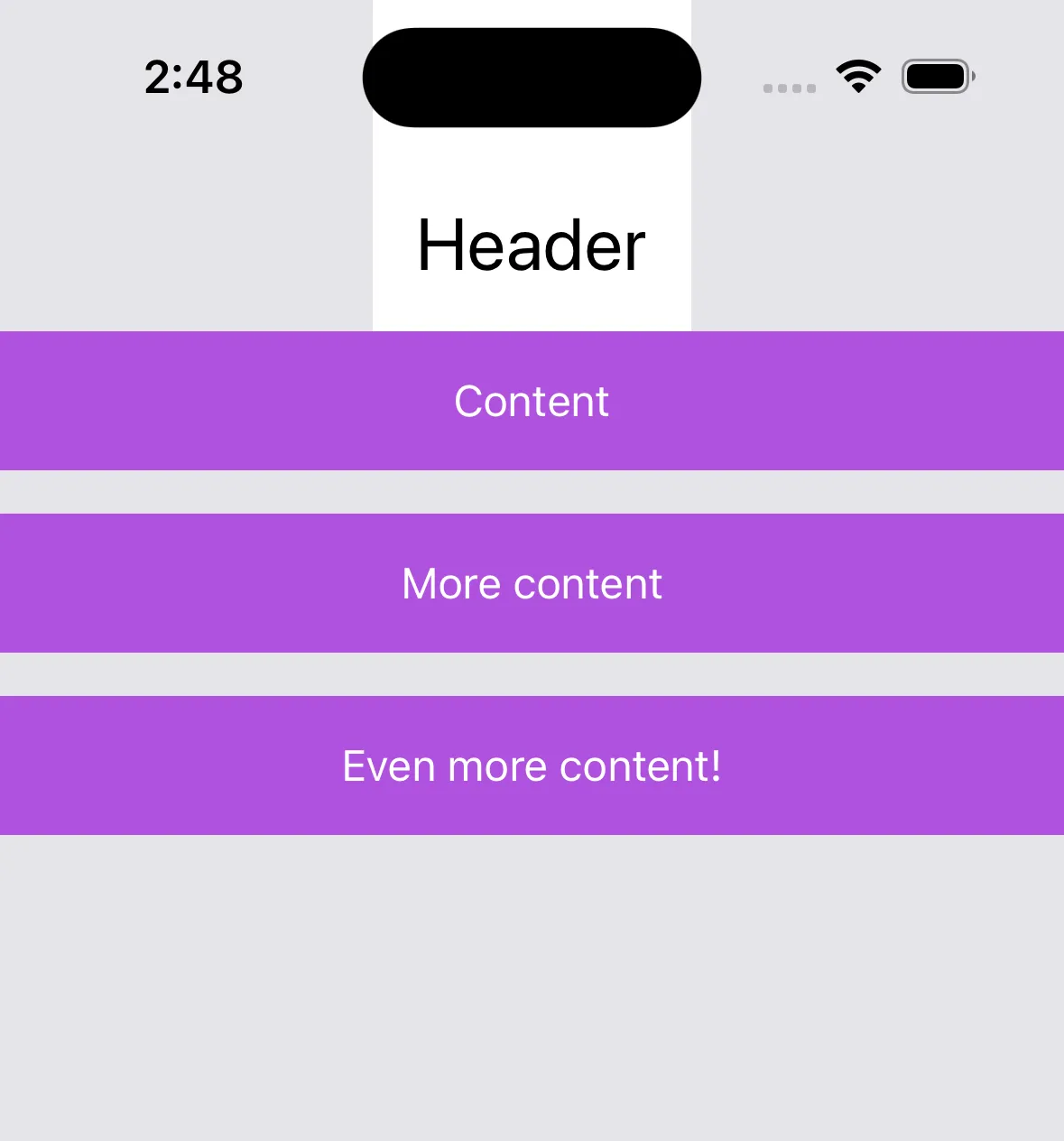
The screen is actually more complex than it looks. The header and content are layered in a ZStack. This means we have to manually offset the content so that it isn’t initially obstructed by the header. So, how do we handle this? Say hello to our options: padding and contentMargins.
Can you spot the subtle difference between these two blocks of code? The two produce identical UI. But one of them has a debilitating bug lurking beneath the surface.
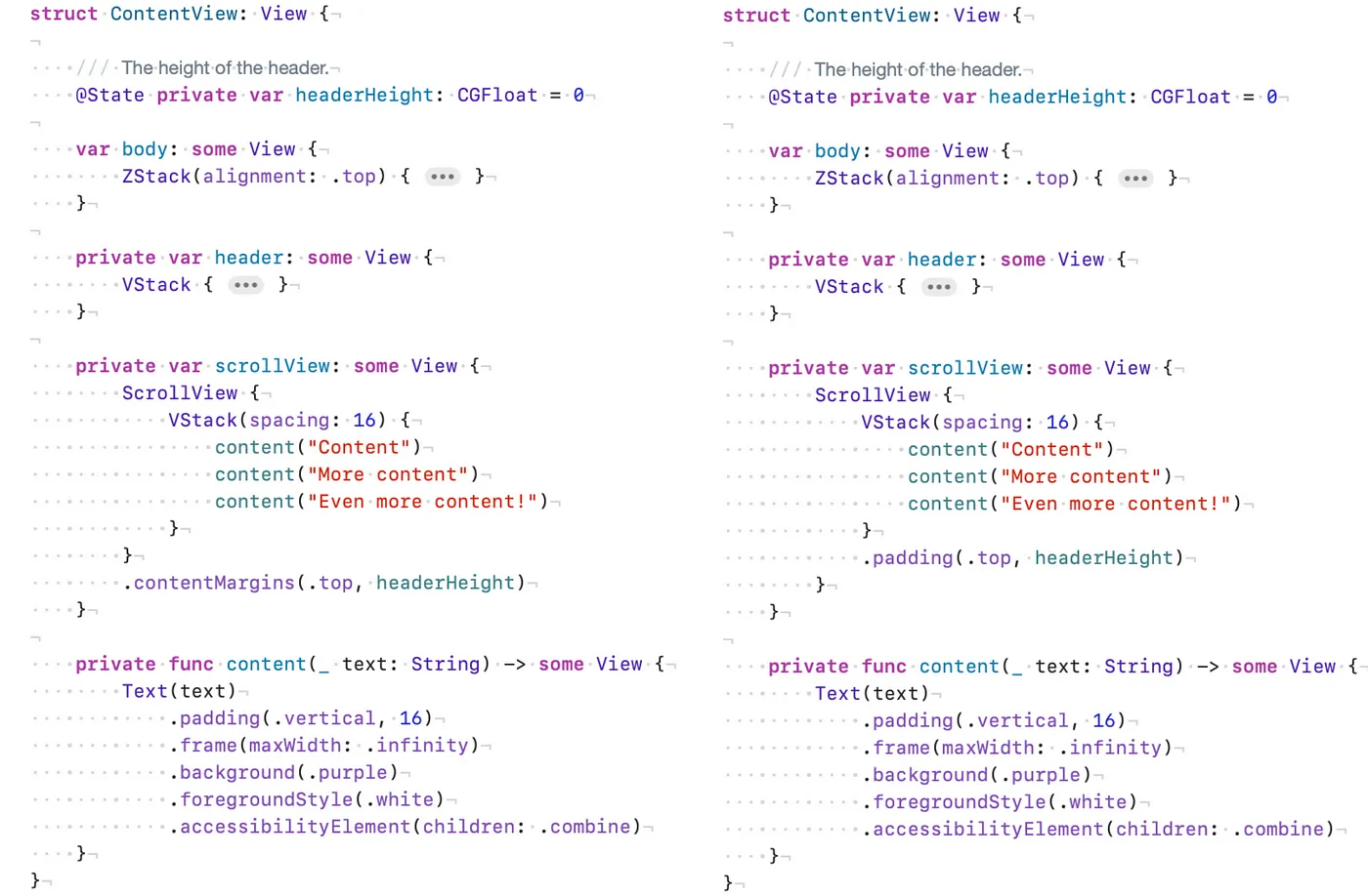
Good eye! One view uses .contentMargins(.top, headerHeight) and the other uses .padding(.top, headerHeight). Now, which one produces the bug? Let’s try scrolling with VoiceOver on to find out.
VoiceOver scrolling with padding
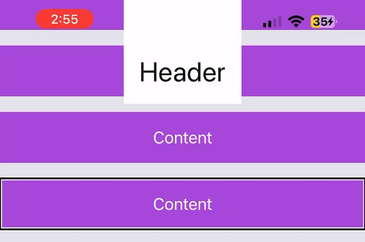
Looks like padding causes a bug! When scrolling, focused elements can be hidden behind other UI — big no no! Let’s see what scrolling looks like when we use contentMargins instead.
VoiceOver scrolling with contentMargins
Ahhh, much better. Using contentMargins, the screen accurately scrolls so that the focused element is always fully visible. But why is that? Why does VoiceOver treat padding and contentMargins differently?
Turns out, ScrollView is the culprit. It interprets padding and contentMargins differently, and then communicates those interpretations to VoiceOver.
Padding: A visual adjustment
When you apply padding to a ScrollView or its content, it visually adjusts the layout by adding space around the content. However, it doesn’t inform the ScrollView container or accessibility tools about this adjustment. The logical bounds of the content remain unchanged. Think of logical bounds as the “invisible structure” or “interaction area” that tools like VoiceOver, hit-testing mechanisms, or other accessibility features use to interpret and interact with the content.
Since logical boundaries are unchanged by padding, VoiceOver assumes the screen’s elements are in their original positions. This assumption produces the bug we saw earlier.
Content Margins: A layout and visual adjustment
On the contrary, contentMargins adjusts both the visual layout and logical boundaries of the content. This ensures that the ScrollView and its child views are offset properly, respecting the space defined by the contentMargins.
VoiceOver recognizes the updated logical boundaries, aligning the focusable elements with their visual positions. This prevents focused elements from being hidden or inaccessible, as the content is shifted logically to accommodate the header or other overlapping elements.
Why this matters going forward
This nuance is incredibly easy to miss during development. Let’s be real — it’s all too common to rely on visual testing alone to check layouts and interactions. As we saw, padding looked fine for visual adjustments but quietly introduced a subtle bug that could easily slip past less experienced developers.
By using contentMargins, we can dodge these headaches and create apps that are consistent and accessible for everyone, including VoiceOver users. Honestly, though, Apple could make this clearer in the docs. It feels like one of those quirks you only learn the hard way — by stumbling into it yourself.

