Article
Strengthening Collaboration Between Product & Brand
March 10, 2025
Paul McAleer [PM]: So let’s dig into this a bit. Rose Grabowski’s post is something that really got me thinking because it was so very relatable. While I’ve seen progress on this, there’s still a weird discomfort out there when a brand team “hands off” something to a product team to design and build the actual app or website.
Ben Wood [BW]: The majority of my career has been at digital marketing and product design agencies. I’ve received many, many documents like this — but I will say they’ve gotten better over the years. Brand agencies don’t do a lot of work, traditionally, in the UX or product space. Back when I started my career, UX and digital weren’t things that were thought about at all. I think now there’s at the very least, a nod towards it.
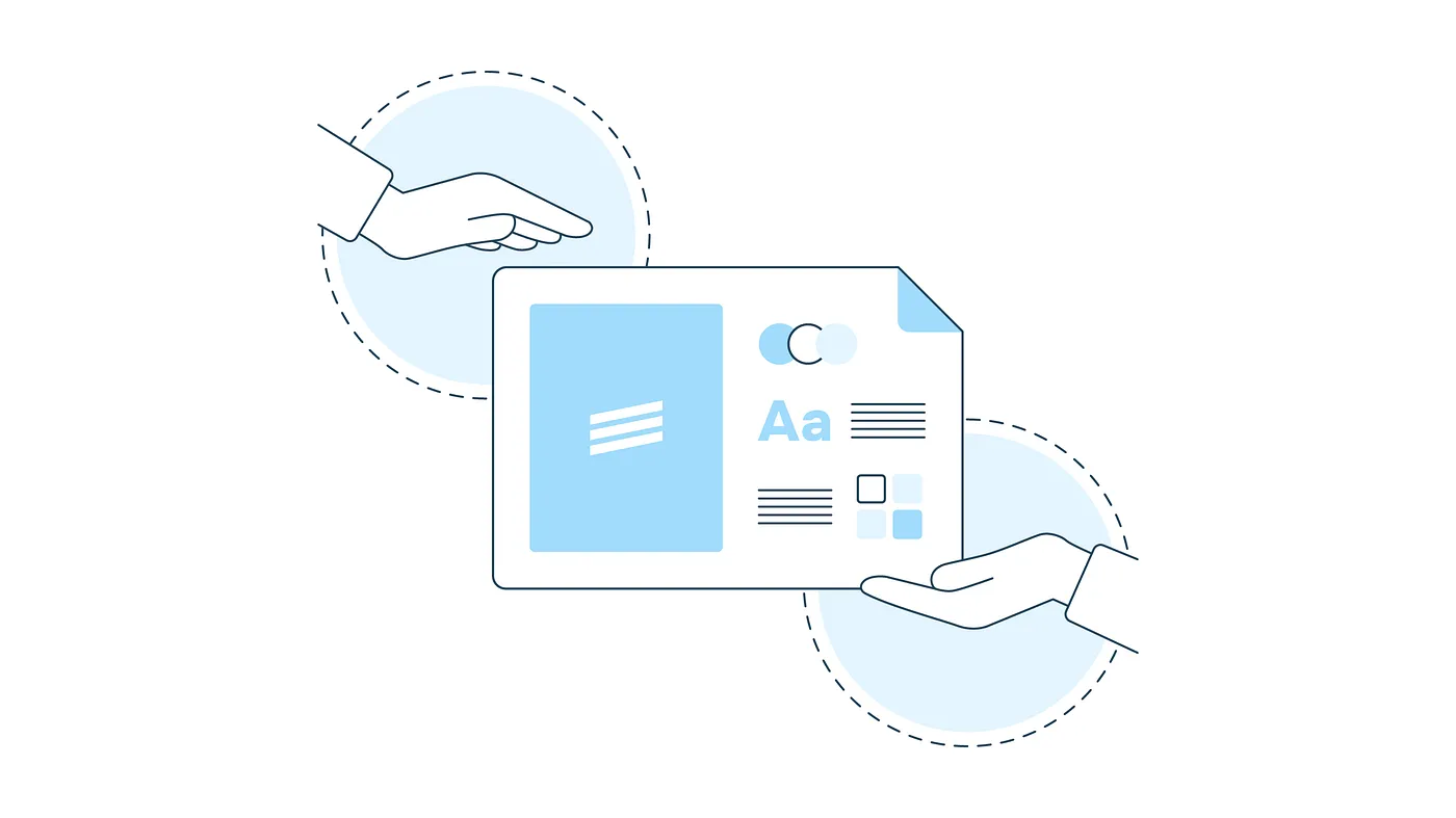
Ali Joaquin [AJ]: Sometimes when we’re working with clients, they hand us a brand package and say “Here’s what we know so far about our brand”, but they don’t have a digital property or native app yet, which is okay — we can work with that! Honestly, it’s sometimes preferred to really let the digital design system shine. However, there are also times when clients have internal marketing or brand teams who need to “sign off” on the product work to ensure it looks and feels like the brand. So the handoff oftentimes isn’t really a, “Here you go, here’s everything, you’re all set.” It’s an ongoing conversation.
To make a good user experience, you may have to bend the rules of the brand. Accessibility is a big one. You may need to tweak things like the prescribed color palette because the individual colors don’t always pass color contrast standards. And that may not be something the brand team is familiar with.
BW: Part of this depends on the flexibility of that brand or marketing team. It’s about the flexibility of the system, but also meeting with those teams — the sooner, the better. It’s good to have those conversations versus, say, going out on your own making changes, and then hearing much later down the line that something isn’t on brand.
AJ: We have ongoing, prescheduled design reviews with all of our partner engagements, and there is someone from marketing or brand who is in all of those reviews. They see the actual screens and flows of what we’re designing for their app — there’s an element of sign off. But there may be people higher up in leadership or other stakeholders who are less directly involved in the review process, and when they see their product in action, their gut reaction may be, “That’s too far away from what we normally do.” This doesn’t always happen, but when it does, it creates a lot of swirl.
We’re always going to do our damndest to make sure what we create is on brand and abides by our partner’s brand language. And we obviously don’t want to put a product out there that feels different than the brand itself — that’s never our intention. We strive to be flexible too; we have to be flexible in our line of work to create experiences our partners love, users embrace, and that adhere to brand standards.
PM: Those aren’t always small changes, right? When it’s a deck, a Figma file, or a mockup of any kind, it’s a lot easier to change it. When it’s been developed, it’s a real thing — and changing it at that point is certainly possible, but it’s a lot less pleasant for anyone.
AJ: It’s more expensive at that point too.
BW: There was a project I worked on a while back where we were at the finish line, ready to go with the first iteration of the website. A week before we were ready to launch, a brand team member said, “All these illustrations are wrong.” They wanted them to be a bit more flat and not as environmental or atmospheric as we had them; they didn’t not meet brand standards, but they didn’t have brand standards for that specifically — like, “Hey, we don’t do this style.”
PM: More of an “I’ll know it when I see it” situation.
BW: Yep.
PM: And that doesn’t feel good, right? It almost works — but it’s not quite there.
BW: Because the brand team didn’t agree with the direction of the illustrations, the whole site had to be redesigned and the front end had to be rebuilt within a 2 week period.
Part of the situation here is that we do understand our role. We’re not print designers here at Livefront — and the way you set things up like typography, color palette… we want to stay as close to those standards as possible while allowing for things like accessibility. So it’s a matter of making sure that when we need to have a conversation around a change, we have that conversation.
And to be clear, I’d prefer to see a screen or mockup in branding materials. They’re interpretations — “this is our typography, this is how it works in marketing materials, this is how it may work in an app or a website.” I give credit to these teams putting these together — showing and imagining how the brand is going to show up on web and in apps. But, we have very specialized knowledge and skills on this that we bring to the table.
AJ: I appreciate the intent behind it, too. The team working on the brand is trying to prove out that it’s going to work on these different properties. And they’re trying to take an intentional step into our realm — so that is helpful. But that brand handoff deck may not be a cut-and-dry answer for what the product team needs, and it may not precisely and exactly apply to the product.
BW: Accessibility is one example. When we’re designing and building, we’ll look at any and all combinations of foreground and background colors. We’ll often see a client has, say, tested all of the foreground colors against white, but then we will see those same colors fail in practice when placed against darker backgrounds.
AJ: That’s a perfect example of where our experience as product designers comes into play. We don’t want to introduce confusion for users or reduce accessibility when creating a product because things like foreground color and background color weren’t fully thought through by the brand team — and that’s okay! We’re more than happy to take on that responsibility. Every design we share with clients has been considered for accessibility needs. It’s not an extra step after a design is approved — it’s baked into our process.
PM: Right, and that reinforces the idea of where brand guidelines live and what they influence. Here’s an example of a one-pager, here’s a home screen, here’s a business card, here’s a tote bag. That’s great. But there should be principles laid out that are a higher order and longer-lived. That means for digital products, things are probably going to look different than a tote bag, or a cassette tape we’re creating for an event.
BW: When it comes to how it looks in the UI, we’re going to do our best to interpret something as close to one-to-one as possible, knowing that there’s flexibility and caveats we’re going to have to make. We might have to do something like tweak one color to make it a bit lighter, so it works with a headline color that is established, for example.
AJ: There’s a way to do it and make everything still feel very cohesive — but that doesn’t mean we can always take things verbatim, depending on what level of granularity is included in the brand guidelines.
PM: Right. There’s a give-and-take on this that is necessary. It might be typography in one instance; or something might be missing altogether like in your example, Ben.
BW: What happens when accessibility conflicts with brand guidelines?
AJ: Our clients and partners understand the rationale behind accessibility of course, and no one wants to go through a lawsuit because they don’t pass accessibility standards. We see a lot of those initial brand or marketing mockups fall flat from an accessibility perspective. It’s not intentional, of course. But again, it’s what they don’t know, they don’t know, and it can happen.
BW: That reminds me of another aspect that isn’t thought about much in brand: performance.
PM: I can’t imagine too many brands want things to be really slow.
BW: Right. There’s a lot of large, beautiful photography with edge-to-edge, beautiful typography over it. But of course, the larger you make an image on the web, the slower your page is going to load, and in so many industries — especially ones like retail — that lack of speed costs money. I think that’s one of the reasons we tend to gravitate towards illustration. It’s more than just a trend; it performs better in a lot of cases.
PM: We’ve touched a bit more on the visuals, but are there other things you two would like to see more guidance on from a brand perspective — either as guidelines or a point collaboration?
BW: Copywriting. UX copywriting and marketing copywriting are different. The voice and tone of a headline might not be the same as the voice and tone of an error message.
AJ: It’s a balance of utility versus brand. You want to create a product that works at the end of the day and still feels like the brand, but you don’t want to confuse users when they’re trying to use an app or experience.
PM: Yeah, because there’s the possibility a brand could have ‘trustworthiness’ as one of its tenets. A failed checkout payment probably isn’t the time to be really witty with your messaging. A strong content strategy and plan, even if it’s not totally complete, is a key part of this.
AJ: Honestly, I think product should be part of this whole process, if you’re creating an app or even if you’re creating a website. Product might not make the core decisions for the brand, but you can take our perspectives into account. Doing so could avoid future awkward situations — say, retroactively expanding the color palette or shoehorning in different colors to meet accessibility standards last minute. Everyone needs to work together.
PM: Right. It’s okay if everything isn’t fully baked and ready to go as soon as we’re building the product because these are living standards and documents. As the product changes, so will these guidelines. Of course, everyone is trying to be as thoughtful and exhaustive as possible, but we need to give enough space for the reality that happens with any of these mediums.
AJ: What you did on day one is probably not what you’re doing ten years in, even if you haven’t done a complete redesign or rebrand — but your brand has changed as trends and tastes have shifted. It’s brand evolution over time and just because it’s put in a deck or “on paper” doesn’t mean it’s final. It’s a living, breathing thing.