Article
SwiftUI Custom Alignment
September 18, 2023

SwiftUI comes with many built-in options for aligning views. When you use the basic container views such as HStack, VStack, and ZStack you have the option to provide an alignment parameter which controls the placement of subviews relative to each other. Alignments are categorized as either HorizontalAlignment or VerticalAlignment.
A container’s available alignments are those perpendicular to the predominant axis of the container view. For example, HStack lays out subviews horizontally, so it allows VerticalAlignment. VStack lays out subviews vertically, so it allows HorizontalAlignment. ZStack lays out subviews along both vertical and horizontal axes, so it uses a compound Alignment type which contains both a HorizontalAlignment and VerticalAlignment.
Each alignment type comes with a collection of standard alignments. For example, the standard alignments for VerticalAlignment are: top, center, bottom, firstTextBaseline, and lastTextBaseline.
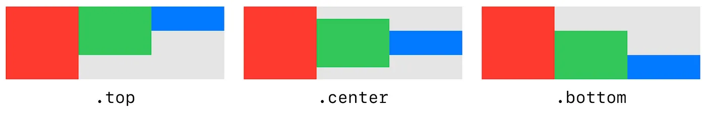
These pre-defined alignments can be used to create most typical layout designs. But what if a design calls for views to be placed at a location other than one of the standard alignments?

For this, SwiftUI allows us to define our own custom alignments. Let’s see how we can define a custom VerticalAlignment that places views two-thirds of the way down a ZStack.
Custom Alignment Implementation
The built-in alignment options are defined as static properties on the corresponding alignment types. Here’s how VerticalAlignment defines it’s top alignment value.
extension VerticalAlignment {
    public static let top: VerticalAlignment
}
Let’s define our two-thirds alignment in a similar way.
extension VerticalAlignment {
    public static let twoThirds = VerticalAlignment(…)
}
You’ll notice we actually have to initialize a VerticalAlignment when we declare our custom alignment value. The initializer takes a single parameter of type AlignmentID.Type. We’ll need to define an AlignmentID for our custom alignment. This type is never meant to be instantiated, so we’ll define it as an enum.
enum TwoThirdsAlignmentId: AlignmentID {
    static func defaultValue(in context: ViewDimensions) -> CGFloat {
        …
    }
}
The AlignmentID protocol requires a single static function named defaultValue(in:). This function contains our custom layout calculations. It receives a ViewDimensions value which provides sizing information about the View we’re aligning. It’s also responsible for returning an offset in the view’s coordinate space. So returning 0 for a vertical alignment would align to the top edge of the view. Returning the height of the view would align to the bottom edge of the view. For our two-thirds alignment, we want to align to two-thirds of the view’s height.
enum TwoThirdsAlignmentId: AlignmentID {
    static func defaultValue(in context: ViewDimensions) -> CGFloat {
        context.height * 2/3
    }
}
Now we can use our AlignmentID with our VerticalAlignment.
extension VerticalAlignment {
    public static let twoThirds = VerticalAlignment(TwoThirdsAlignmentId.self)
}
Since we want to use this custom alignment with a ZStack, there’s one more static property to define. Remember that ZStack uses the Alignment type which combines a VerticalAlignment and a HorizontalAlignment. In this example, we’ll use a leading horizontal alignment. So let’s define a twoThirdsLeading alignment like this:
extension Alignment {
    static let twoThirdsLeading = Alignment(horizontal: .leading, vertical: .twoThirds)
}
Using a Custom Alignment
Now we’re ready to use our custom alignment in a ZStack. Let’s start by building a SwiftUI View with a ZStack and some text content.
struct Example: View {
    var body: some View {
        ZStack {
            Color.cyan
            TitleView()
            RedLine()
        }
    }
}
Our ZStack contains three views: a background Color view, a TitleView, and a RedLine view. The Color view expands the ZStack to use all available space. This will make it easier for us to see how the content views are being aligned. The RedLine view will also be used to show us exactly where views are being aligned vertically. By default, ZStack uses center alignment to place all content views in the center of the container. Let’s see what happens when we use our new custom alignment.
struct Example: View {
    var body: some View {
        ZStack(alignment: .twoThirdsLeading) {
            Color.cyan
            TitleView()
            RedLine()
        }
    }
}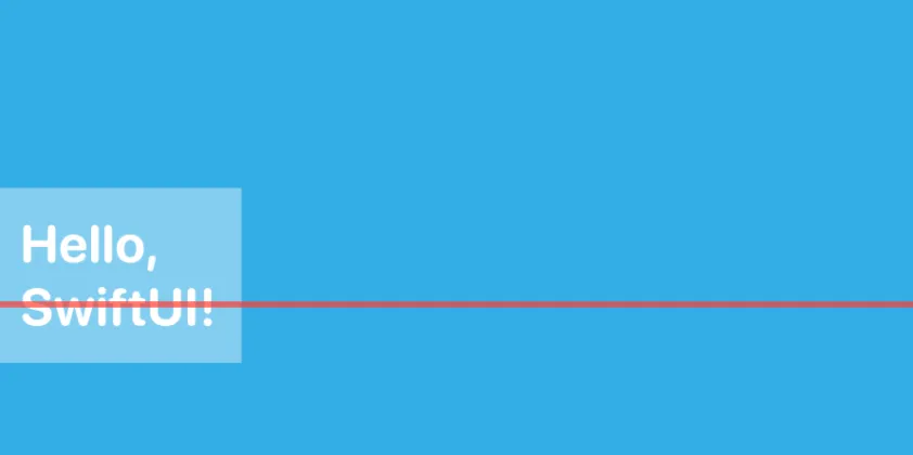
Our custom alignment is working! We can see that all three content views are aligned to two-thirds of their heights. But there’s one more change we need to make to match our original design. Rather than pinning the TitleView on the RedLine at two-thirds of its height, we actually want the TitleView to be centered vertically on the RedLine. To achieve this, we need to adjust how TitleView responds to our custom VerticalAlignment.twoThirds alignment. This can be done with SwiftUI’s alignmentGuide view modifier.
struct Example: View {
    var body: some View {
        ZStack(alignment: .twoThirdsLeading) {
            Color.cyan
            TitleView()
                .alignmentGuide(.twoThirds) { context in
                    …
                }
            RedLine()
        }
    }
}
The alignmentGuide modifier is very similar to the defaultValue function of AlignmentID. In the first parameter, we specify which alignment we’re modifying. In this case, it’s our custom twoThirds alignment. Then we provide a closure which receives a ViewDimension describing the sizing of the TitleView. In this closure, we’re again responsible for returning an offset in the view’s coordinate space. Instead of returning two-thirds of the view’s height, we’ll now return half of the view’s height.
struct Example: View {
    var body: some View {
        ZStack(alignment: .twoThirdsLeading) {
            Color.cyan
            TitleView()
                .alignmentGuide(.twoThirds) { context in
                    context.height / 2
                }
            RedLine()
        }
    }
}
And we’re done! The TitleView is now vertically centered at two-thirds of the height of its container. Try experimenting with different combinations of standard alignments, custom alignments, and alignmentGuide to see what layouts you can come up with.
Thanks for reading!
Paul works at Livefront , where the test coverage is strong, the designs are good looking, and all the developers are above average.

