Article
Advanced Android Edge-to-Edge (Part 1): Keyboard Transitions with MotionLayout
January 15, 2021
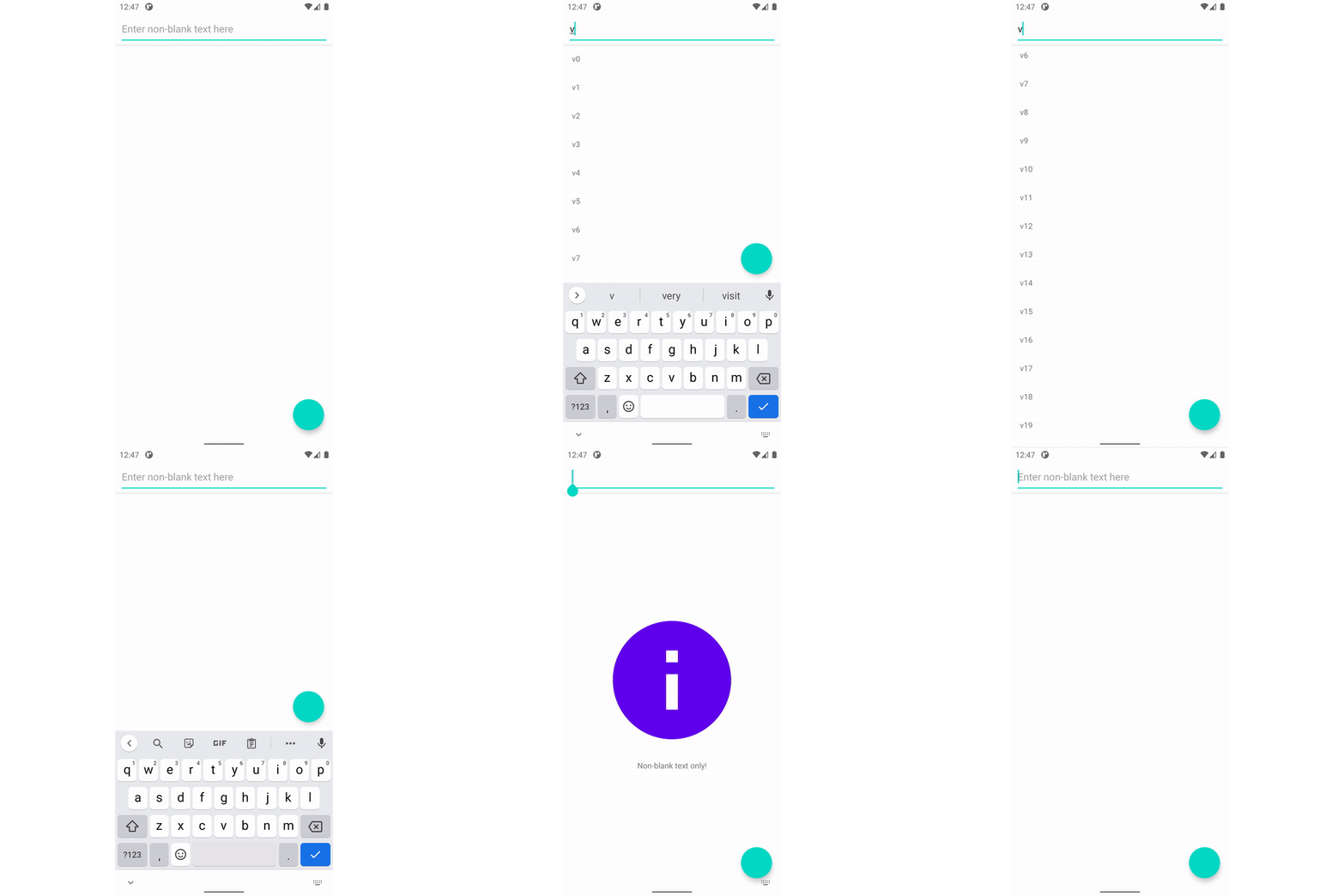
This is the first part of a series devoted to providing complete working examples of advanced use cases for insets on Android. The snippets in these posts can be found in context at https://github.com/alexvanyo/android-edge2edge .
- Part 1: Responding to keyboard transitions with
MotionLayout - Part 2: Insets and
BottomSheetDialogFragment - Part 3: Mind your horizontal insets (coming soon!)
If you aren’t already familiar with the concept of going “edge-to-edge” and the underlying APIs available, I’d highly recommend two series of articles by Chris Banes that provide a walkthrough of the concepts and the API surface available to developers:
Gesture Navigation: Going edge-to-edge (I) Animating your KeyboardPart 1: Responding to keyboard transitions with MotionLayout
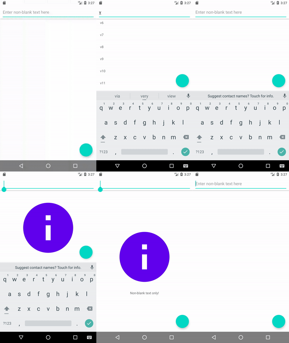
MotionLayout was released with version 2 of constraintlayout , and provides powerful utilities for naturally defining layouts with multiple states. With Android 11’s addition of WindowInsetsAnimation.Callback , it should be possible to use MotionLayout to direct the animation for the IME appearing and disappearing — and indeed it is! Let’s take another look at the desired end result, and then take a look at how to use MotionLayout to create it.

( see the end of the article for behavior across different API versions and navigation types )
The main idea is this: We are going to set up two ConstraintSets for the MotionLayout. The first will define where we’d like the layout to be when the IME is closed (the scrolling views and the button anchored to the bottom), and the second will define where we’d like the layout to be when the IME is open (the scrolling views and the button anchored above the IME). Then, we can set the MotionLayout’s progress in the properly defined WindowInsetsAnimation.Callback.
This implementation must still support APIs 29 and below, where we don’t have WindowInsetsAnimation.Callback. It also has to support padding for a RecyclerView and NestedScrollView, so that items are nicely visible underneath the bottom system bar yet can be scrolled to be revealed completely.
Let’s take a look at the layout file first, trimmed a bit to highlight the most important views for the animation:
There are four children of MotionLayout that display the UI: A toolbar, a RecyclerView, and NestedScrollView for the fixed error content, and container for the button.
Those final three views notably do not have any constraints defined in the layout file, as those are the three views that we will constrain via the MotionScene defined in motion_main.xml.
There are three other space containers that are children of the MotionLayout, that we will constrain the visible views against. It might seem strange that the floating action button and the Spaces are wrapped in containers, but MotionLayout likes to have extremely strong control over its direct children. Since we will be adjusting the height and margins of these spaces, it’s easiest to wrap them in a FrameLayout to avoid interaction issues with MotionLayout.
Two of these spaces are fairly straightforward: bottomSystemBarsSpace will be set up to match the height of the bottom systemBars() insets, while imeSpace will be set up to match the height of the bottom ime() insets.
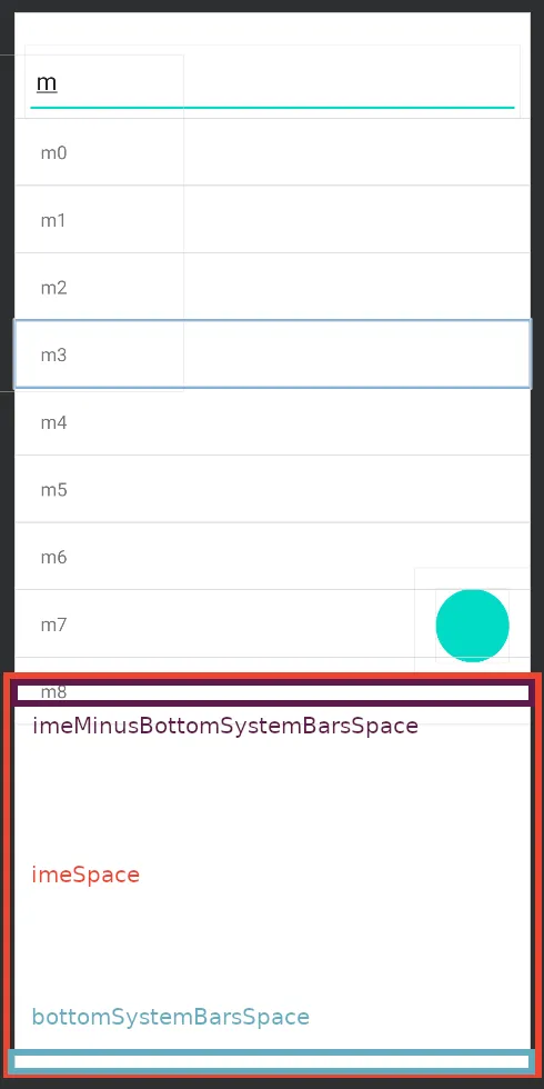
The third space is a bit more interesting: imeMinusBottomSystemBarsSpace will have the height of the bottom systemBars() insets, but it is placed so that it’s top is the top of the imeSpace. The result of this is that the bottom of the imeMinusBottomSystemBarsSpace ends up being the value of the bottom systemBars() inset below the bottom ime() insets, as depicted below:
Let’s take a look now at motion_main.xml to see how these three containers are used:
When the IME is closed, the RecyclerView and NestedScrollView are constrained to the bottom of the parent, while the button container is constrained to the top of the bottomSystemBarsSpaceContainer. When the IME is open, the bottoms of the two scrolling views are constrained to the bottom of the imeMinusBottomSystemBarsSpace, while the button container is constrained to the top of the imeSpace.
The amount of indirection in this layout might seem excessive, but it is important. To allow MotionLayout to automatically transition between the constraints, we define two separate “fixed” spaces for the bottomSystemBarsSpace and the imeSpace, and change where the views are constrained, rather than trying to animate the height or translation of one of the views directly.
imeMinusBottomSystemBarsSpace also allows us to always set the padding of the two scrolling views to be the bottomSystemBarsSpace and keep a smooth transition. If we tried to constrain the bottom of scrolling views to the top of the imeSpace (like we are doing for the button) and set the padding to 0, then the animation would appear slightly jumpy because the MotionLayout wouldn’t be able to animate the padding change. Therefore, we constrain the two scrolling views so that the same bottomSystemBarsSpace padding works in both ConstraintSets.
Now that we’ve set up the layout, let’s drive it!
To make working with insets easier, I’ll be using a doOnApplyWindowInsets helper method inspired by https://medium.com/androiddevelopers/windowinsets-listeners-to-layouts-8f9ccc8fa4d1 :
Let’s look at the main function to set up the inset handling:
We first tell the system that we are handling all insets ourselves, with WindowCompat.setDecorFitsSystemWindows(window, false).
We then apply 3 common insets that aren’t impacted by the transition: We set the padding of the toolbar to add in the top systemBars() insets, and we add the bottom systemBars() to the bottom padding of both scrolling views. In combination with clipToPadding=false, this gives us the nice behavior for the scrolling views that we want.
We then split into our two distinct codepaths: One for API 30 and above, and one for API 29 and below.
Let’s start with the more interesting case for handling API 30 and above:
Here we create an ImeProgressWindowInsetAnimation (a subclass of WindowInsetsAnimation.Callback that I’ll define below) which will give use a callback for the (0f..1f) progress of the animation. We simply set the MotionLayout’s progress to this value, which will nicely perform the transition we defined in the layout file!
ImeProgressWindowInsetAnimation is also an insets listener itself, so that it can also call onProgress when new insets are dispatched outside of an animation.
We also pass spacesWindowInsetListener to run along with the ImeProgressWindowInsetAnimation’s internal listener:
Here, we set our constraining spaces to their appropriate values. Notably, we only set the imeSpace’s height if it is actually visible. If we set it all of the time, then we would unset the IME’s height during the inset application right before the IME is closing, breaking the animation!
The final piece is the ImeProgressWindowInsetAnimation class:
The code should be fairly self explanatory, setting up the values needed to convert the inset difference into a progress value as the IME animate. One particular note is that the order of onApplyWindowInsets is vital, so that onProgress is run after the passed in windowInsetsListener.
Whew, that was a lot! Thankfully, the fallback version for API 29 and below is much simpler:
Because we can’t get a a callback, we just set the progress directly based on whether or not the IME is visible, with no animations. We also reuse the spacesWindowInsetListener from above, calling it directly to properly update our spaces.
And that’s the setup! For more detail, the full sample application can be found at https://github.com/alexvanyo/android-edge2edge . There’s quite a bit of code here, but it allows for an incredible amount of control over the IME animation and how it impacts views. Building off of this, you can fine-tune the paths and add keyframes with the MotionLayout API, as well as add this transition to an existing MotionLayouts for animating between other ConstraintSets as well.
Thank you for reading! Hopefully this has inspired you to create beautiful IME animations made possible with the new tools provided by Android 11. For more inset handling, check out the next article in the series which explores how to make BottomSheetDialogFragment play nicely with custom inset handling:
Behavior matrix:
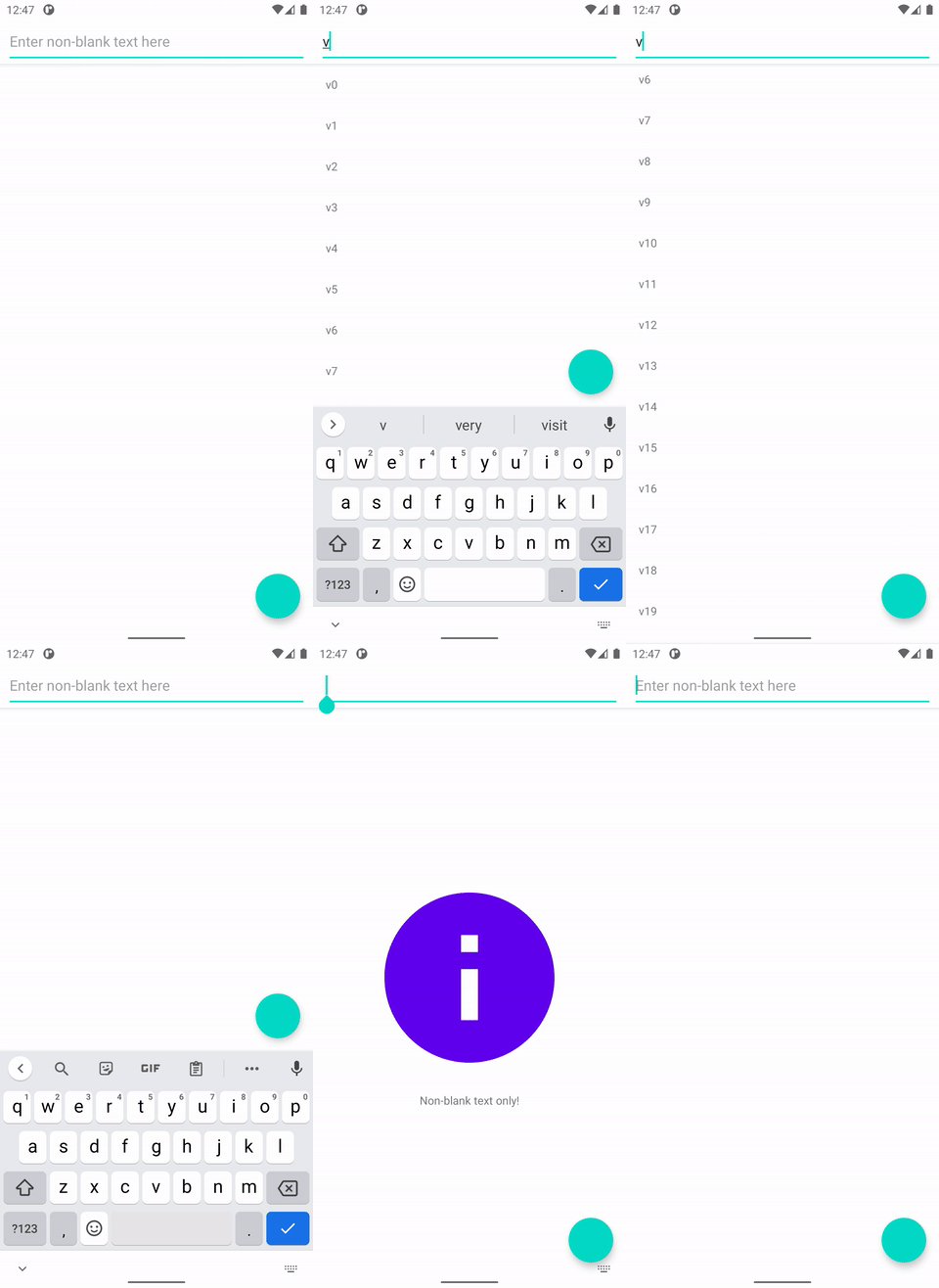
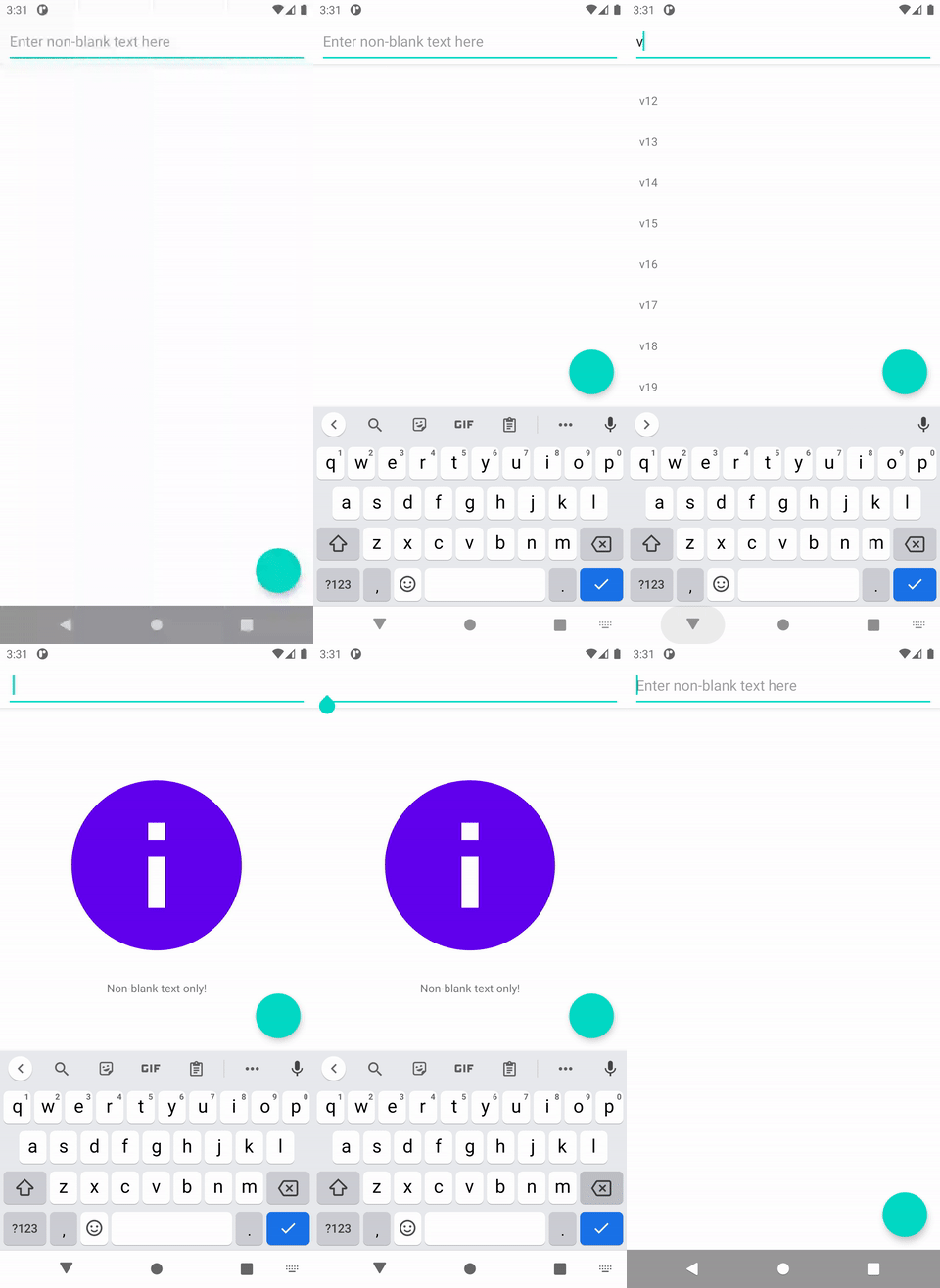
The following is the resulting behavior across different API versions and navigation types:


-
Alex Vanyo
Software Engineer

