Article
Cast Aside
July 19, 2023
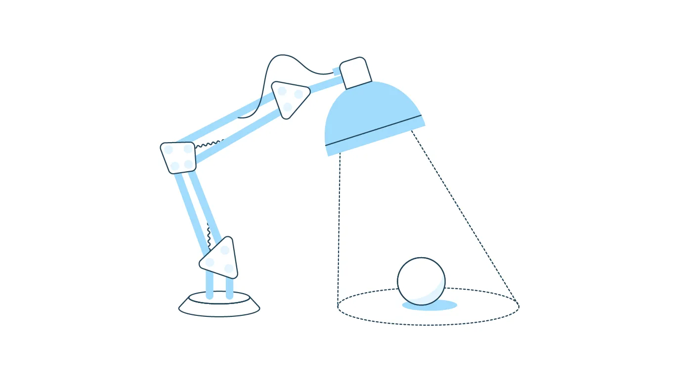
The Lost Art of the Realistic Drop Shadow
Every day, UI designers use shadows to enhance their designs. Whether you call them box-shadows or drop-shadow, the execution and success of their application vary greatly. But how can you ensure you effectively use shadows to create polished and professional visual design work? This post will guide you through mastering shadows in UI design using inspiration from nature and a real-world example.
Shadows are powerful tools to show the difference between multiple objects. As an object moves away from a surface, its shadow grows softer. Drop shadows can add depth and emphasis to your designs, creating a container for content without boxing it in. You can also use this elevation to inform users of interactivity.
The Evolution of Elevation
One of the first companies to build their design system around shadows was Google, whose elevation model was the basis for their Material design language — first released in 2014. However, Material Design has received two major updates since its inception, which continue to diminish the usage of drop shadows in practice. Let’s examine the differences between the original material guidelines and the most recent elevation guidelines from material 3.
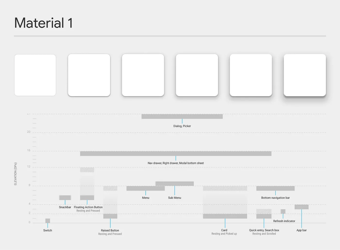
Material was revolutionary in its attempt to replicate the physical surfaces and edges without being skeuomorphic. Shadows provide meaning about what you can tap, what you can swipe, and what you are currently touching. There were eight different elevations, with a max elevation of 24dp. With the launch of Material 3 (and Material 2 before it,) Google reduced the total elevations to five and the maximum elevation to 12dp.
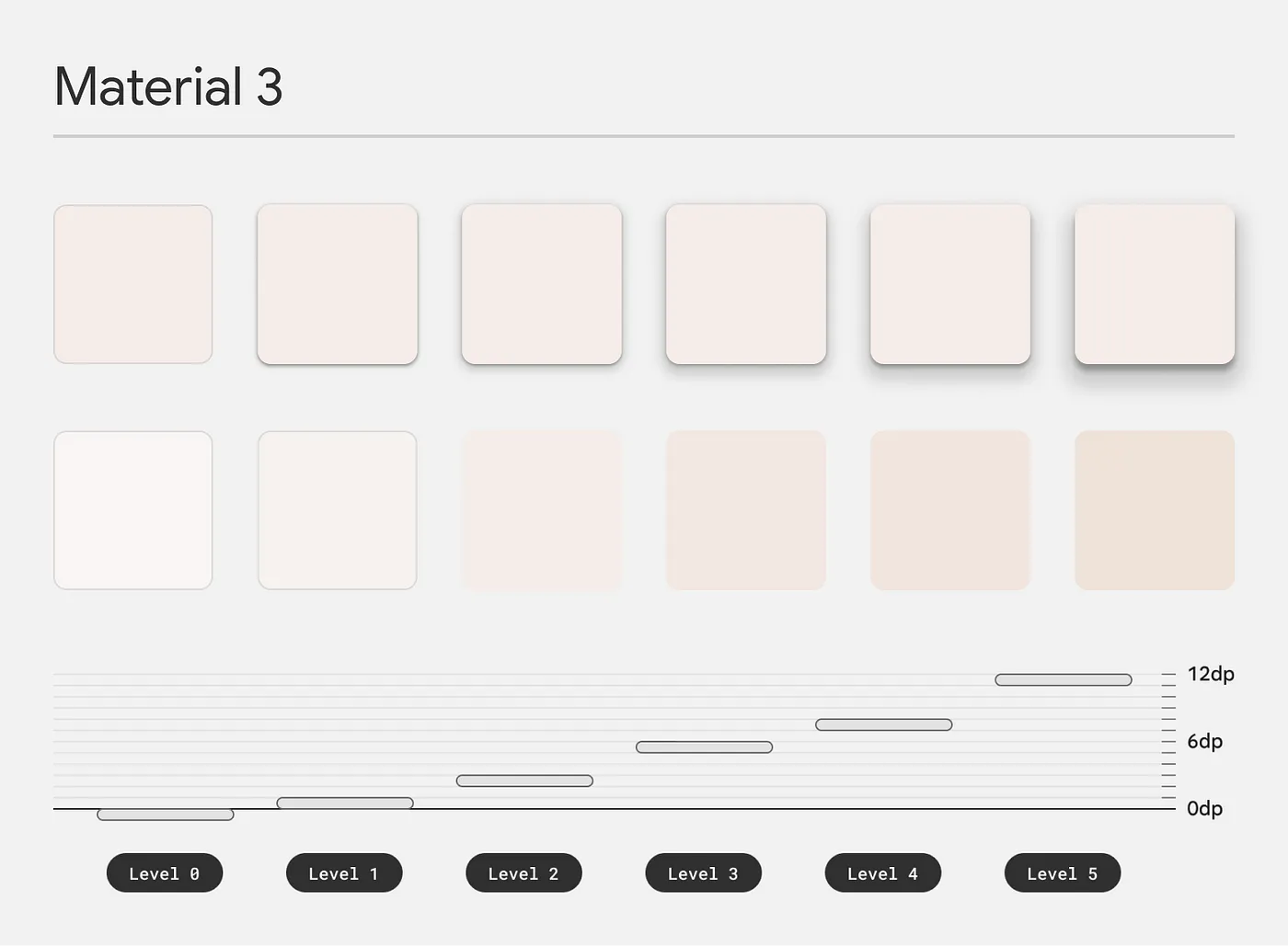
The most significant change, however, was using tone and tint as the primary means of illustrating elevation levels instead of shadows — unless there was a need to provide additional contrast against backgrounds. While elevation is again used to show component states, there is a standard elevation change of 7dp across all components compared to the varying elevation changes of the original Material.
Creating a Shadow
You need to understand the behavior of shadows to use them in UI design effectively. Drop shadows are created with three variables. We’ll start with the blur of the shadow. The blur increases as the light source moves toward the object and the background. Blur also increases when the object itself moves away from the background and towards the stationary light source.
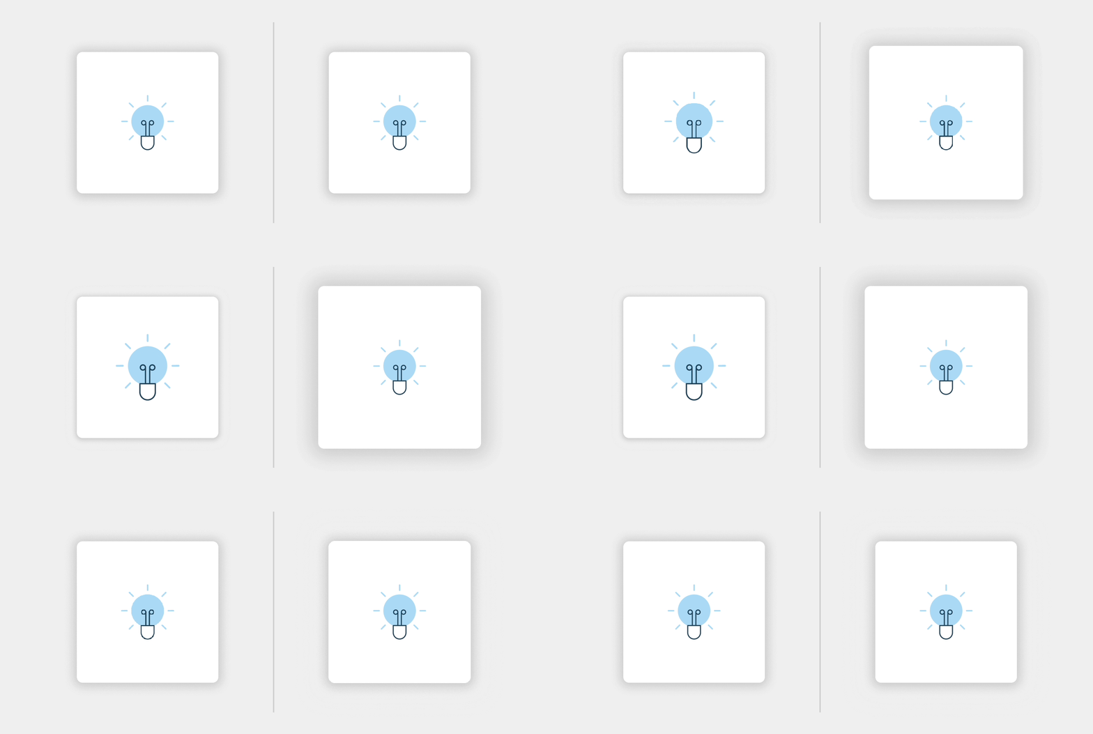
Next, we have the shadow‘s direction’, sometimes called “offset.” If you move further away from the shadow surface, along the X or Y access, you will see that your shadow will move in the opposite direction of the light source.
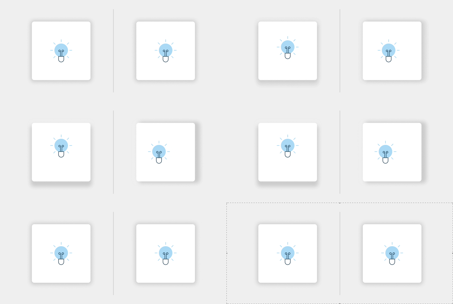
Finally, we have color and opacity. While the surface influences the color of the cast shadow, it also depends on the light source’s color — more on that later.
Replicating Nature on livefront.com
By mimicking shadows in nature, you can create more realistic designs. Like your design software, nature has three variables to consider when working with shadows: the light source, the object blocking the light, and the surface that the shadow is cast upon. Once you understand how these variables behave, creating shadows in Figma or Sketch becomes a breeze.

Let’s take a look at some shadows from a collection of devices. You’ll first notice that the light source is inconsistent, appearing above, below, and to either side of each device. For this section to live up to its full potential, we must first determine the light source. For this execution, we will use a light source that sits just above the devices. The light source creates shadows that offset from the bottom of each device.
Another variable is light quality and source. A shadow created from a clear, clean light source will generate crisper edges, whereas a diffused light source creates softer, more subtle drop shadows. The light source also affects color. While a warm light source will add a warm tone to the surface it is shining on, the shadow will be tinted in a hue opposite the light source. For our execution, we will use a neutral light source to “create” shadows with a neutral color.
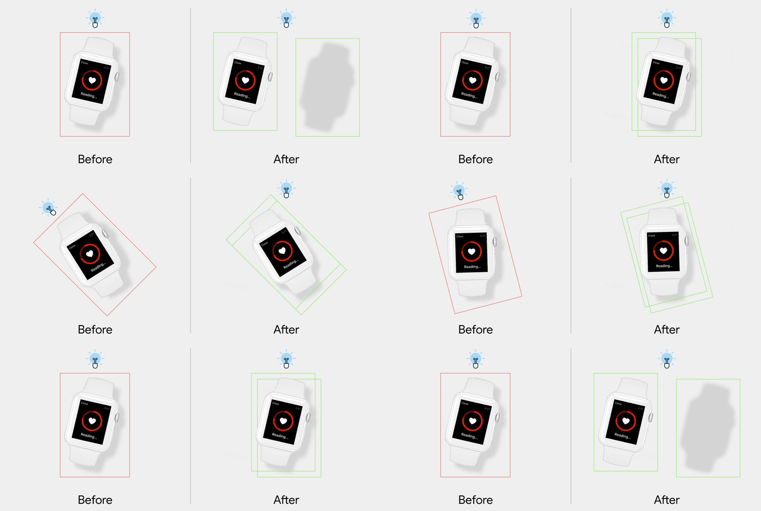
One complication is that each of these devices rotates on hover. Currently, on hover, the shadows will turn with the device. Go outside and test this with a real object in nature; you’ll notice that while a shadow rotates with the object creating it, its position relative to that object does not change. We will need to rotate the device and shadow independently for our collection of devices.

And there you have it. Using what we’ve learned from nature, we created realistic shadows that do not distract the user from the content — even when rotated. Understanding the behavior of shadows and mimicking nature will help you master the art of using shadows convincingly and effectively in UI design.


