Article
Error States, Your New Bestie
A guide for designers on how to identify, classify, design and document error states for your mobile app (so they’re less intimidating)
February 15, 2023

Let’s be real for a second — error states are inevitable. And when they appear, they also create a scenario that is every designers of digital products nightmare: a frustrated user. The only thing we can do as designers is prepare and have well-designed and thoughtful error states. Before I take you through the steps on how to achieve this, let’s start with some basics:
What is an error state?
An error that crops up in a digital product can be surfaced to the user in many forms: alerts, inline messages, or even a full-screen takeover. The main purpose of these error states is to communicate to the user that the action or response they were expecting did not occur.
What are the general causes of errors?
It doesn’t matter how killer your backend technology is or how user friendly your UI is, things can (and will) go wrong. A few common reasons that will cause error states to occur:
- API response failure (e.g. unable to get search results)
- Poor or no network connection (e.g. user is in airplane mode)
- Invalid input (e.g. the user didn’t include an @ in their email address)
I know, you’re skeptical on how I’m going to make you love (or at least tolerate) designing for error states, but stick with me. The best way to manage it all is to create a system; here are the basic steps to set you up for success:
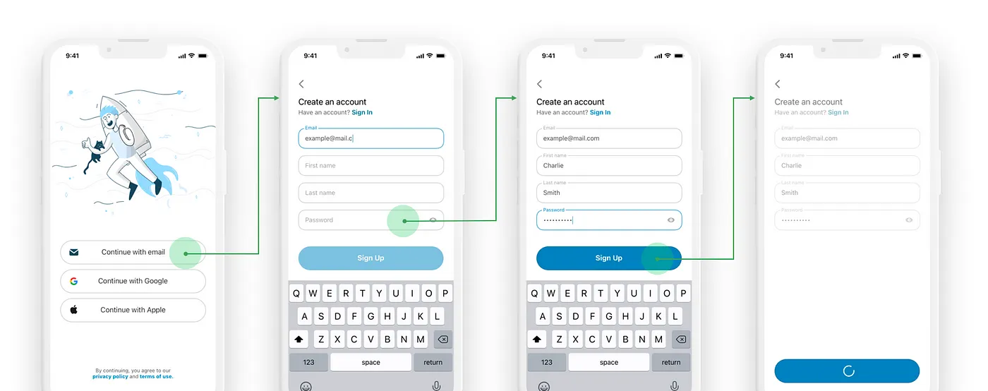
Step 1: Design your happy paths
This is the part we all like, so I’m starting you off easy. Get all your screens in pixel-perfect, ready-for-development condition. Many of the error states will work in unison with the happy path designs, so it’s best to get those done first.
Step 2: Coordinate with Product Manager and Developers
Now we jump into the most intimidating phase. Your Product Manager and Developers on your team have more insight on the inner workings of the app, including what can possibly go wrong.
Start to understand where the information you are displaying is coming from and what actually has to happen behind the scenes for an action to be successful. Get into the nitty gritty of it. Question everything.
Step 3: List out all error states
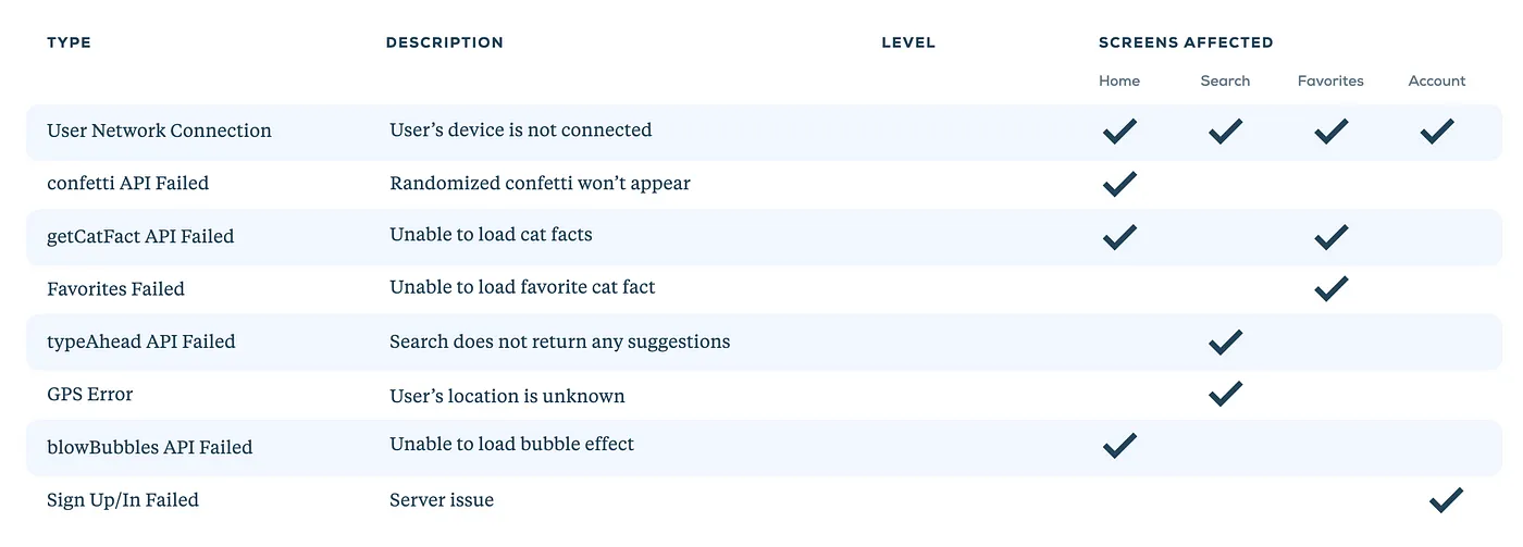
Now that you’re cognitively overloaded, list out all the error states you uncovered with your team. Give each state a unique name. I usually go with naming it after the API or the action that would cause the failure.
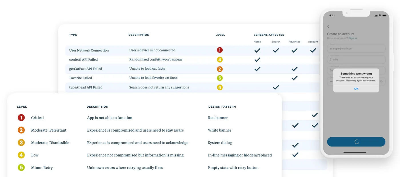
This can be done in Excel, Figma or any program of your choice, but note this will end up turning into a table. The error state names will be your Y-axis.
Your X-axis is going to consist of the following:
- Type (i.e. error state names)
- Description (i.e. summarize what will happen when it fails)
- Level
- Screens Affected (have a subcategory under this header with the names of all your screens; e.g. Home, Search, Account)
Now that you have an understanding of what will go wrong under each error state, check off the screens that each error will effect. This creates a nice, little inventory of the screens you need to address.
You made it. I promise that was the hardest step.
Step 4: Create a classification system
All errors are not created equal. That means all errors shouldn’t be handled equally.
To accommodate different severity levels, we now get to create a fun little classification guide. This can honestly be anything you want (numbers, colors, emojis, so on..) but I’ll stick with a number and color combo. I use a classification system of 1 (red) to 5 (green) to rank severity, but find what works best for you, your product and your team.

Step 5: Brainstorm general design patterns for each level
The more severe an error is, the more obnoxious, err…I mean noticeable, the error should be. I then brainstorm general approaches to design for each level in the classification system, keeping in mind how impactful the error handling should be to the user.

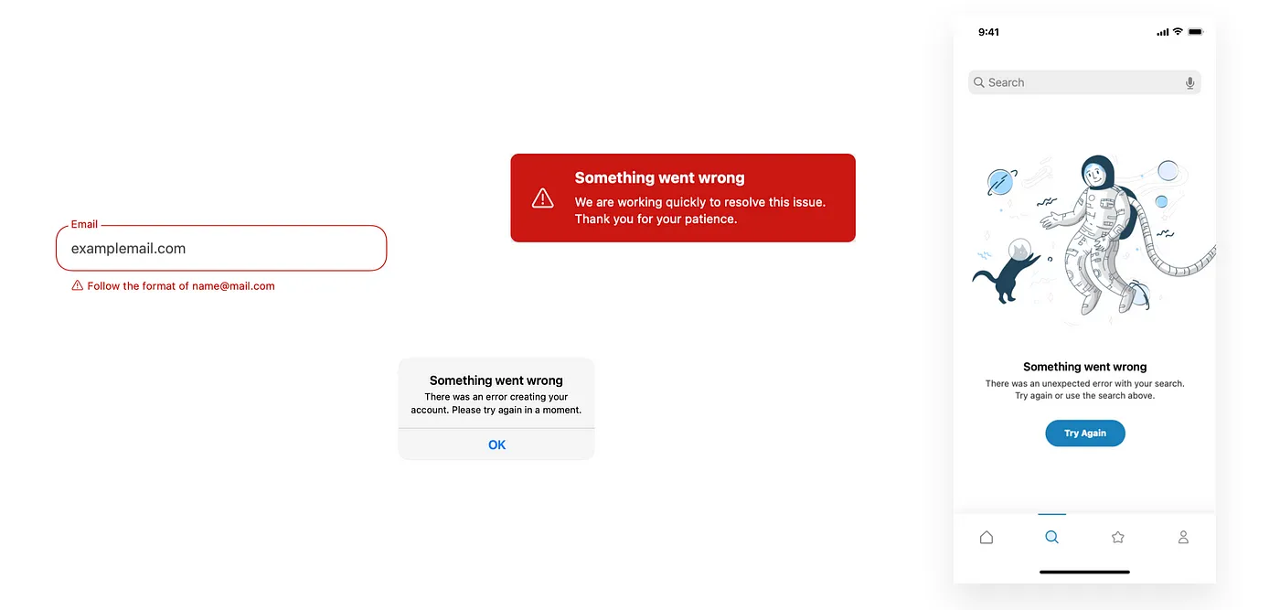
Assigning a design pattern to each level will create consistency between similar types of errors. Common mobile error pattern types include:
- In-line messaging
- Dismissible alerts or dialogs
- Urgent banners
- Replace/hide information
- Full screen message
Step 6: Assign a level to each error state and apply design patterns
Now back to your table! The last column we have left to fill is “Level.” Looking at your description and number of screens effected, determine where that error state should fall in your classification system.
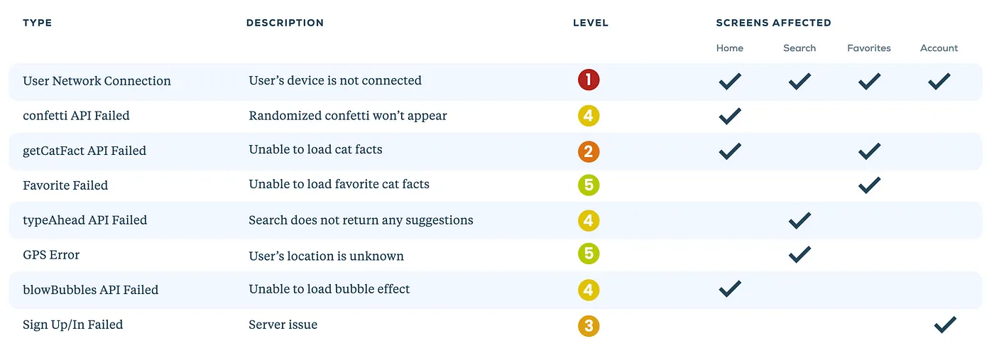
And this is where it all comes together. You have your happy path designs, list of errors, inventory of screens you need to design error states for, and a guide on what the design patterns should be for each.
So start applying those error state design patterns! It might take a few iterations to get it right but don’t be afraid to modify/add/subtract levels and design patterns, if needed. After this step, your first draft of error states will be complete! But you’re not done yet.
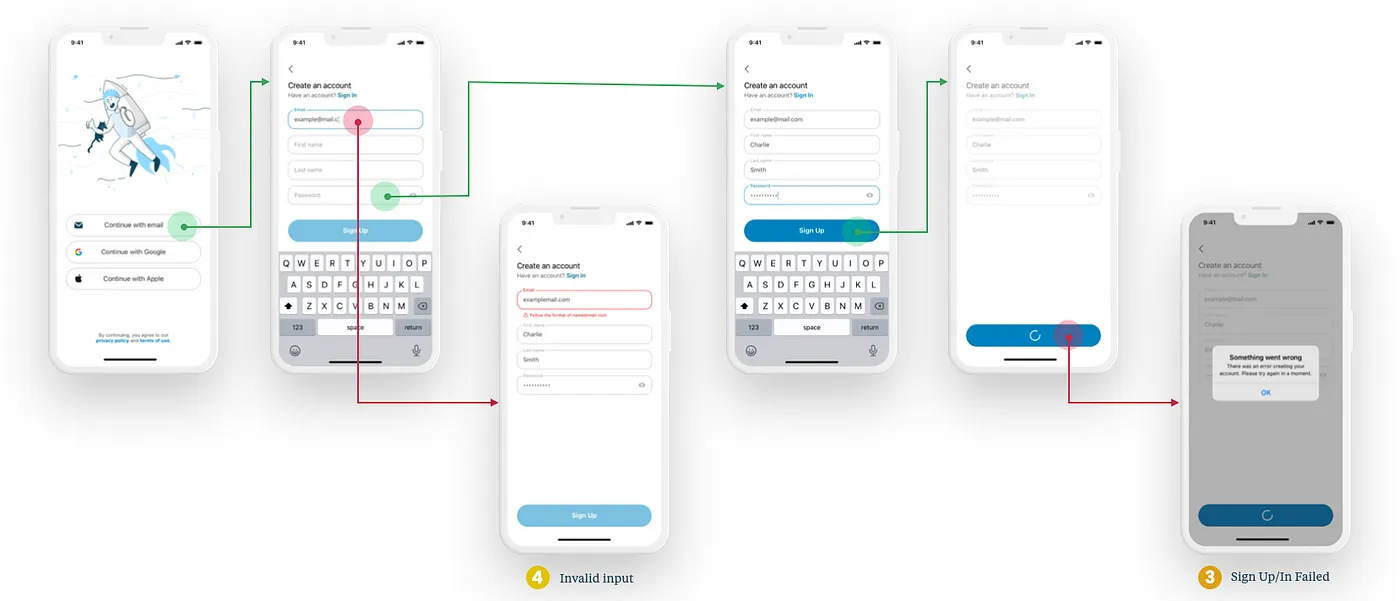
Step 7: Review with Product Manager and Developers
Bring your handy dandy error states table and designs back to your team for review.
It’s common to miss out on some states the first time around. So don’t fret if more error states come up. This is the beauty of the system you just created. Adding any more error states should be a breeze. As soon as you understand what happens during the new error, you can quickly classify it and know what the design pattern will be.
Step 8: Define rules of hierarchy
A question that will be asked by your team: “What does it look like if Error A happens along with Error B?”
There will be a time with multiple errors happen concurrently. Think about how it should handled. Will the more severe error take precedent? Will you show all error states at once?
Try to create clear rules using your classification system as a guide (e.g. if a Level 1 happens with a Level 3, Level 1 will take precedence). This will save you time since you do not need to individually make rules for each and every error state combination. It’s also helpful to mock up examples of common simultaneously failing error states, so your team will have a visual reference.
Step 9: Organize into a deliverable and share!
Your hard work is done and now you should show it off! Create a shareable document that includes the classification system with general design patterns, your error states table, and design comps for each state.
Okay, so you might not love error states at the end of this but I promise you your Product Manager, QA team and developers will sure love you. And most importantly, you will love yourself now that you have an organized, scaleable system for an otherwise dreaded topic.
And what should you do with all this new found time? Grab your new bestie’s hand and skip off to enjoy a bottomless mimosa brunch.
Phylicia is a UX designer UXing UX at Livefront .


