Article
Put me in coach (marks)
July 31, 2024
Whether you’re onboarding a user to an app or introducing new features, providing some form of user education is important to help users understand what could be unfamiliar. Recently on a project here at Livefront , we were designing a screen with new core features to add to an existing mobile app. We decided to add a set of coach marks for these features, as we felt that they would be a great way to quickly give users the information they needed without getting in their way.
User testing is the best way to gather critical information about how users will interact with our interfaces, so we got our designs ready and set off to gather all that sweet valuable feedback about our new features and coach marks!
Well… turns out, those coach marks were immediately skipped and completely overlooked by almost every… single... user. Most didn’t even acknowledge them. Then, because they were skipped, users were left confused about what they needed to do or where to start, which is the problem we were seeking to solve in the first place.
While this was not what we were hoping to see, it was also the best feedback we could’ve received because it showed us that we had to change our approach.
Here’s what we did and how we went from zero to hero.
First, what is a coach mark?
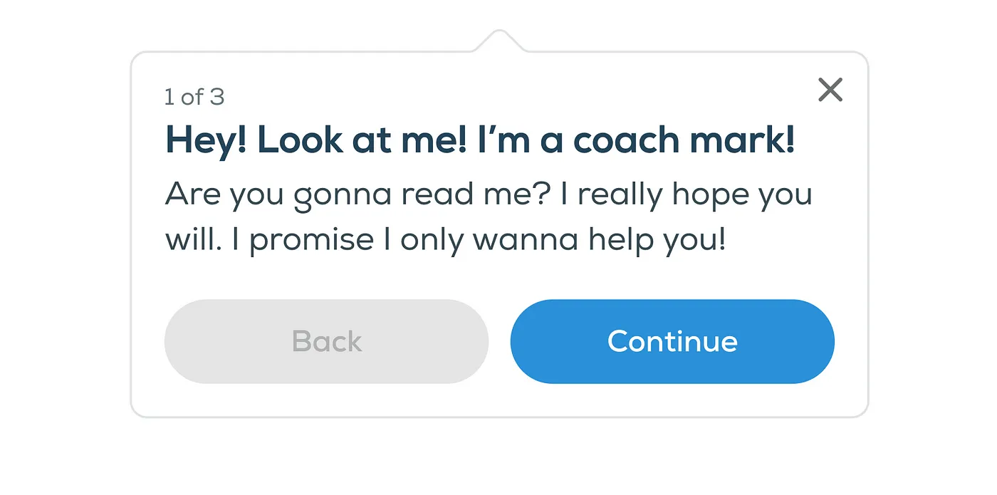
A coach mark is a message that appears near an unfamiliar feature or interaction in hopes of guiding the user in the right direction and providing needed information. They’re (hopefully) dismissible, and there are often multiple in succession.
How can I make sure my coach marks are successful?
- There’s a time and place. A coach mark can be a quick and easy way to educate the user without forcing them away from their path. Start by determining how much information you think is necessary to inform the user, then decide if a coach mark (or multiple) is the right way to display that information.
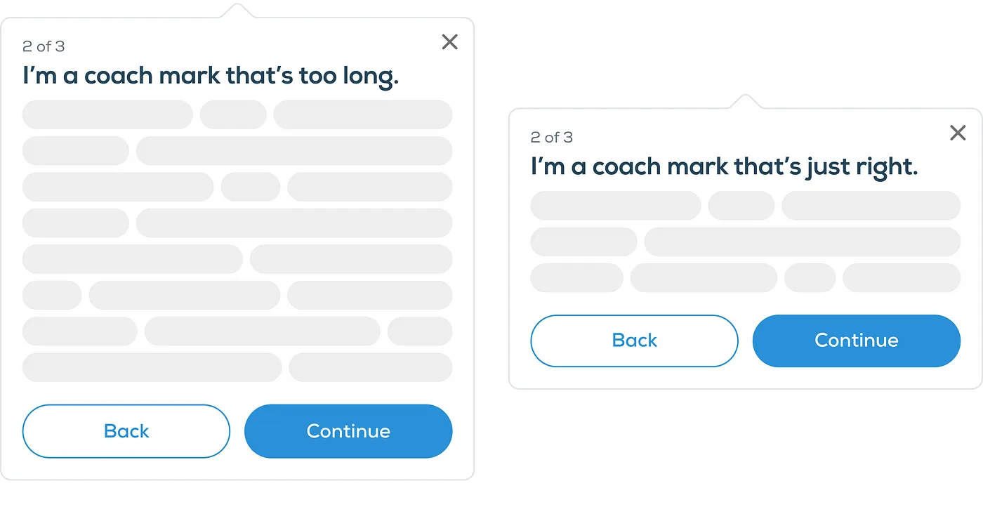
- Keeping it simple is crucial. Use clear and descriptive language and stick to 1–2 small sentences per coach mark. No one wants to read a whole storybook right now!
- Make sure it’s dismissible. Even though our ideal situation is to have users read our coach marks, we still want to give them the option not to. Not allowing a user to close or skip all or each coach mark will only cause frustration that could lead the user to close the app altogether.
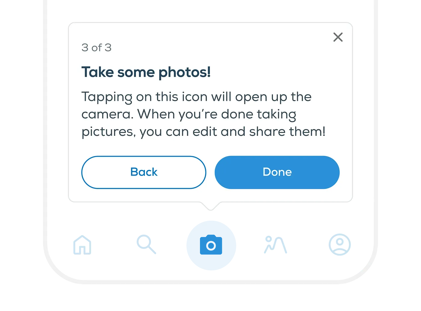
- Use visual indicators. Highlighting what the coach mark is talking about can help direct the user’s attention, even if they don’t fully read the coach mark. Try using an arrow, an illustration, or a scrim behind the coach mark to help call out the content.
- Context is everything. Make sure your coach mark isn’t covering the feature or interaction it relates to. Coach marks can add clutter to what are often already complex screens, so making sure it’s placed correctly and appears at the right time will help users feel confident enough to continue forward.
So what did we decide to do?
Instead of presenting coach marks right away as we did previously, we designed an optional guided setup to introduce users to the app's new features. The guided setup consisted of 3 quick steps, giving users full control over the data they were willing to disclose, along with explanations of how this information would benefit them later. By personalizing the app’s new features on the user data collected during the guided setup, users are now ready to go as soon as they land on the new screen.
If a user skipped the guided setup, then we presented improved versions of the previous coach marks to make sure those users were still provided helpful information. Our previous coach marks were shown out of context with empty states, which contributed to user confusion. The new versions were now being shown with fake data to show the user what their new screen would look like when they added the information needed. We also wanted to grab the user’s attention and help them focus on the context, so we used a scrim to hide unnecessary information on the screen and visually highlight the fake data and coach marks.
How did it go?
In our second round of testing, our guided setup proved to be extremely successful. None of the participants struggled to go through any step of the setup and all understood the purpose of what we were asking. Upon landing on the screen, they were extremely pleased to see how their information was tied into the new features.
With our improved coach marks, 6/8 participants read and interacted with the coach marks. This was a HUGE improvement from the previous 0. Those who didn’t read the coach marks still had an understanding of what they needed to do based on a glimpse of the focused fake data and our detailed empty states!
In total, 14/16 participants didn’t encounter any struggles.So, before you throw out those coach marks, think about how they can be improved and supported.
In the end, we found that not only did we need to reconsider our use of coach marks, but with a few small tweaks, we transformed an overlooked feature into a valuable source of user education. Our guided setup provided personalization that made our new features intuitive and self-explanatory. For users who skipped our guided setup, our improved coach marks provided extra clarity and context for how they can move forward. This gave both types of users an educational experience that was fit to their needs.
Both of these together greatly improved user comprehension and we were now confident we had chosen the right educational avenue for our users!
Olivia creates user experiences by wrangling pixels at Livefront .