Article
Flight School:
3 Key UX/UI principles you might not have learned in your graphic design program
April 14, 2025

You did it! You cracked the shell. Freshly hatched from your graphic design program, BFA under one wing, and portfolio under the other, you’re ready to spread your wings and take flight into your first big-bird UX/UI job.
For a beautiful moment, you’re soaring. Your first salaried deadline is on the horizon, the wind is beneath your wings, you think you’re getting the hang of it — when suddenly — a senior designer swoops in and starts asking questions.
Questions like:
- “Why is your padding an odd value?” (My what, is what?)
- “Did you check the color contrast?” (Check it for what, exactly?)
- “Why aren’t you using the native date picker?” (The what now?)
Just like that, you’re in a tailspin. Did you sleep through a critical day of Mr. Boringofsky’s class? Was there a secret UX/UI course you were supposed to take?
Before you descend beak-first into impostor syndrome, remember: you’re not alone. Many graphic design programs focus on the fundamentals — hierarchy, typography, color, and composition — but primarily in the context of print. While those principles still apply to digital design, some crucial digital design concepts often get left out.
So fluff those feathers and stick with me, chickadee. I’ll take you through three key principles every young designer needs to glide confidently into the world of UX/UI.
1. Digital products need vertical rhythm
In print design we learn all about rhythm and balance when it comes to a poster, a booklet, a label — but how do those concepts apply to a long scrolling screen? What about a screen that scrolls forever? In digital product design, maintaining a strong sense of vertical rhythm is key to creating high-quality interfaces.
Vertical rhythm is created through the consistent spacing and alignment of elements on the vertical axis of the screen. When page elements — headings, body text, buttons, images — are arranged consistently, we create a product that is visually balanced, readable, and scannable.
To create vertical rhythm you should:
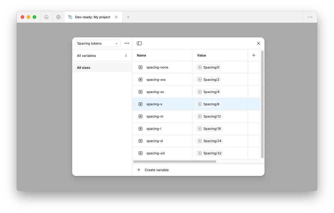
- Use an 8pt grid system: Many digital products rely on an 8pt (8px when you’re working in Figma) spacing system to maintain consistent alignment. Since most screen dimensions are divisible by 8, this avoids issues like half-pixel rendering and ensures designs scale well across devices.
- Keep spacing consistent: Use 8pt increments for padding and margins between elements, too. If you need tighter spacing, stick with even numbers like 4pt or 2pt to maintain alignment and hierarchy.
- Apply rhythm to typography: Varying text sizes is fine (even odd numbers are OK), but be sure your line heights (aka leading, in print terms) also align to your grid. This keeps blocks of text legible and vertically aligned with other elements on the page.
2. Digital products need to be accessible
We know that printed materials should be designed so everyone can read, understand, and engage with them — especially people with visual impairments. In print, we often have some control over the context, environment, and audience for each design.
Digital products, on the other hand, can be accessed anytime, anywhere, on a wide range of devices, and with just as many variations in user settings and preferences. To make sure your digital product is flexible, functional, and inclusive for all, we need to think beyond visual accessibility and consider motor, auditory, and cognitive differences, too.
That’s where standards like the Web Content Accessibility Guidelines (WCAG) come in. Making sure your product is accessible isn’t just best practice — it’s essential. According to the World Health Organization, as of 2023 “an estimated 1.3 billion people — about 16% of the global population — currently experience significant disability.” And this number is increasing due in part to the aging worldwide population. These guidelines can feel overwhelming, but when you consider them from the start, they are an easy way to ensure your product is accessible to everyone.
To design an accessible digital product, you must:
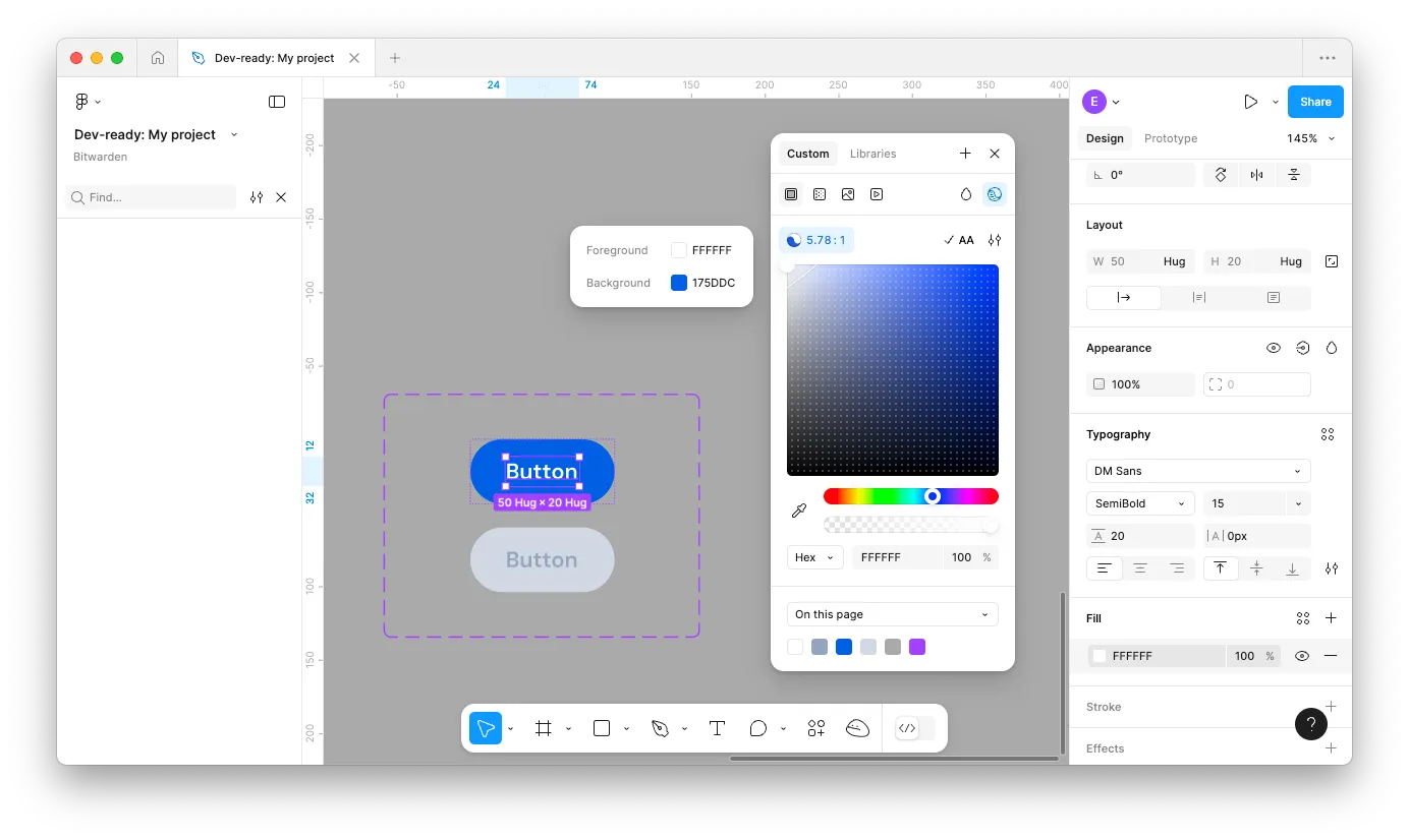
- Ensure sufficient color contrast: Text should have strong contrast against its background. For normal-sized text, WCAG recommends a contrast ratio of at least 4.5:1. For large or bold text (18pt+), a 3:1 ratio is great. This ensures users with low vision or color blindness can read your content.
- Design with scalable text in mind: Users can adjust text size on their devices, so make sure your layouts can handle dynamic type. Test your designs at multiple text sizes during the design process to make sure text wraps appropriately and your layout doesn’t break as text gets larger. To understand text scaling, check out the platform-specific guidance for text sizes for iOS and Android .
- Make interactive elements accessible: Buttons, links, and form inputs should have clear labels, be large enough to tap (minimum 44pt for iOS and 48dp for Android), and be fully usable with a keyboard.
3. Digital products need to consider native patterns
In print design we tend to follow the established patterns for each type of media we create. A typical book spread includes the title at the top, page numbers at the bottom, and a consistent typographic system. A movie poster will also follow a recognizable structure — a tagline at the top, bold title and imagery in the center, and key credits toward the bottom.
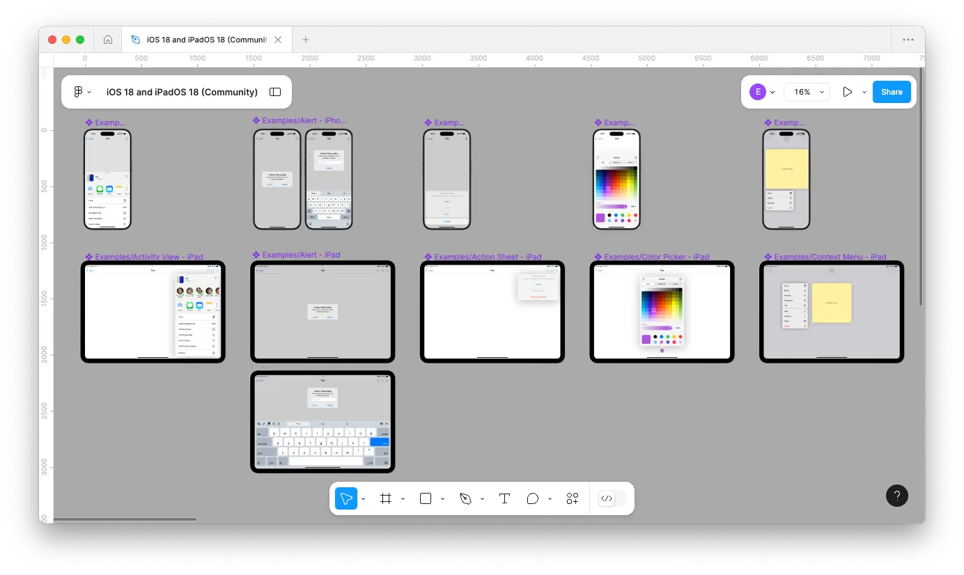
Digital design works in a similar way, but the patterns are more formalized — especially when it comes to mobile apps. Native mobile patterns refer to the standard user interface components and interaction behaviors that are built into mobile operating systems like iOS (Apple) or Android (Google, Samsung, etc.). These patterns include elements like navigation bars, tab bars, modals, date pickers, animations, and gesture behaviors.
In both print and digital, following these familiar patterns creates a consistent experience, reduces user confusion, and helps your designs communicate better.
To align your digital product with native patterns:
- Get familiar with platform guidelines (and stay up-to-date on them): Review the official documentation: Apple’s Human Interface Guidelines (HIG) and Google’s Material Design Guidelines (Material 3). These resources document how apps should look and behave on their respective platforms. They’re also updated regularly, so be sure to stay up-to-date when new operating system versions roll out.
- Start standard, customize later: While it’s totally possible to create a fully custom app interface, native patterns provide a reliable starting point. These components come out of the box optimized for accessibility, performance, and user expectations, saving time for both you and your developer. Start with native, then modify or layer in custom styling as needed.
- Use native UI libraries: While the platform guidelines describe how components should look and behave, Figma and other design tools offer ready-to-use libraries with native elements — like buttons, sliders, menus, and more — for both iOS and Material 3 . These are a great resource to get your design up and running quickly.
Transitioning from print to digital design can feel like learning to fly all over again — it’s easy to think you’ve somehow fallen behind. But remember: we all started somewhere, and many seasoned pros also learned the 8px rule the hard way. With a solid grasp of vertical rhythm, a strong commitment to accessibility, and a thorough understanding of native patterns, you’re already miles ahead.
Emily is shakin’ her tail feathers in 8-count intervals at Livefront


